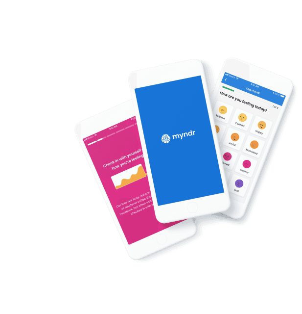

Create better digital products and services, faster.
Maximise your digital product growth & performance with a proven Newcastle-based studio team that will deliver the results you need.
Unlock your product’s fullest potential by accessing two decades of experience across software development, digital design and user research.
Leverage our in-house expertise to better understand your users and clearly define your challenges. Work with Komodo's product teams to shape your web and mobile products.
Client Success
We love success stories. Here are some that we’ve helped create.
We love success stories. Here are some that we’ve helped create.


Clients say


“KOMODO set the bar for all other software agencies we work with.”
Scott Painter
Product lead


“KOMODO took time to fully understand our processes and delivered on our complex requirements.”
Sophie Jones
cOMMUNICATIONS & Learning Manager


“KOMODO support our team to build products across our business services. I have visibility of what's been delivered and challenges we've overcome.”
Ross Cooney
CTO


“As a start-up, having KOMODO as a design and technology partner has allowed us to focus on rapidly growing our business”
Jonathan Valentine
CTO
“KOMODO set the bar for all other software agencies we work with.”
Scott Painter
Product lead
“KOMODO took time to fully understand our processes and delivered on our complex requirements.”
Sophie Jones
cOMMUNICATIONS & Learning Manager
“KOMODO support our team to build products across our business services. I have visibility of what's been delivered and challenges we've overcome.”
Ross Cooney
CTO
“As a start-up, having KOMODO as a design and technology partner has allowed us to focus on rapidly growing our business”
Jonathan Valentine
CTO

“KOMODO set the bar for all other software agencies we work with.”
Scott Painter
Product lead
“KOMODO took time to fully understand our processes and delivered on our complex requirements.”
Sophie Jones
Communications & Learning Manager

“KOMODO support our team to build products across our business services. I have visibility of what's been delivered and challenges we've overcome.”
Ross Cooney
CTO

“As a start-up, having KOMODO as a design and technology partner has allowed us to focus on rapidly growing our business”
Jonathan Valentine
CTO
“KOMODO set the bar for all other software agencies we work with.”
Scott Painter
Product lead
“KOMODO took time to fully understand our processes and delivered on our complex requirements.”
Sophie Jones
Communications & Learning Manager
“KOMODO support our team to build products across our business services. I have visibility of what's been delivered and challenges we've overcome.”
Ross Cooney
CTO
“As a start-up, having KOMODO as a design and technology partner has allowed us to focus on rapidly growing our business”
Jonathan Valentine
CTO