A new brand, and a new way of building
This week we launched the new Komodo brand, and a website rebuilt around it. The site was designed and built directly in code, using an AI-accelerated workflow, so design and build happen in the same place instead of being handed from one to the other.
The brand it replaces was a deliberate move away from black and white. We wanted something that pushed us towards curiosity and playful exploration, and it did that job well for a good few years.
A brand belongs to a moment in a business, though, and the business has moved on. As Komodo heads in a new direction, we have gone back to our roots and asked the typography to carry the brand.
Colour comes from the work
Stripping the palette back to black, white and grey gives us a foundation we can build on properly. There are no brand accent colours at all.
Colour still appears on the site, but it comes from the work. If you see it, a client’s product or a photograph put it there. Because we have not spent colour on decoration, it has real impact when it does arrive.
That is how we intend to keep it. When we reach for colour deliberately it will be for a reason and at a moment that warrants it, rather than as an accent dropped into a layout because the brand said so.
Putting the work first
The old case studies had a lot of visual noise around them, and the work itself got lost in it.
So the work leads. The new case studies are built to be looked at as much as read: far more visual, with real animation, showing the work rather than relying on copy to describe it. The brand sits behind it as a frame, and that is its whole job.
The typeface
Everything is set in PolySans Slim. Poppins served us well, but it was time for a change.
I wanted a proper neo-grotesque sans-serif, ideally one with a licence that would not make Andy wince. PolySans does both. What sold it to me was the ink traps, the small notches cut into the joints where two strokes meet.
They exist because of printing. Ink spreads as it hits paper and pools in the tight corners of a letterform, until the detail fills in and turns to mud. Type designers began carving space out of those corners in advance to give the ink somewhere to go. On a screen there is no ink to trap, so keeping them is a choice. It is a nod to the old process carried into a modern face, and it gives the type character without adding decoration.
That matters more than it might sound. With a palette this restrained and no illustration to lean on, every bit of character has to come from the letterforms themselves.
Type on a grid
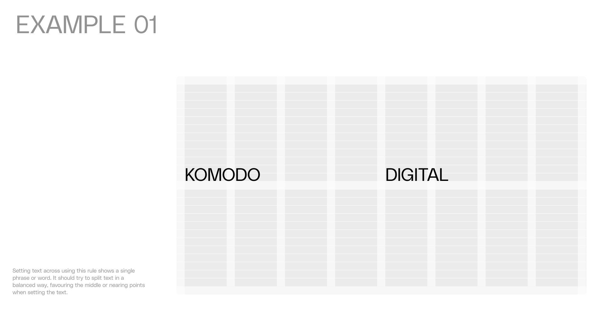
Headings are broken up and spread across the grid instead of sitting on a single line.
With the palette reduced to black, white and grey, type on a grid is what carries the brand, so I wanted it right at the front. Everything is one weight and one colour. There are no accents, no words bolded for emphasis and nothing picked out in a second tone.
Emphasis comes from arrangement. Often it is the space around a phrase that gives it weight rather than its size. Placing it well is part art and part science, there is real human judgement in it, and it is the part of this job I enjoy most and want to push furthest.
Why bother arranging it
Because it gives us something that is ours.
Anyone can set a big headline. Arranging one across a grid is a different discipline and it leaves a signature. The aim is that you could crop the logo out of a Komodo layout, whether a web page, a social post, a printed annual or a whitepaper, and still know whose it is. The typography does far more of that work than the wordmark.
That is also why we intend to lean on this harder rather than stop here. I want to animate it, be more playful with how it arrives and settles, and take the typography a good deal further, always making sure it never gets in the way of the client work.
Off the screen
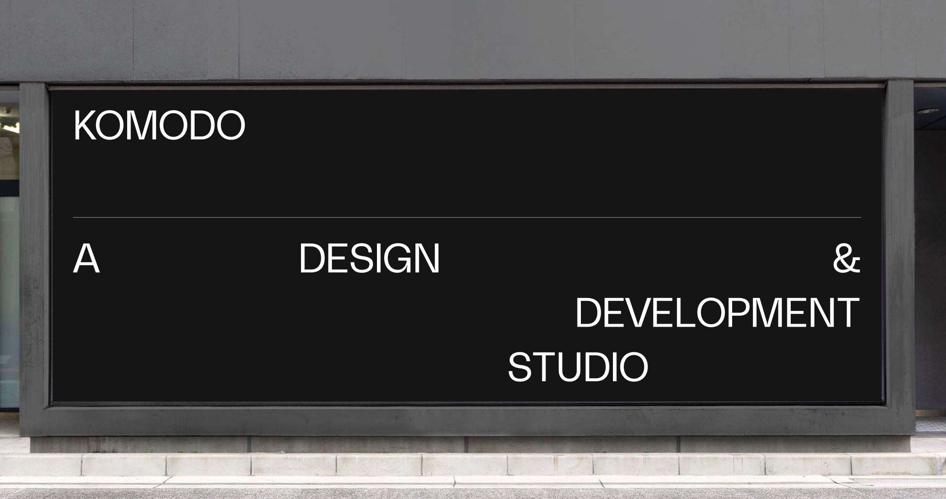
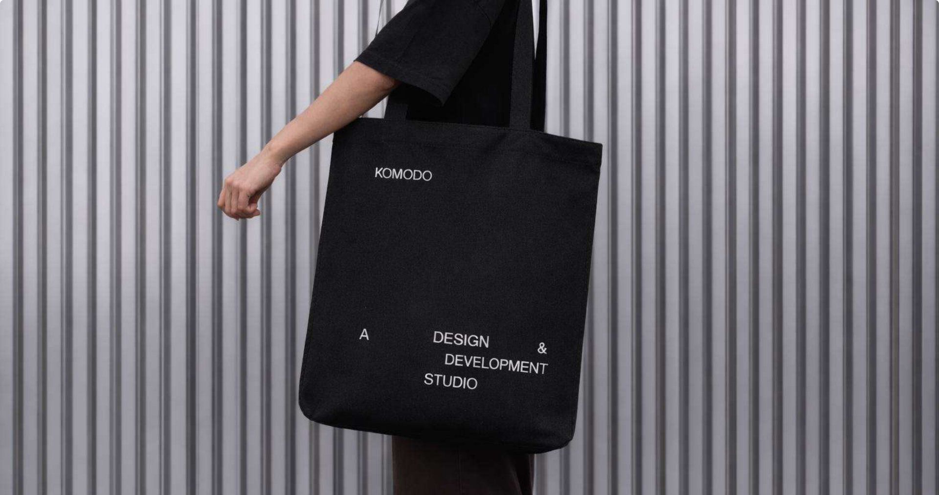
The real test of this is everything beyond the website.
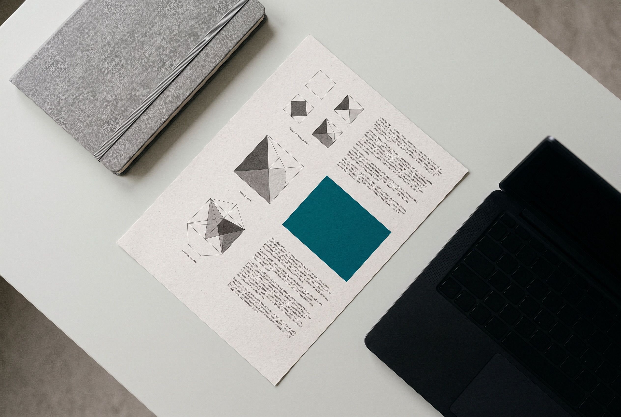
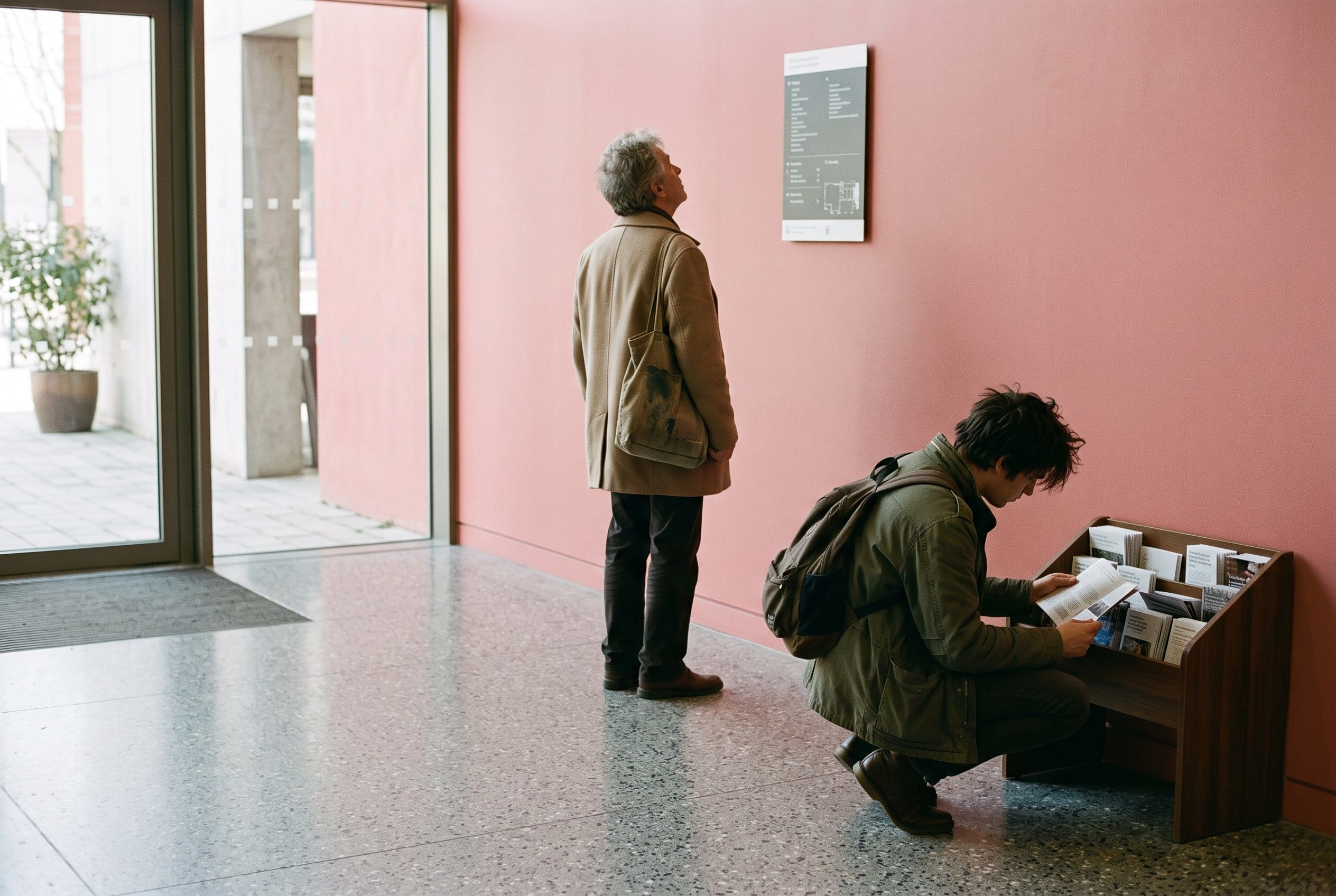
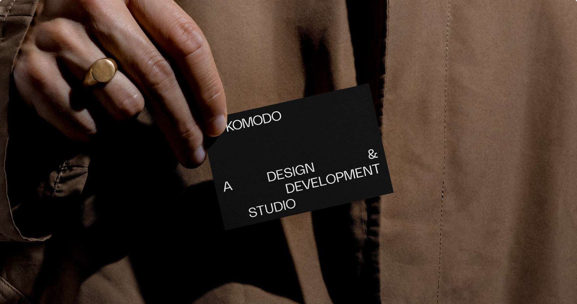
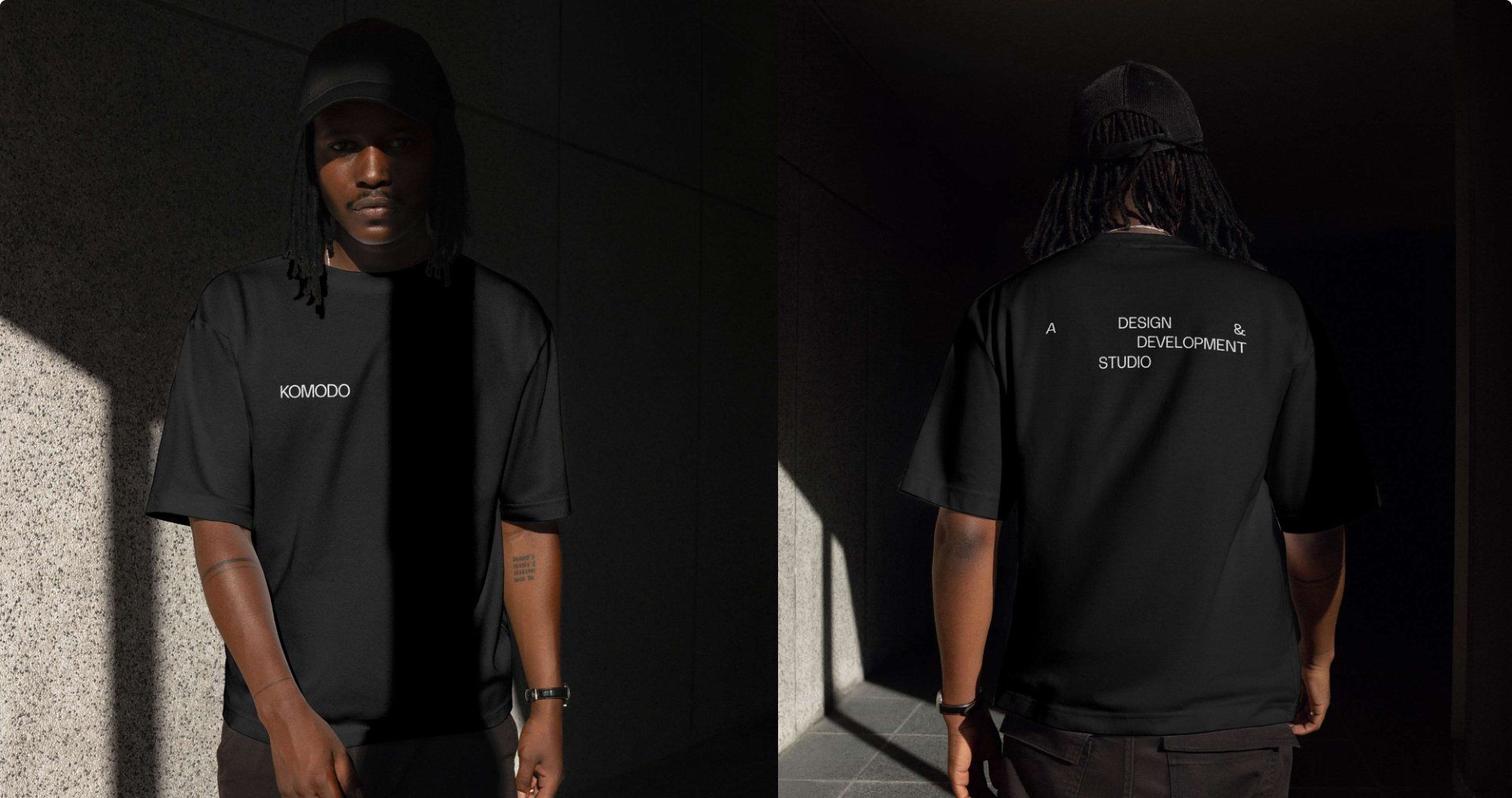
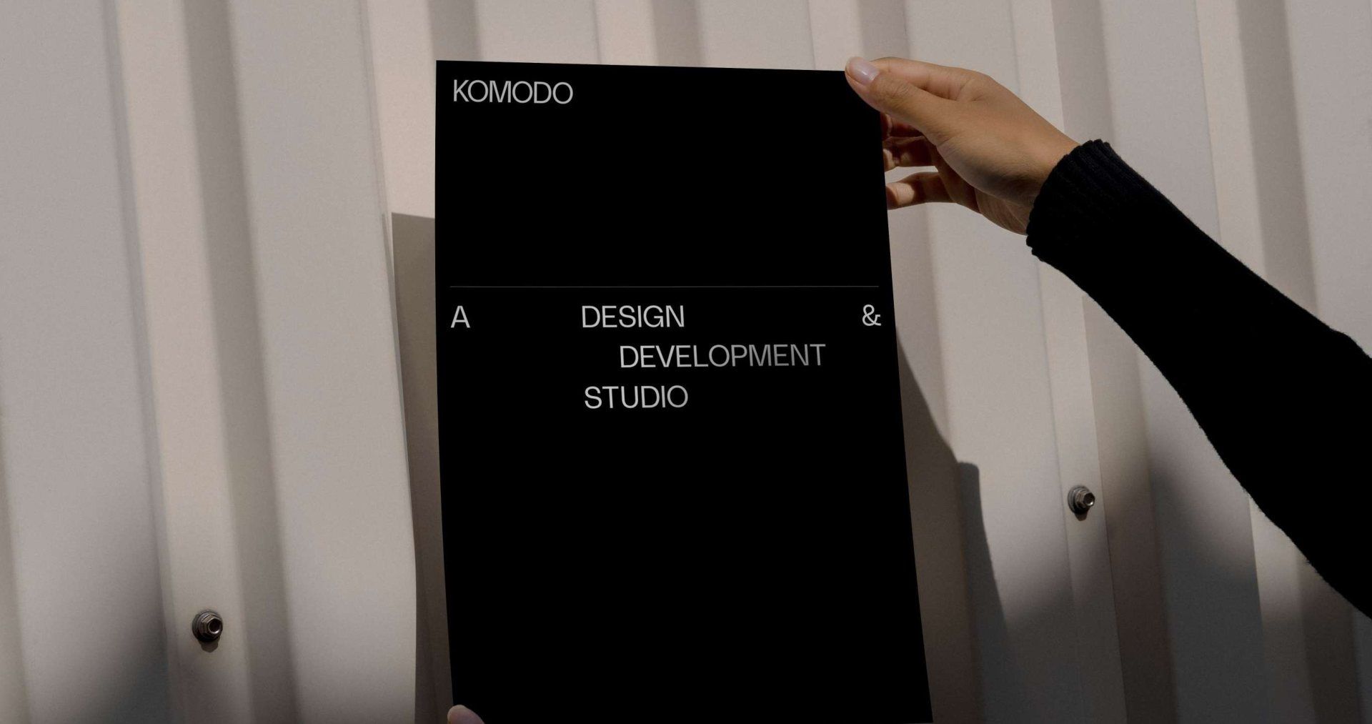
A layout rule is only worth having if it survives leaving the browser, so the same arrangement has to hold on a business card, a tote bag, a notebook and a signage panel.
I came up through graphic design, so print is the part of this closest to my heart. A page has fixed edges and a fixed size, and you cannot resize your way out of a bad arrangement. That constraint helps: the space is what it is, and you have to make it work.
What I would like to come out of this is a design annual. One printed booklet a year showing the client work we have shipped, documented properly and treated as a record rather than a brochure. It is exactly the sort of thing this brand was built to sit around, and it would give us something to put on a table every twelve months as well as a URL to point at.
Finding the balance
There is a balance to strike here, and it is the part I pay most attention to.
Arranging type works best when the arrangement says the same thing as the words. Three or four words give you room to place them, and where you put them sets the pace: a gap that holds the reader back before the next word, two phrases pushed together so they land as one beat, a line left alone with nothing near it. The space becomes part of what is being said.
A hundred characters give you none of that. Push a long heading through the same treatment and it looks arranged without the arrangement meaning anything.
So length decides the treatment. Short phrases are arranged, and long ones stack the way you would normally set them, on one anchor. I would rather a heading be plain and readable than clever and hard going, and I am not prepared to trade legibility for a layout.
The homepage hero is where this is tested hardest. It shows one statement at a time over a field of dithered dots that reacts to your cursor, so each arrangement stays short enough to place properly and the movement carries the rest. That balance will keep shifting as we push the type further, and it should.
Komodo is the frame, the client is the picture
Every one of these decisions points the same way as the business.
Andy has set out the positioning elsewhere: senior-led, AI-accelerated, built to last. In short, experienced people stay accountable for the work, AI runs through the whole process rather than being bolted on at the side, and every new client gets twelve months of support and improvement as standard.
A brand built as a frame suits that. If the argument rests on the judgement of the people doing the work and the quality of what ships, the site’s job is to get out of the way of both. It should make the client work look as good as it deserves to, and no more.
Where this goes next
Getting the foundation right and getting it live was the first job. The next stretch is where it gets enjoyable.
More animation and micro-interaction, especially around the type: how it arrives, how it moves, how it responds to you. The dithered field on the homepage is the first small piece of that, and there is a long way to take it. All of it within the same rule, that the treatment frames the work and never competes with it.
Accessibility sits underneath all of that. It is one of the things we care most about in client work, and it was part of the reason for stripping the brand back in the first place. Four colours with set pairings is a far smaller thing to get right, and keep right, than a palette carrying more rules, more variations and more ways to go wrong. As we push the type and the motion further, that is the balance I will be most careful with. It would be easy to make this more expressive and less usable, and that is not a trade I am willing to make.
More imagery too. I chose not to bring the old photographs across, because recycling old assets onto a new brand rather defeats the point of doing it. That work is under way, alongside more abstract imagery to carry the ethos.
More case studies as well, including older work built out properly and a couple that are finished and waiting on client sign-off before they go up.
What makes all of this realistic is the way the site is built. Because it runs on an AI-accelerated workflow, changing something takes a fraction of the effort it used to, so the site will keep moving rather than sitting still for two years, which is what usually happens to an agency’s own website.
The brand will keep evolving, and that is exactly why it has a system behind it: it can grow without losing track of what it is.