Understandingthe challenge
Industry
- Parking & mobility
- Healthcare
- Accessibility
Platform
- Mobile app
Services
- UX audit
- User research
- Accessibility (WCAG 2.2)
- UI design
- Usability testing
- Design system
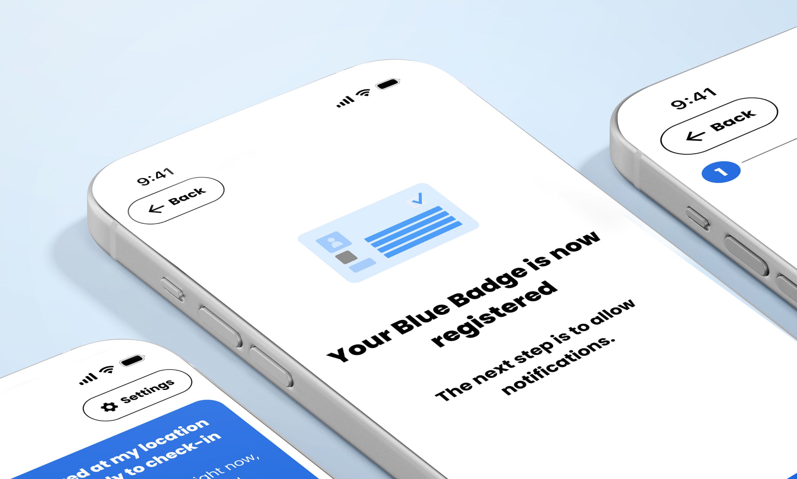
GroupNexus is one of the UK’s larger parking-management companies, running the technology behind car parks including NHS hospital sites. Their Blue Badge app set out to do something useful: let disabled drivers register their badge and check in to park, without the anxiety of a possible fine.
The app had been designed elsewhere, and it was not right for the people it was for. The look and feel had been borrowed from GroupNexus’s wider brand rather than built for a standalone product, and it fell short on accessibility. The main colour did not meet the contrast standard, which quietly shuts some users out. Development had been paused.
The audience is about as broad as it gets, from people who find a two-factor code a struggle to people who live on their phones, and nobody should feel patronised. GroupNexus needed a UK design partner to make the experience clear, accessible and ready for their developers to build, and they needed it quickly.
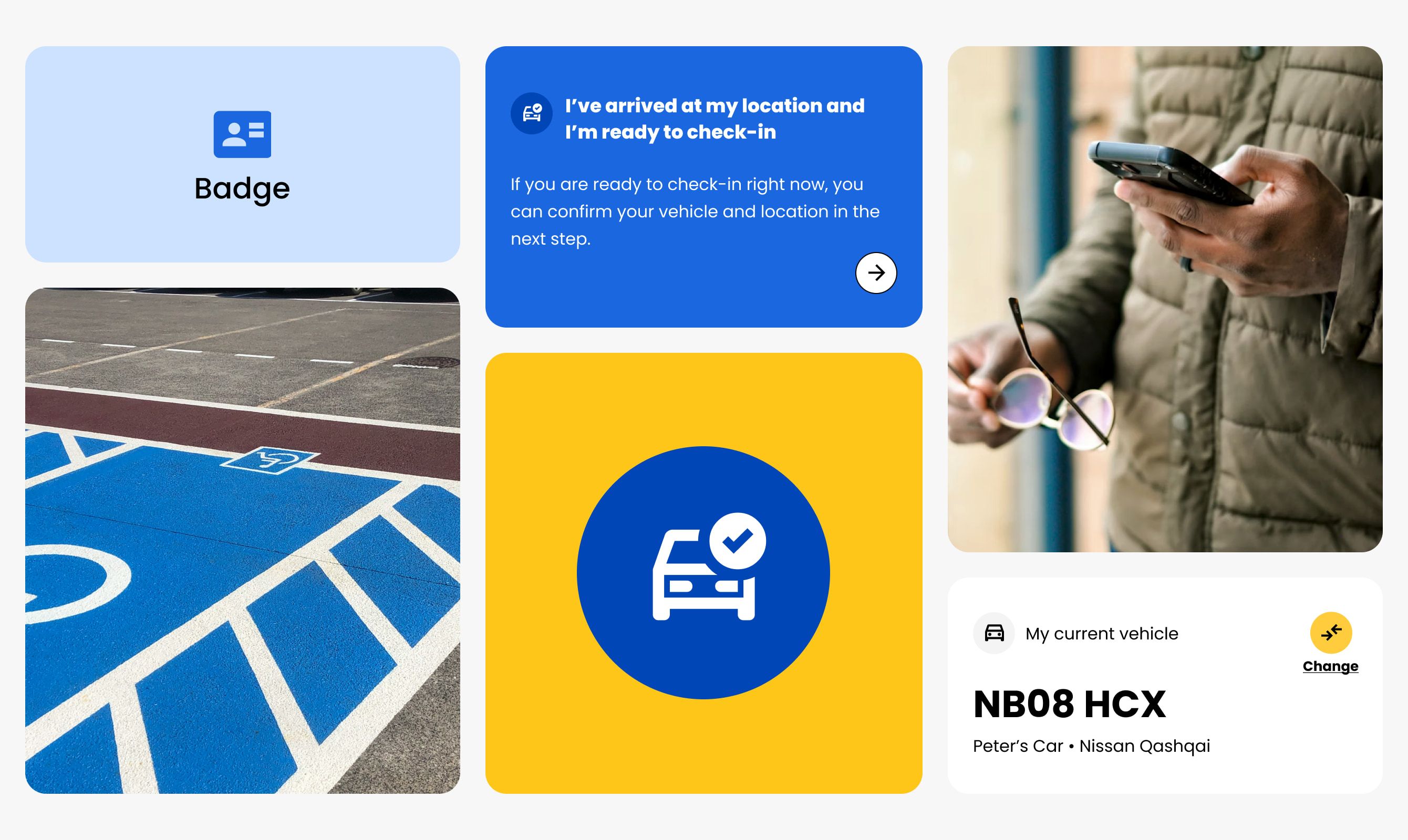
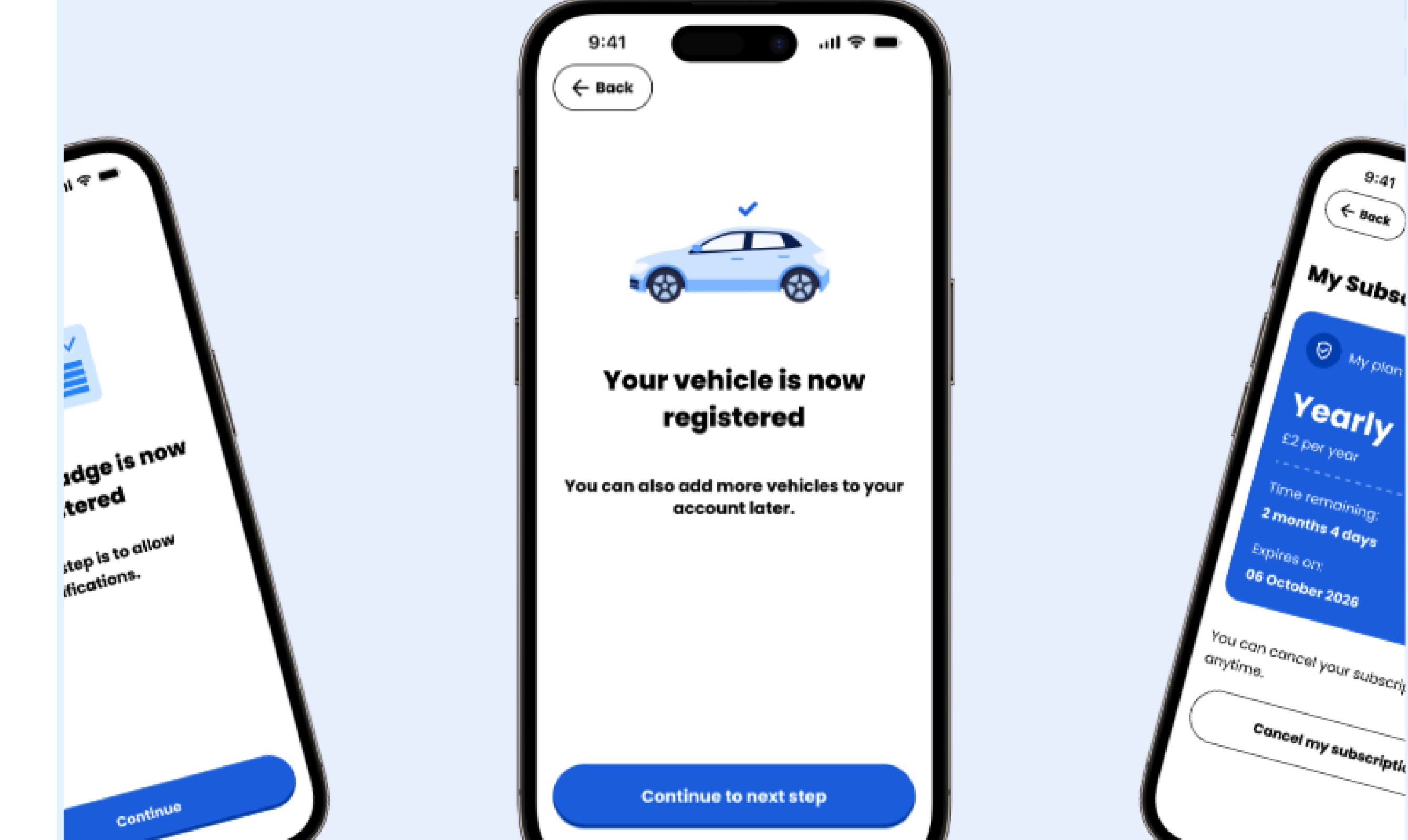
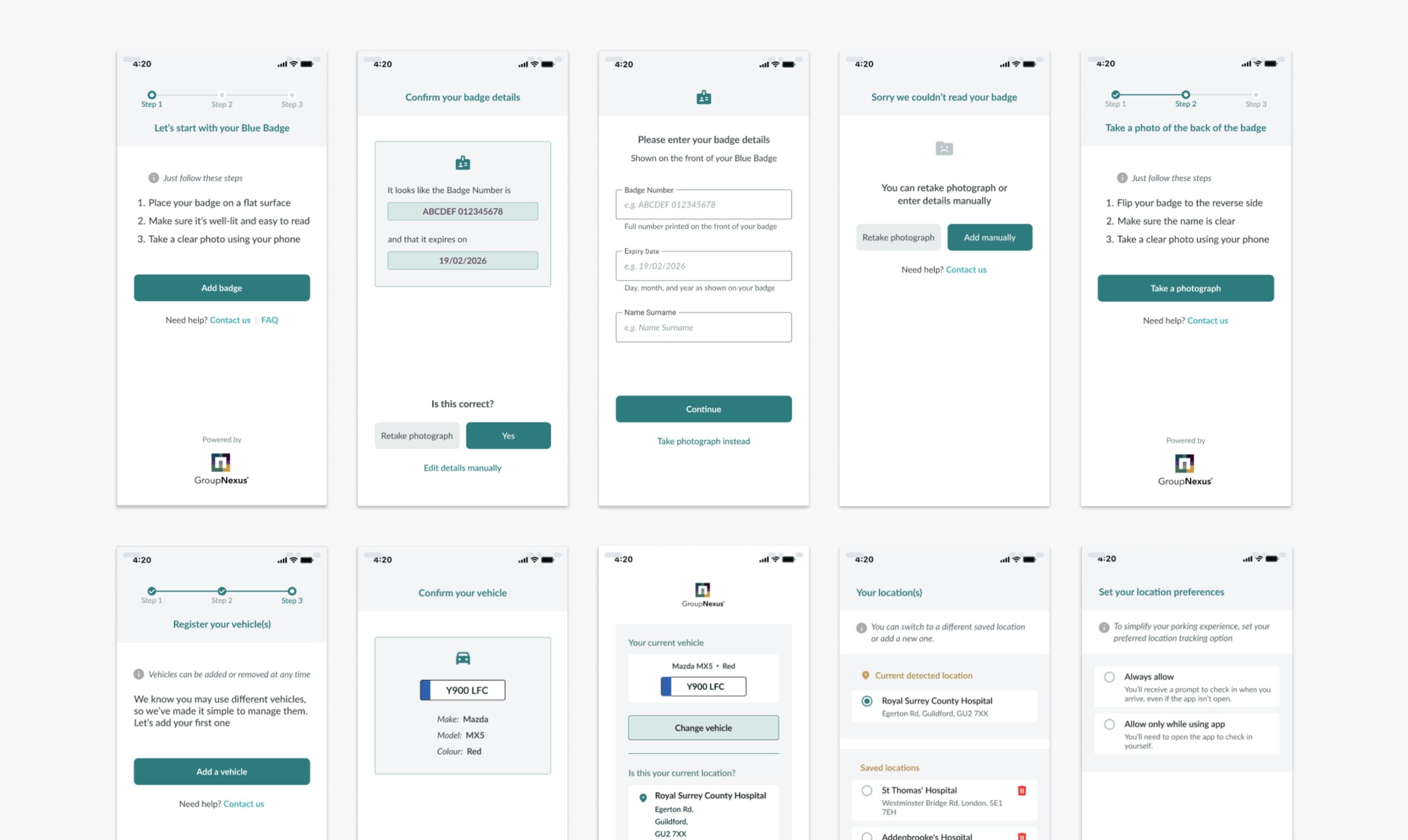
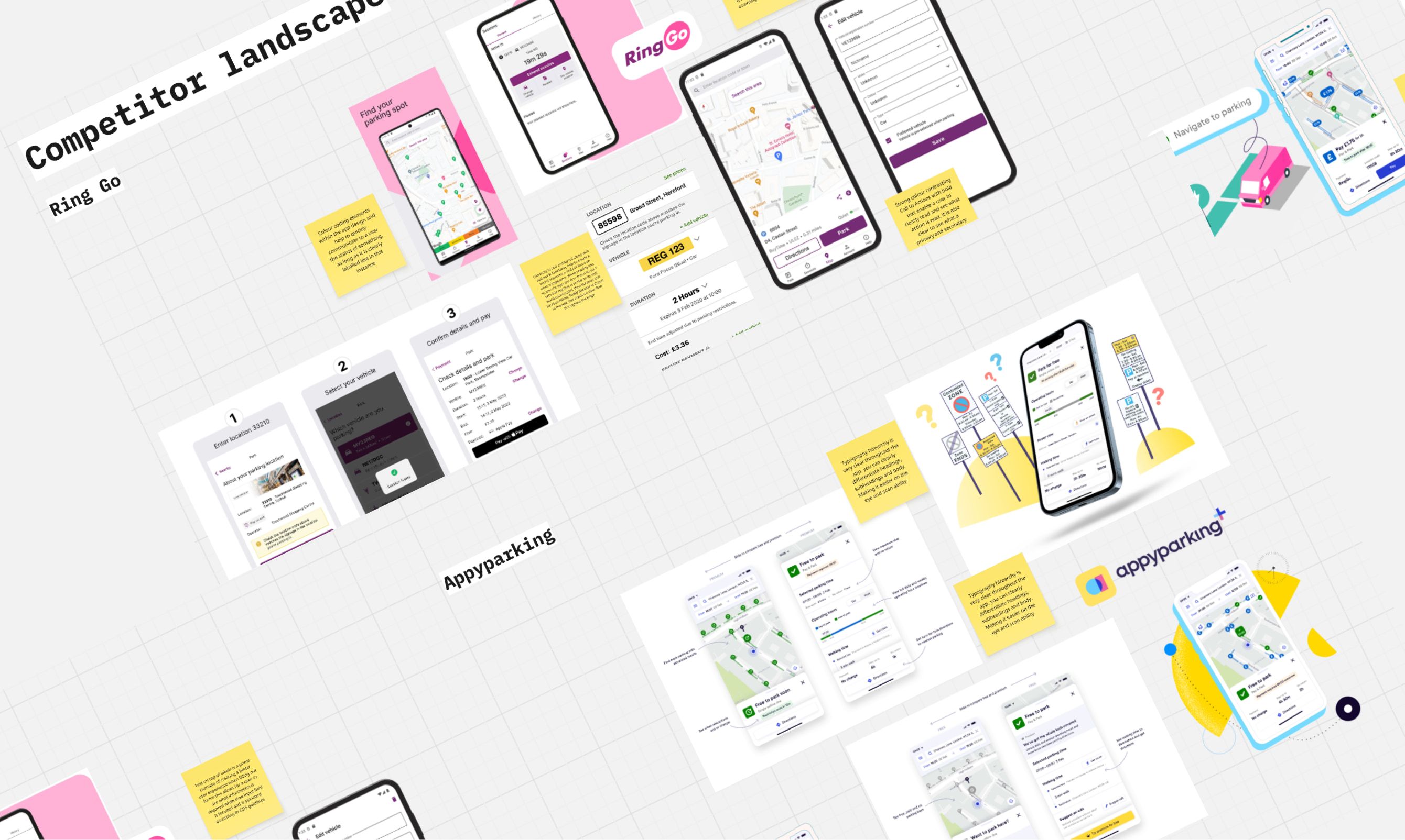
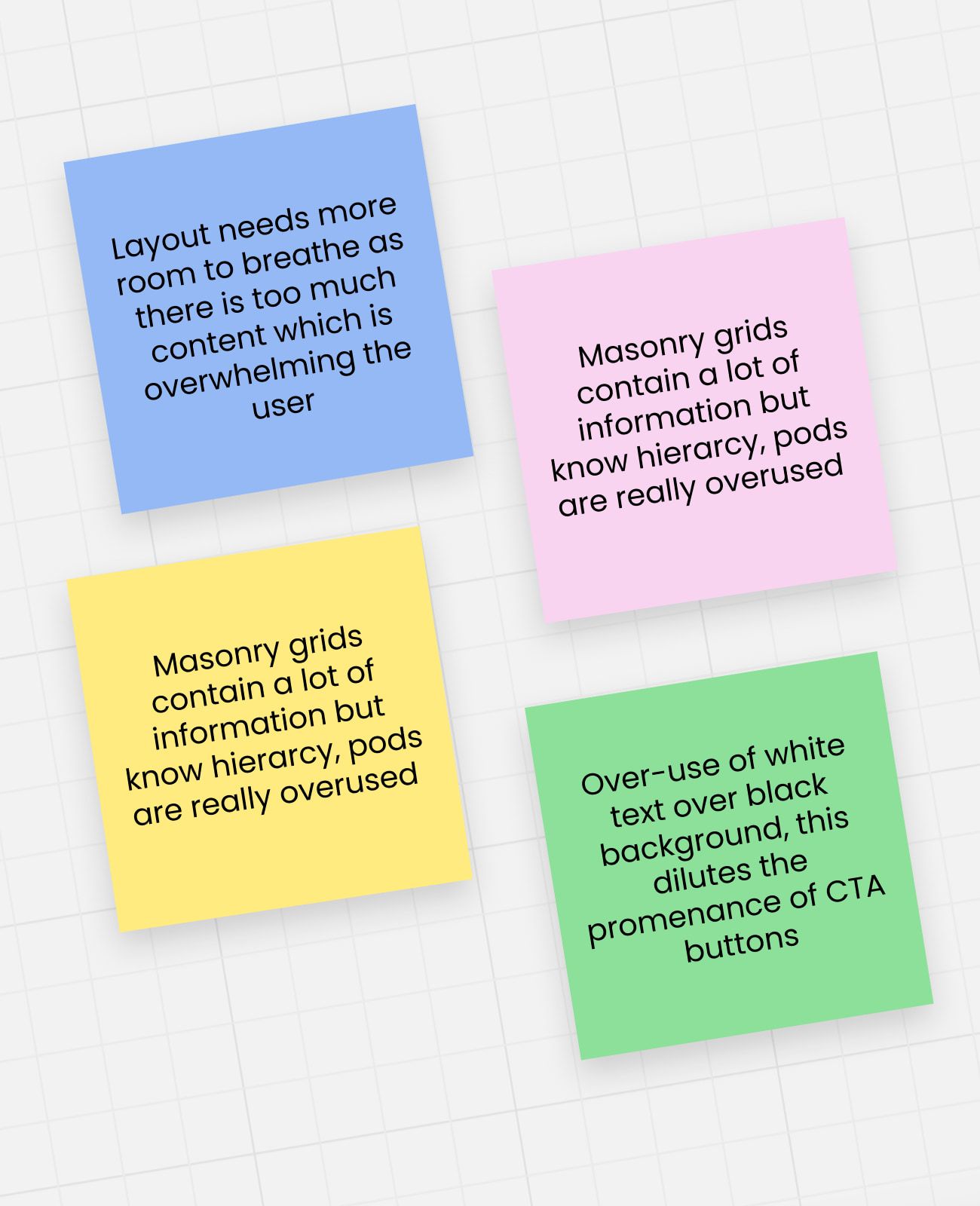
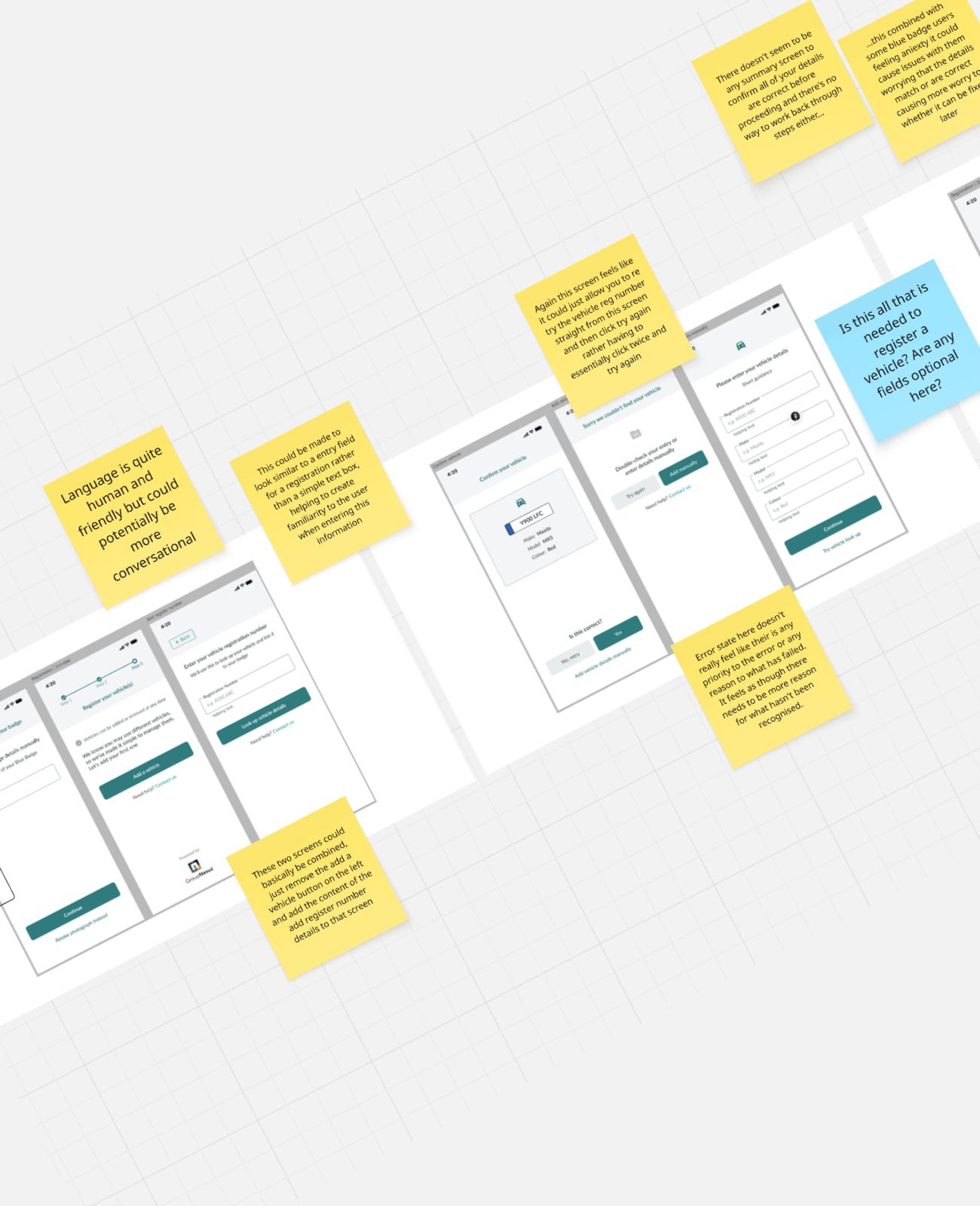
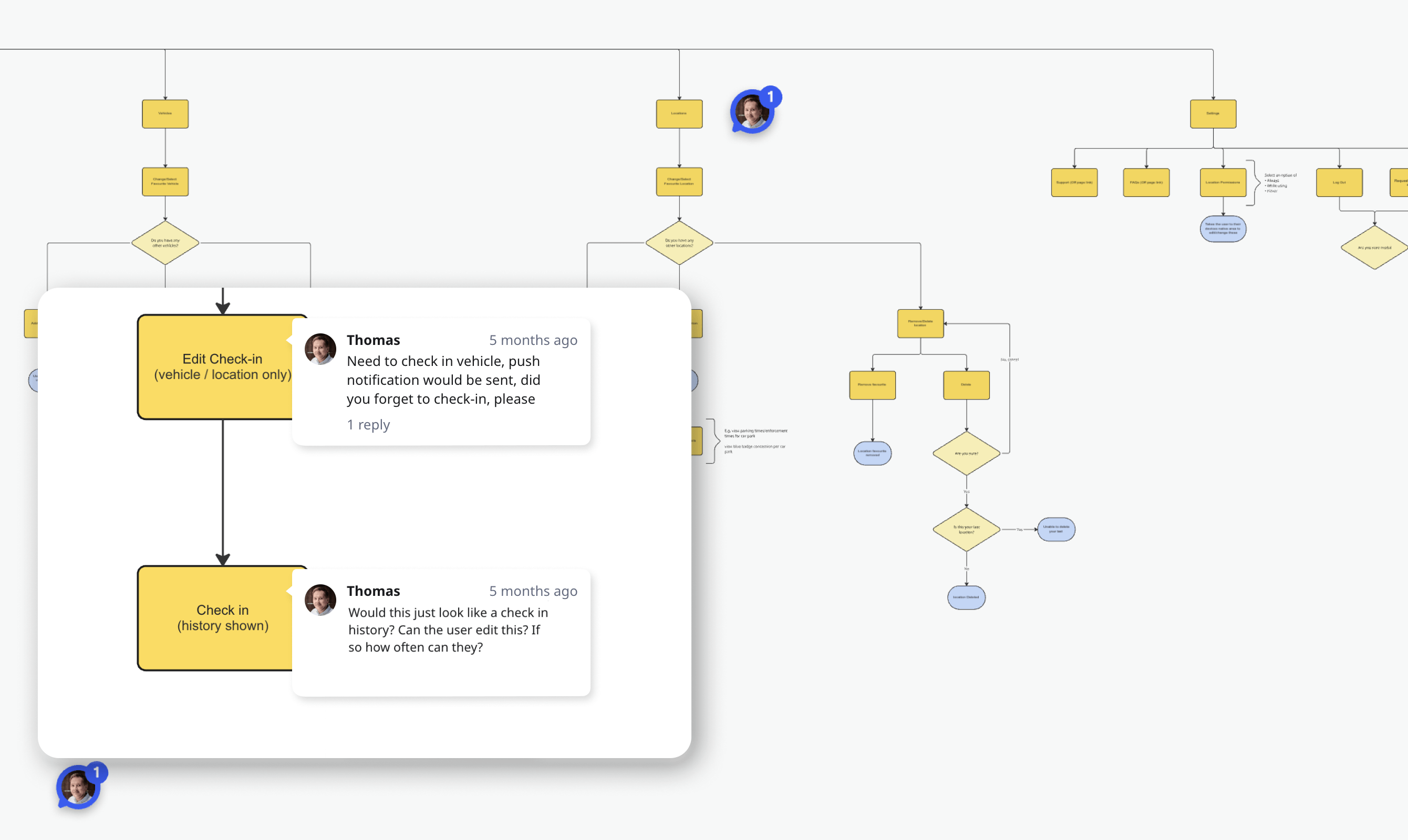
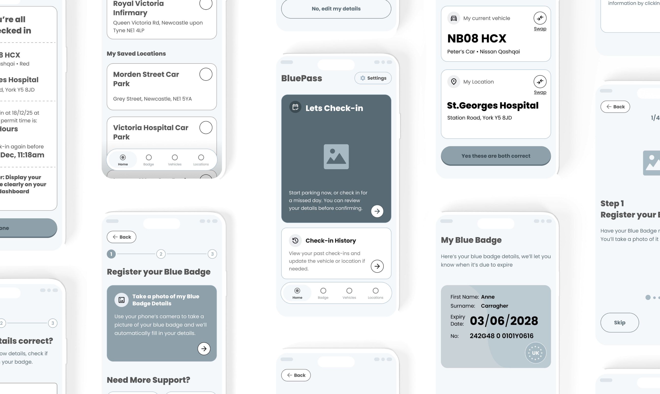
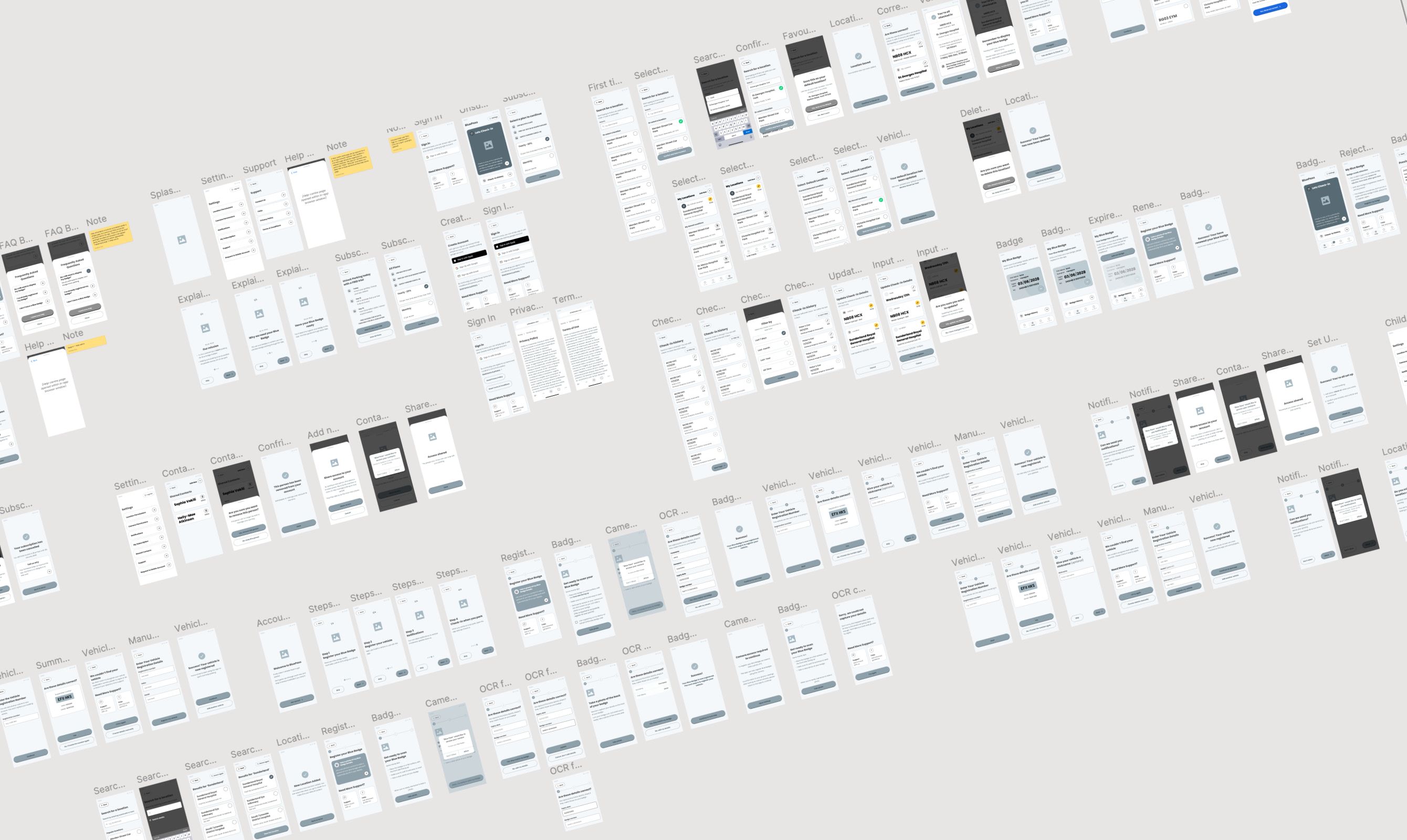
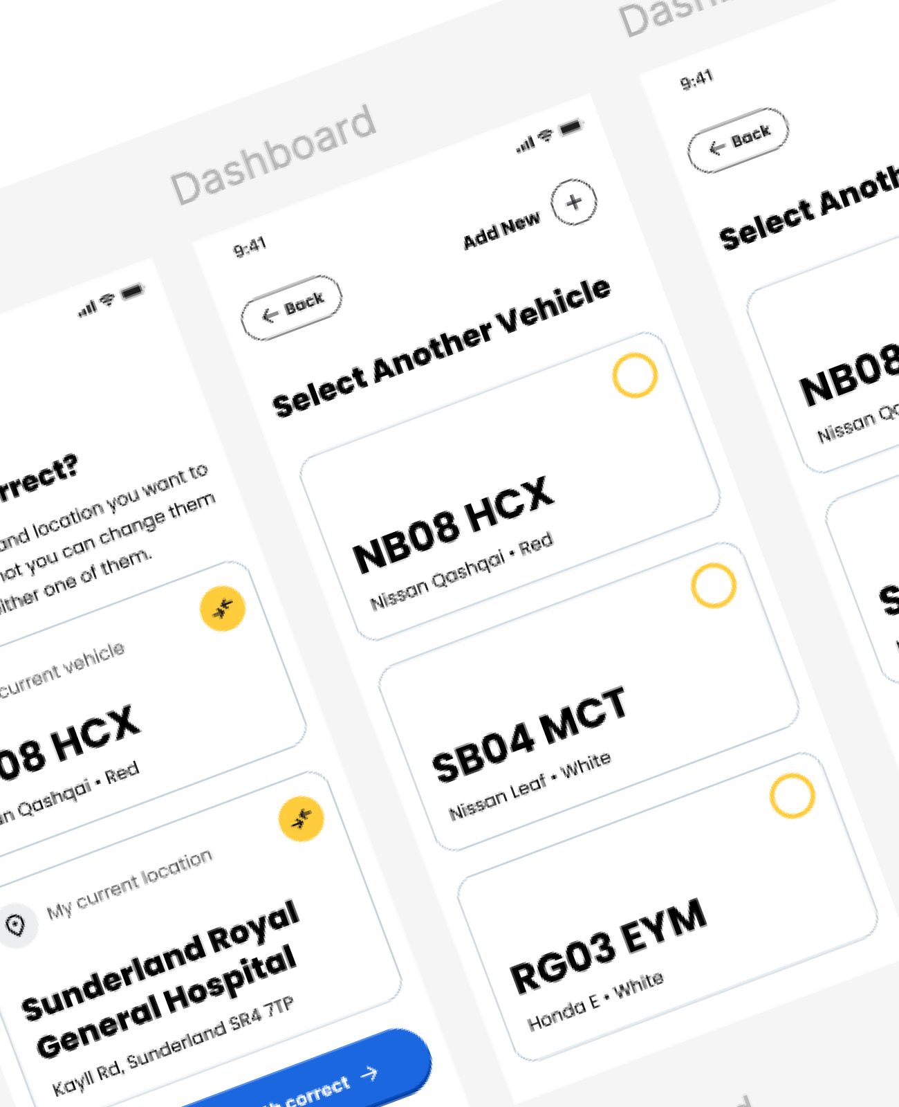
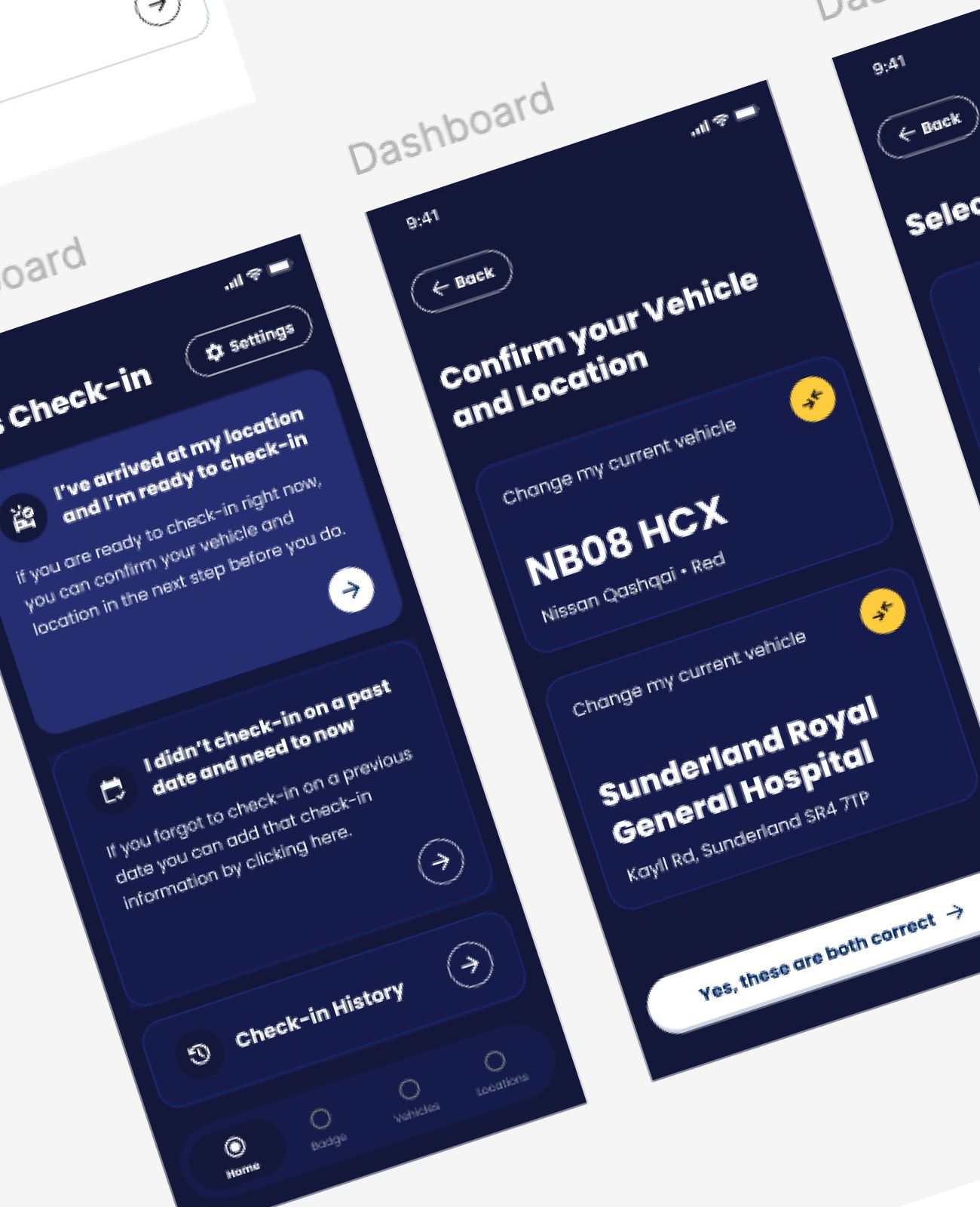
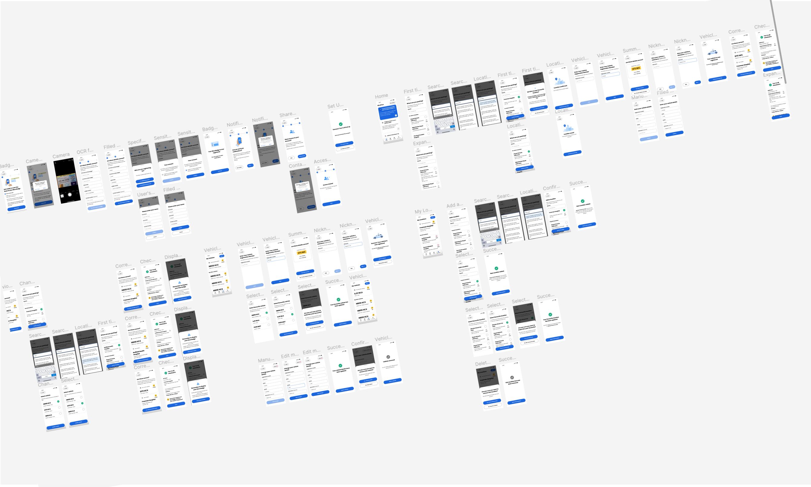
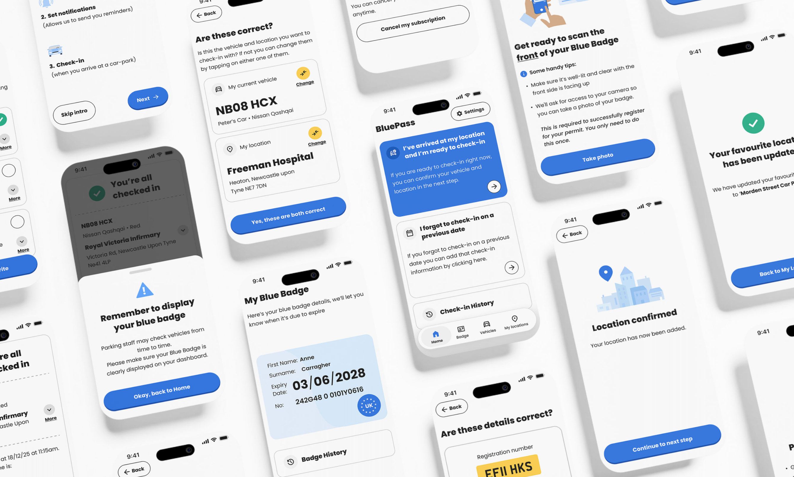
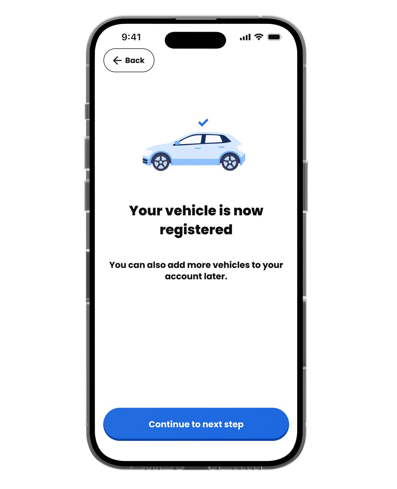
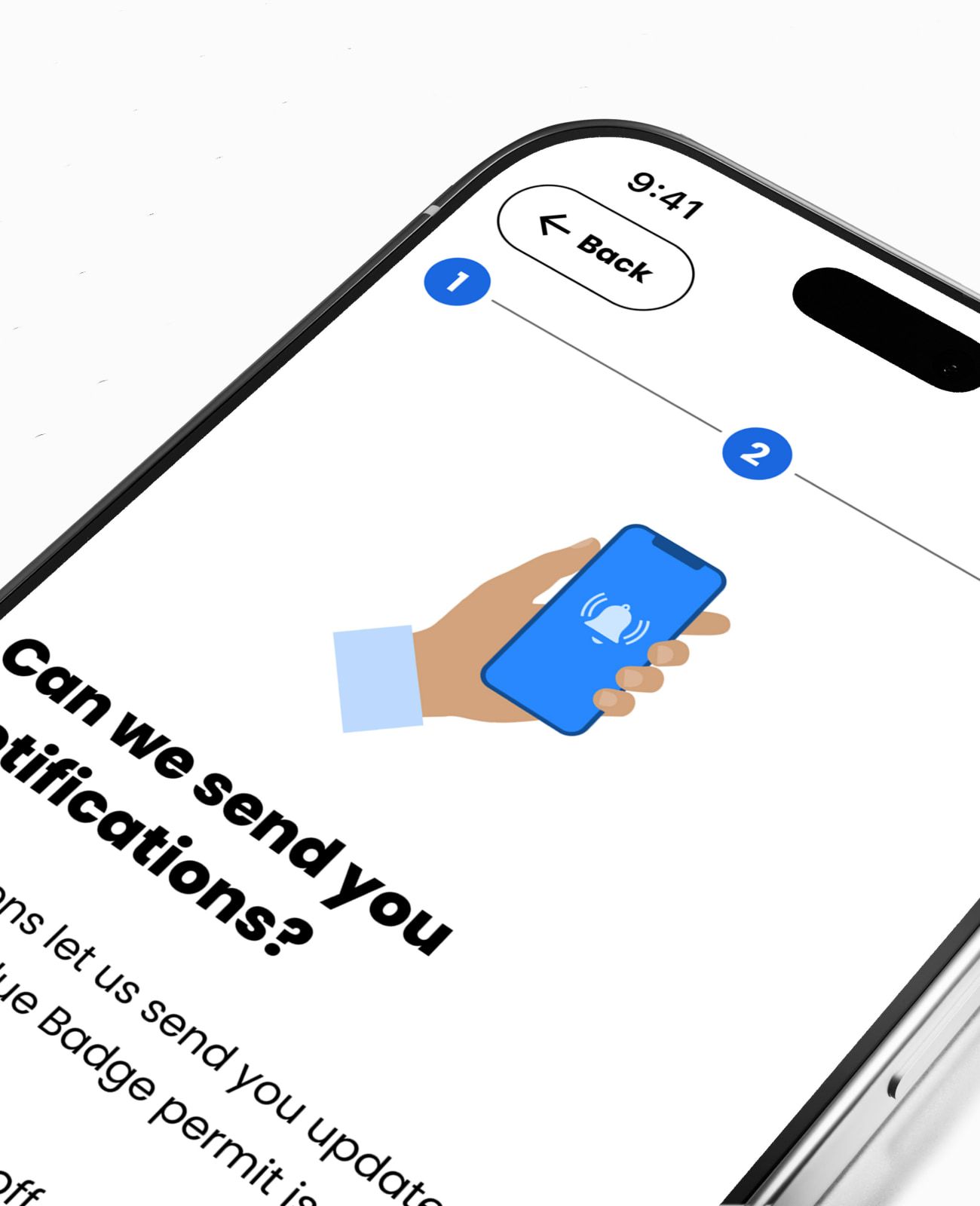
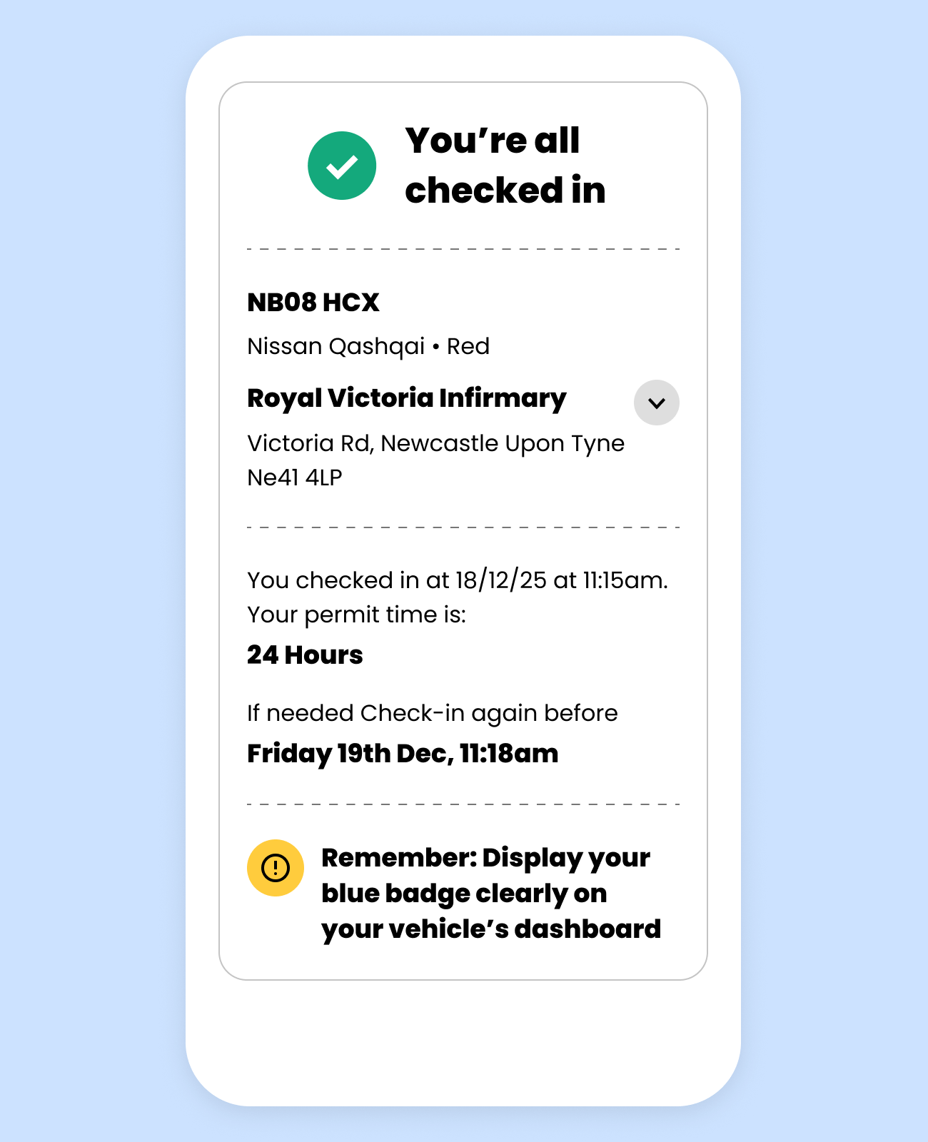
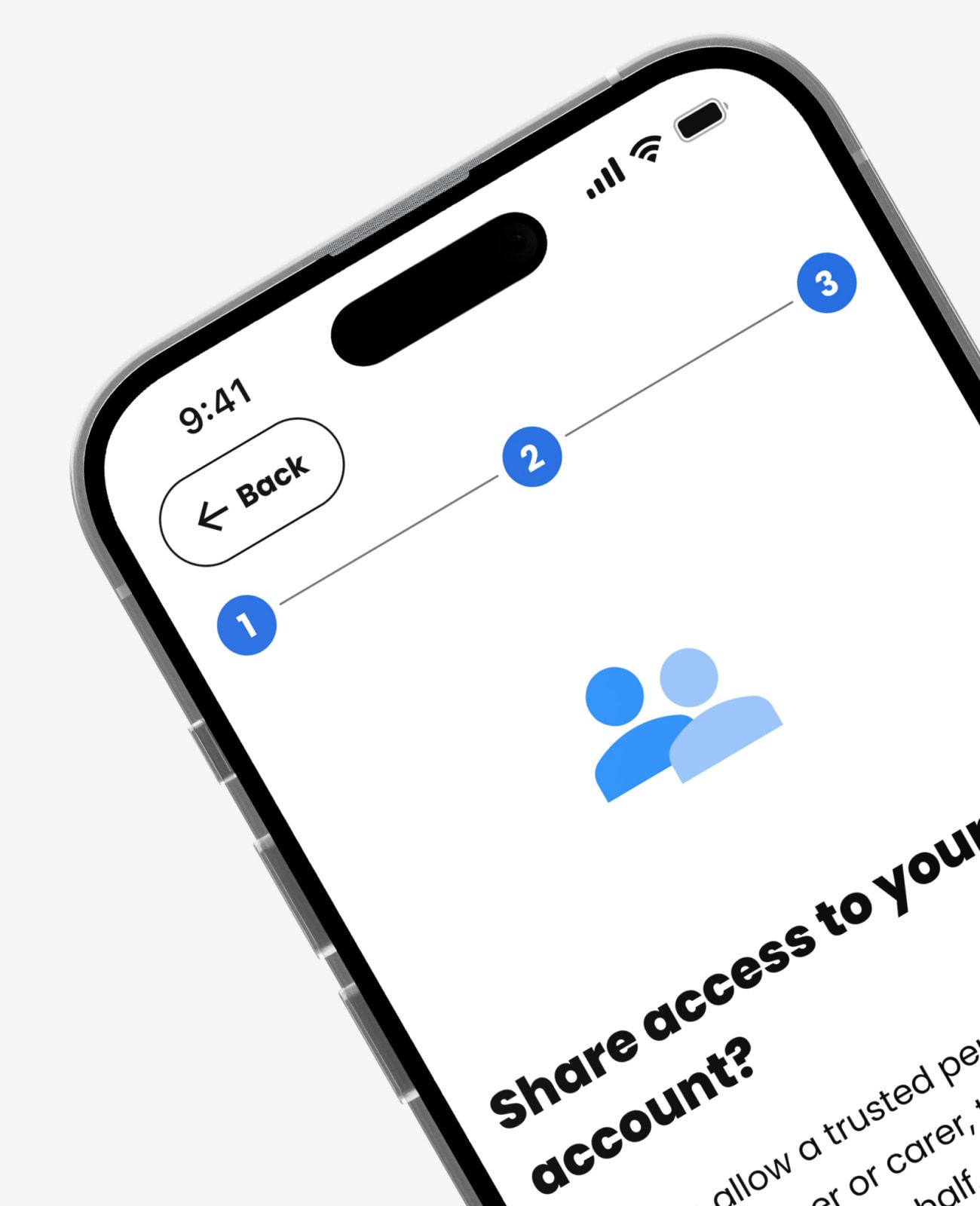
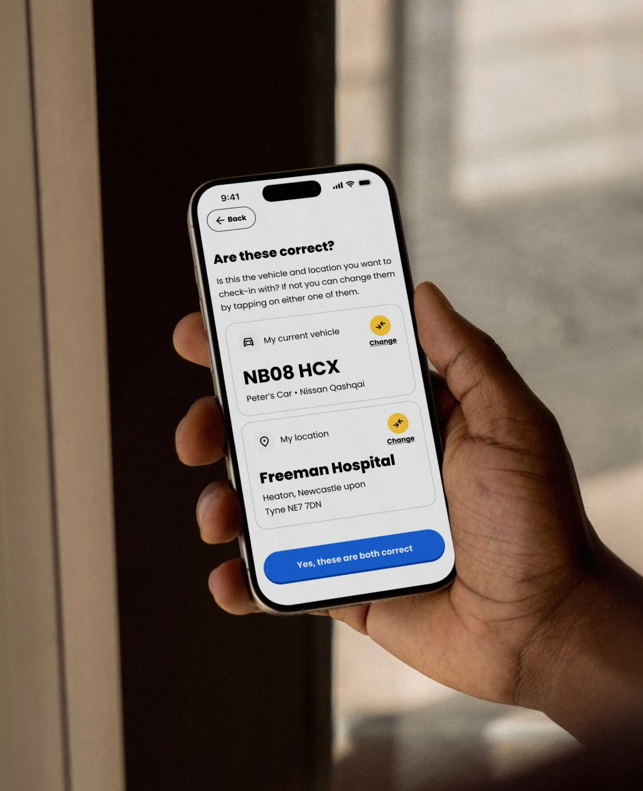
We started by auditing everything that existed, screen by screen, mapping where the journey broke, where it excluded people, and what was missing. Then we redesigned the core journeys: registering a badge, adding a vehicle, choosing a location, and checking in. We also built the flows the first version had skipped but a real launch needs, like checking in after the event, keeping a check-in history so a user can contest an unfair fine, and prompting people to renew a badge before it lapses.
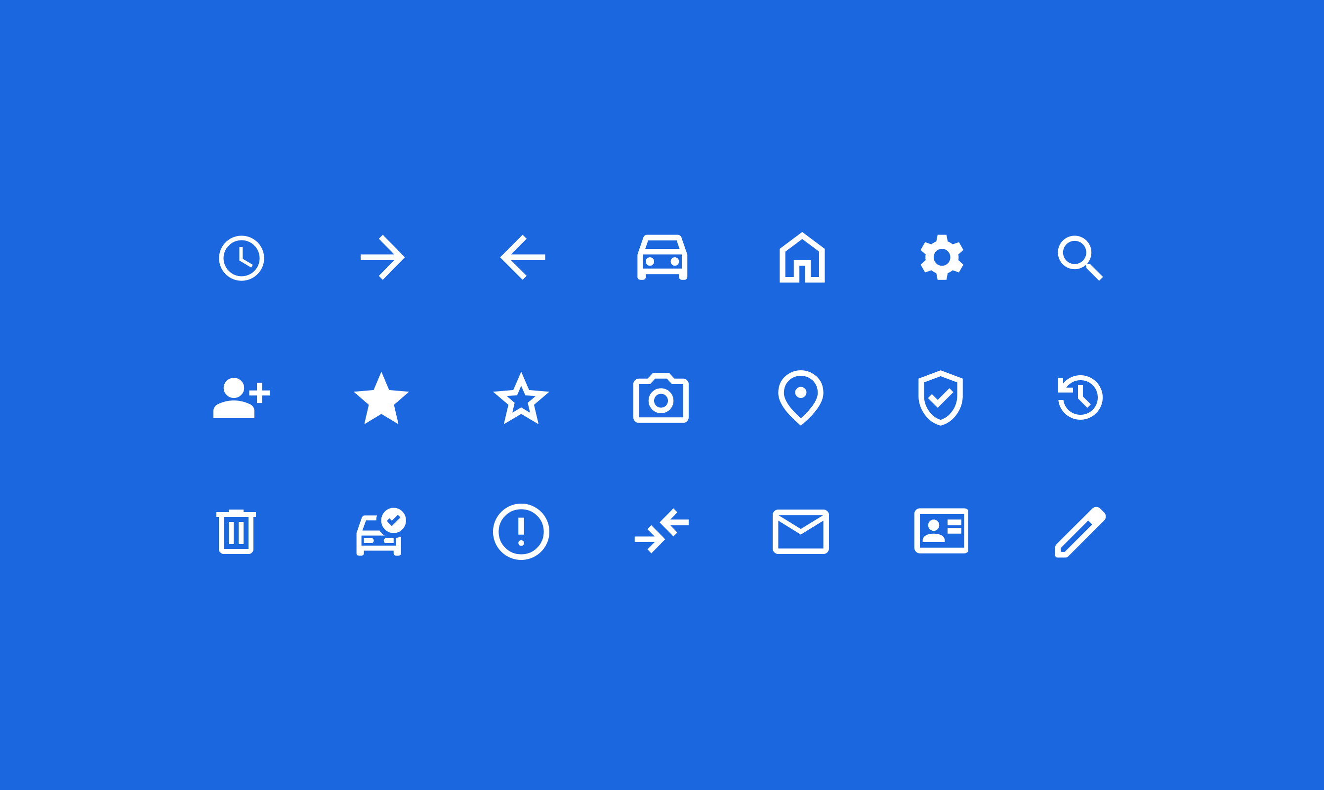
Accessibility led every decision: colour and contrast that meet WCAG 2.2, type and touch targets sized for real hands, plain-English wording, and a clear visual hierarchy. We handed it over as a Figma component library with an annotated, developer-ready file, so nothing was left to guesswork on the build.


Designed for the people who use it
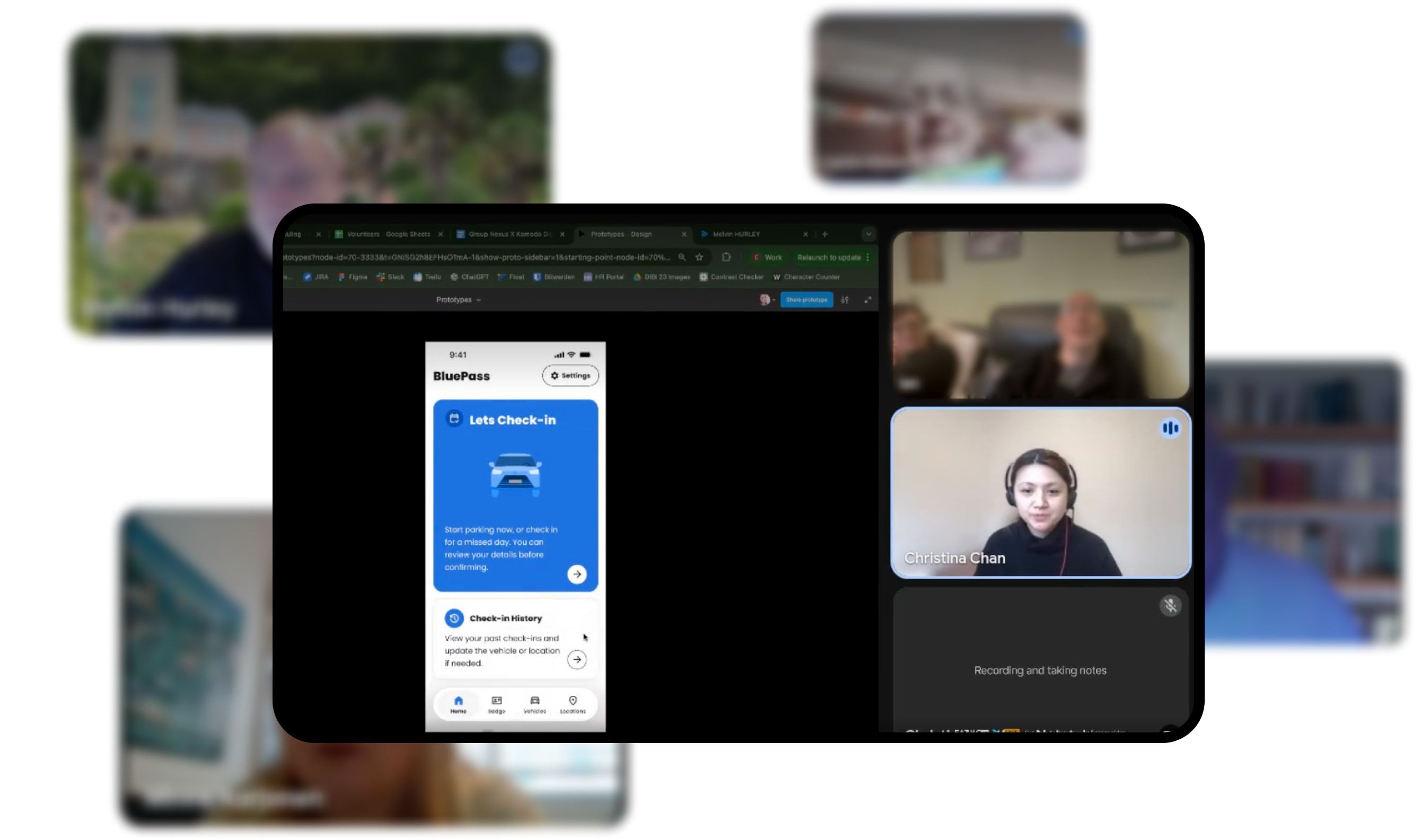
The part that matters most on a project like this is not the screens, it is who you test them with. We ran moderated usability sessions with real Blue Badge holders on the journeys that count, watched where people hesitated, and fed what we learned straight back into the design.
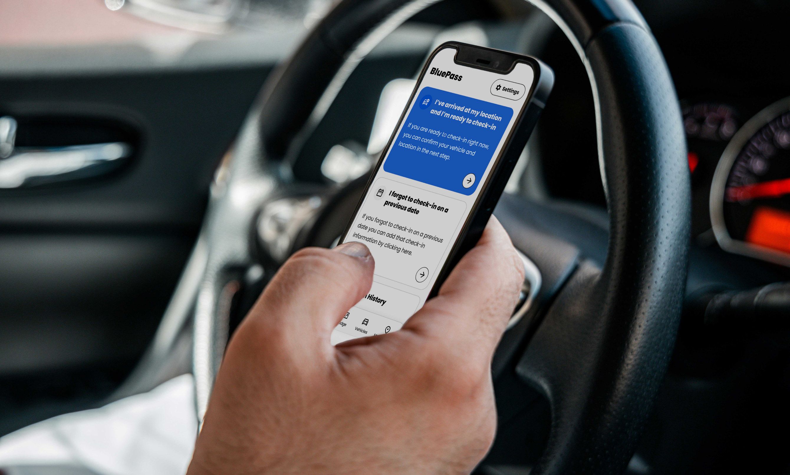
That is how you make something properly usable for a very wide range of people, rather than assuming. The aim throughout was simple: take a stressful, easily-got-wrong moment, parking at a hospital, and make it easy instead.
Accessibility first
Rebuilt to WCAG 2.2, replacing colour and contrast that failed the standard and shut some users out.
The missing flows
Created the launch-critical journeys the first version skipped: retrospective check-in, check-in history to contest fines, and badge-renewal reminders.
Tested with real users
Validated the core journeys in moderated sessions with real Blue Badge holders, then built the findings back in.
A Blue Badge app has to work for everyone, including the people the first design had quietly left out. We rebuilt it around accessibility, then did the thing too many teams skip and tested it with the actual people who rely on it. Getting that right, for a moment as stressful as parking at a hospital, is exactly the work we care about.