Understandingthe challenge
Industry
- Recruitment & search
- Insurtech
Platform
- Web
- Brand
Services
- Brand strategy
- Brand identity
- Art direction
- Web design
- Web build
FinPro place senior leaders into some of the fastest-growing companies in Insurtech. They have a strong record behind them: five years of retained searches, founders who back their own advice, and a podcast the industry actually listens to. None of it came across online.
Their old site looked like a generic recruiter, the kind of stock-photo, safe-blue template they are the opposite of. Worse, it was broken. They had been locked out of the back end for months and could not even publish a podcast episode. For a firm pitching at CEO and COO level, the brand was quietly working against them.
They wanted something that looked like them: sharp, direct, no cliches, closer to a modern venture firm than a recruitment agency. And they needed room to launch a new service line without diluting the premium search business at the heart of it.
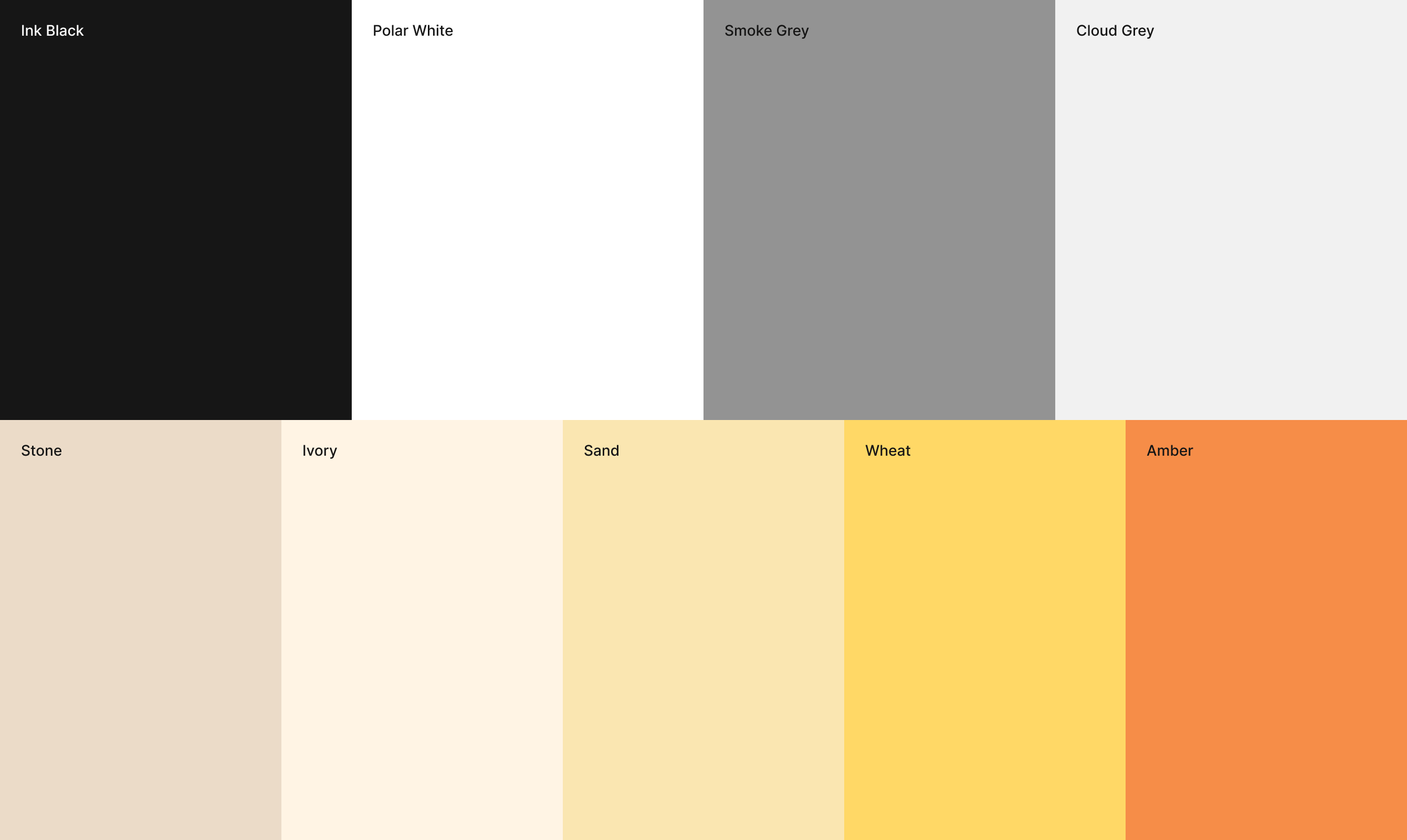

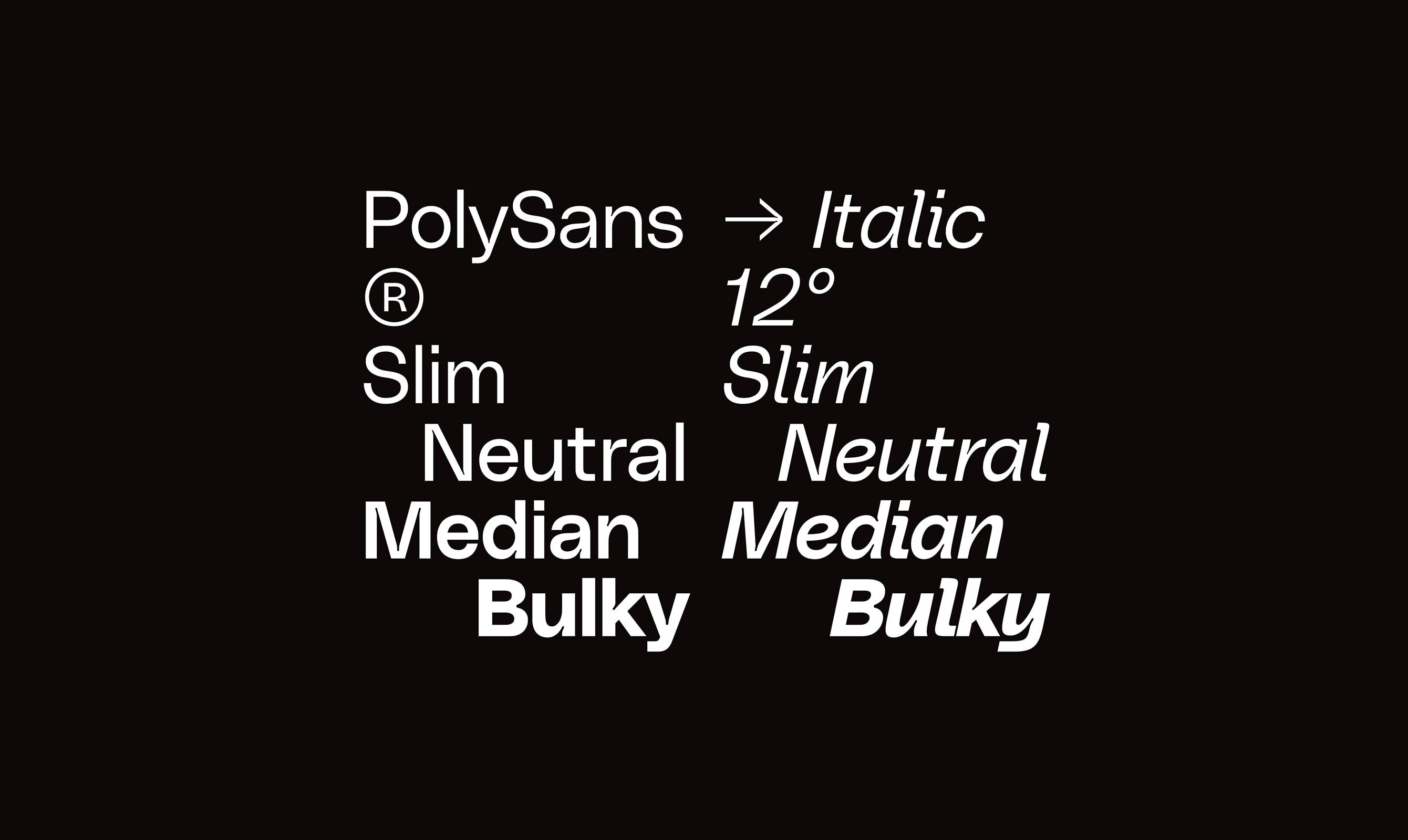
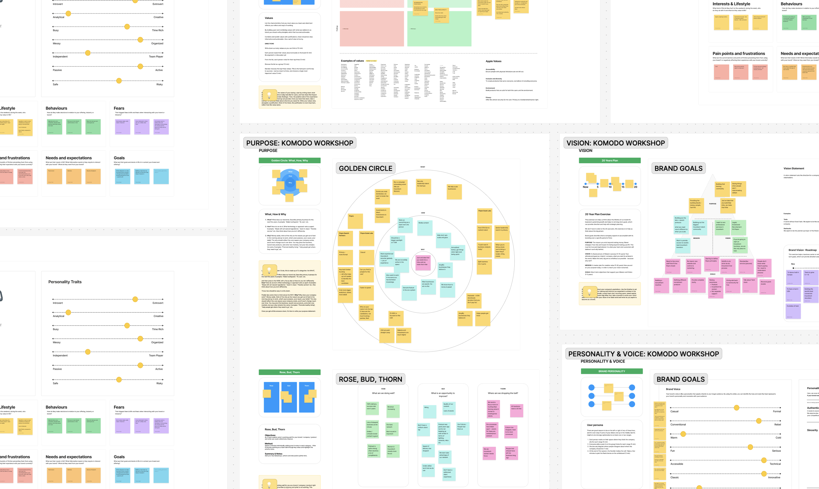
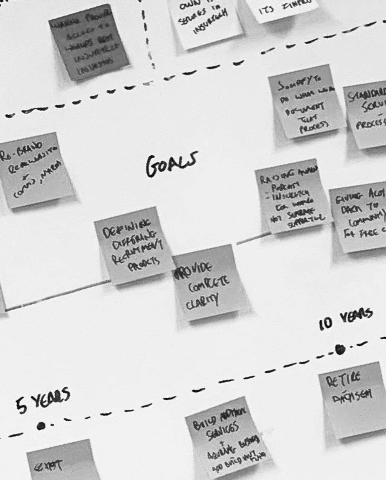
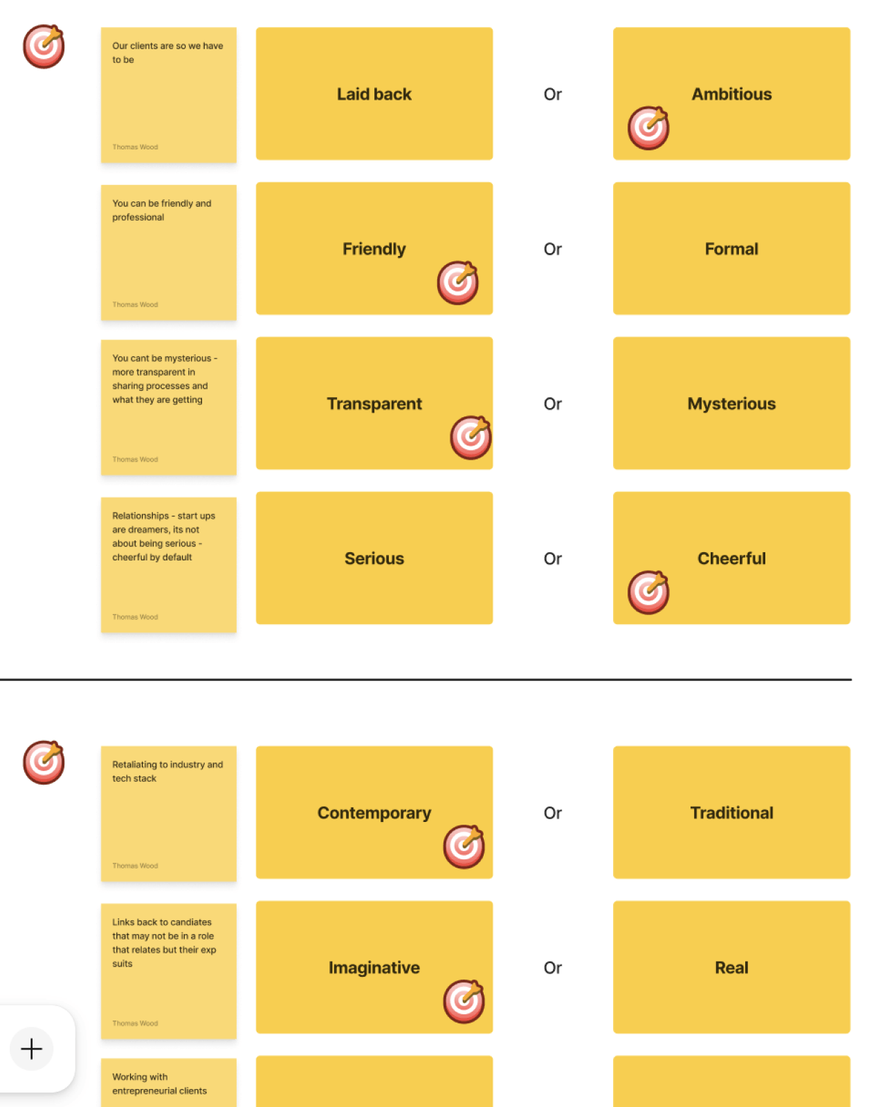
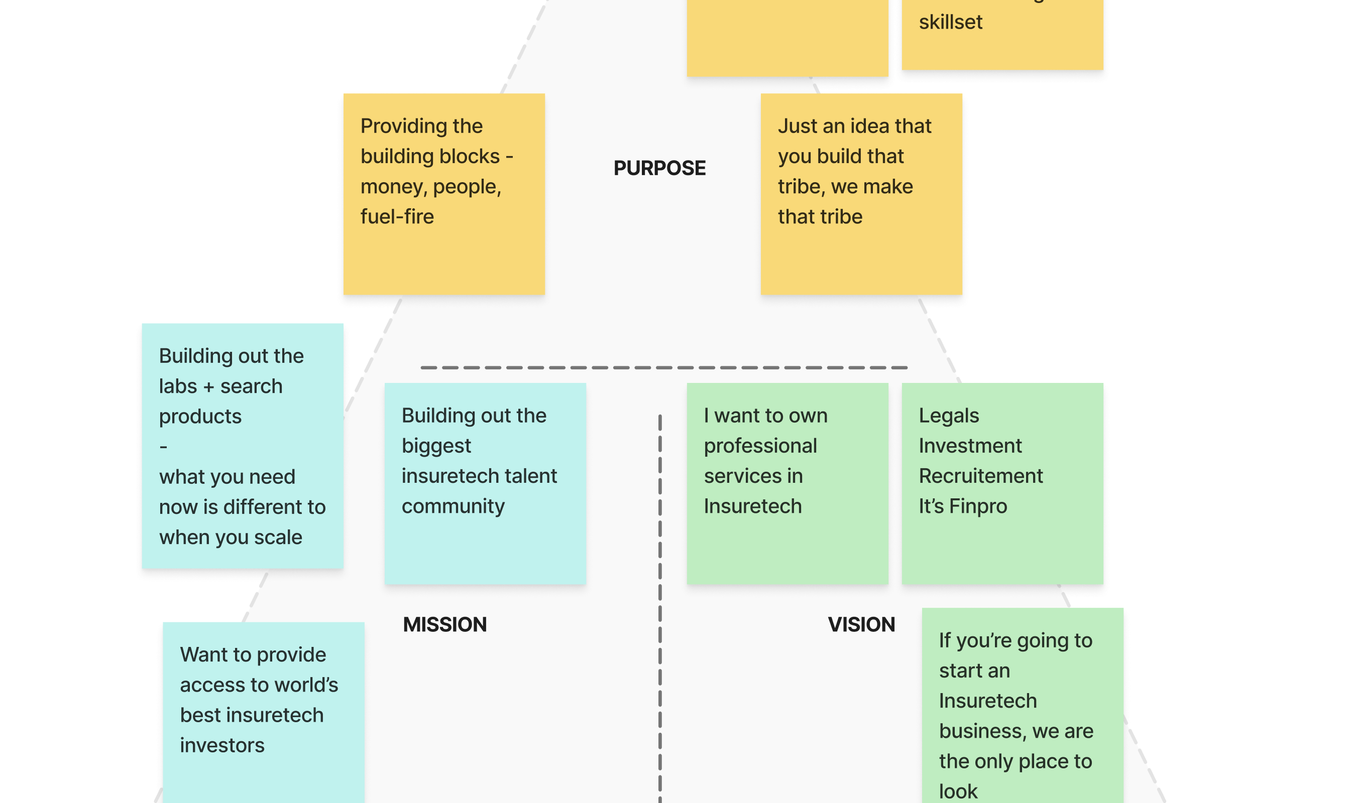
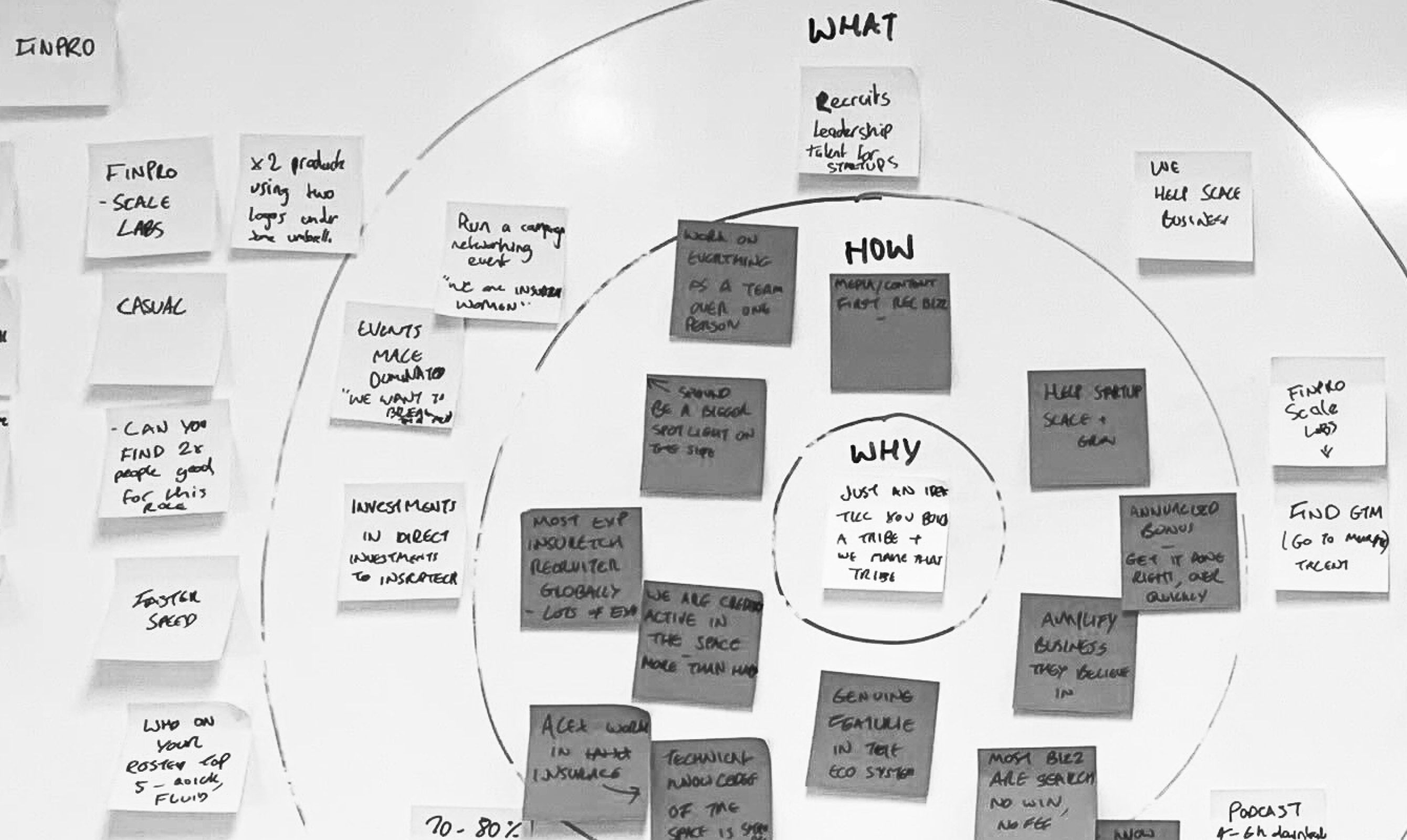
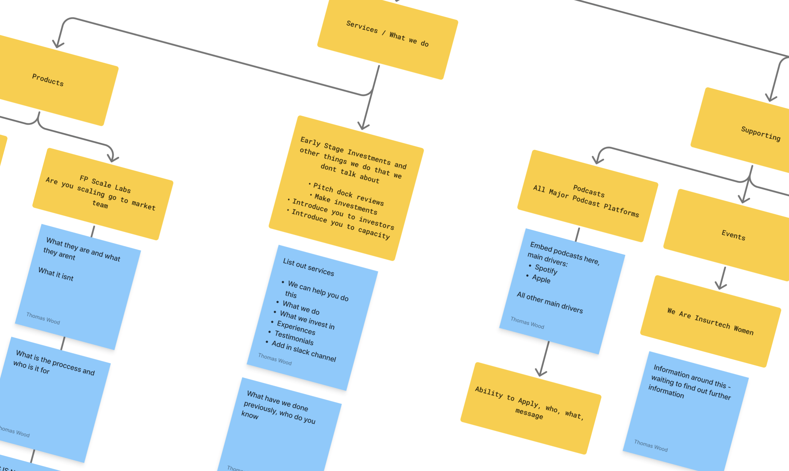
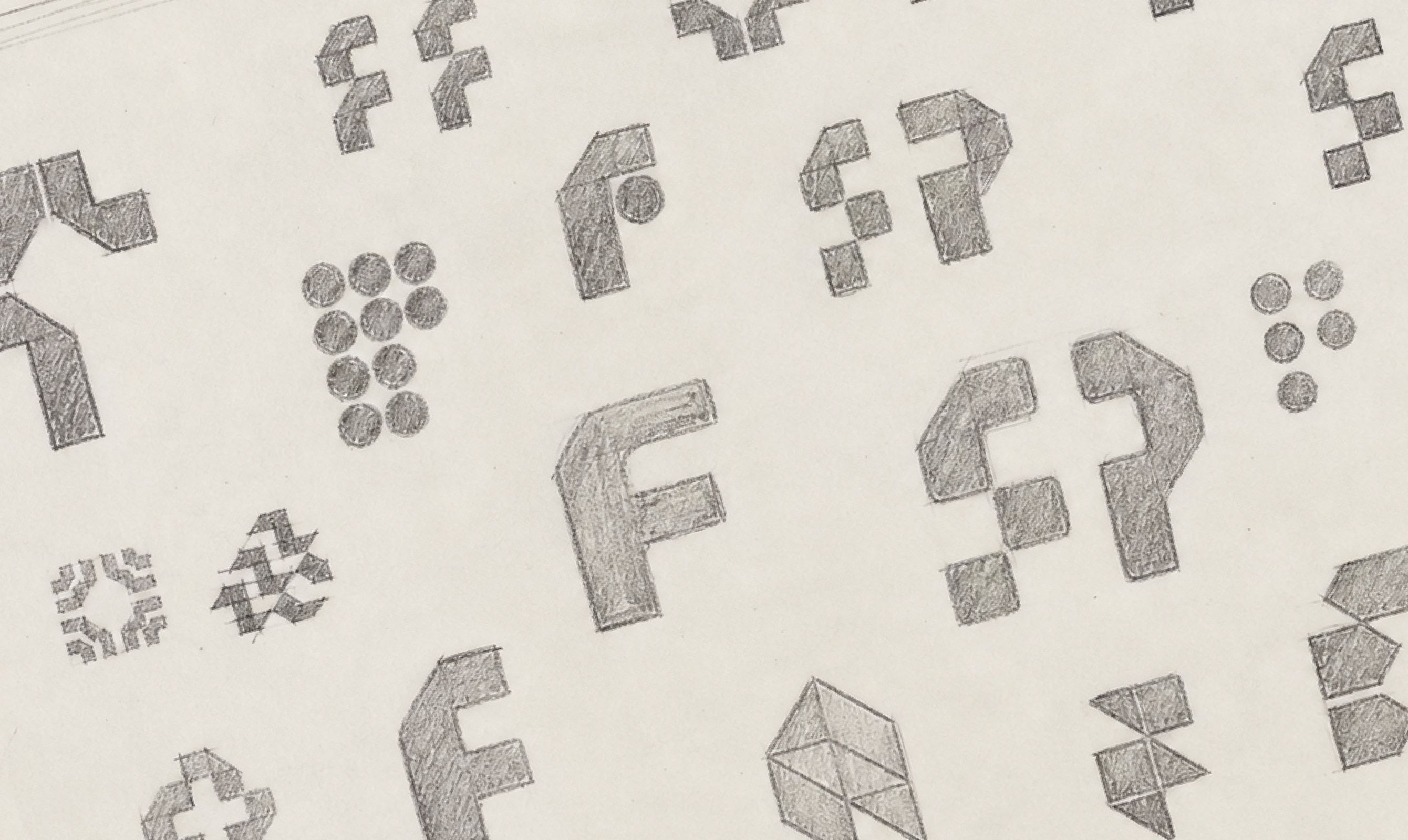
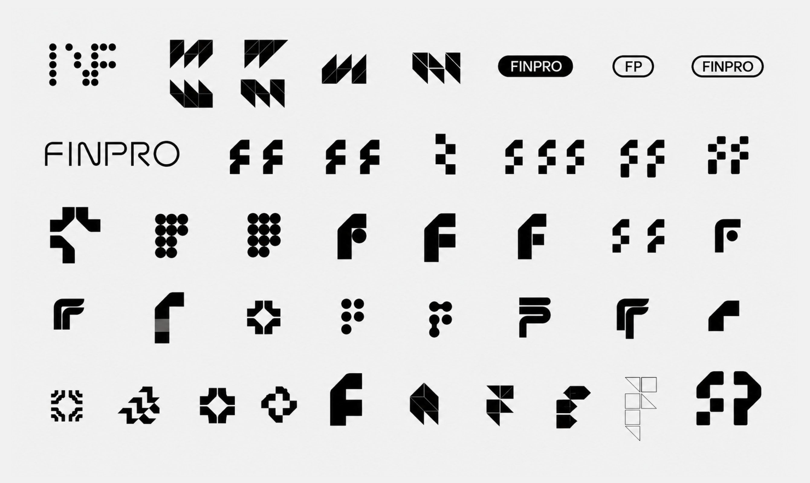
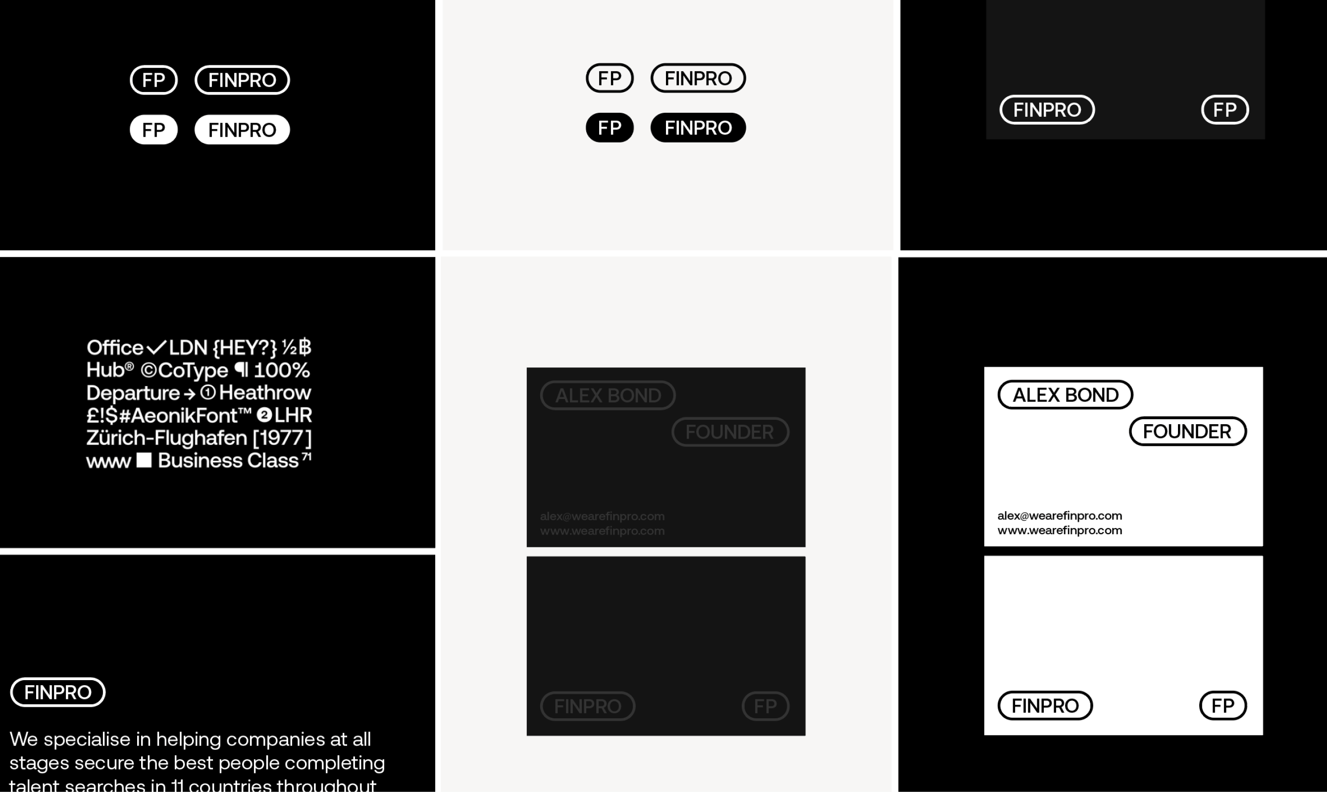
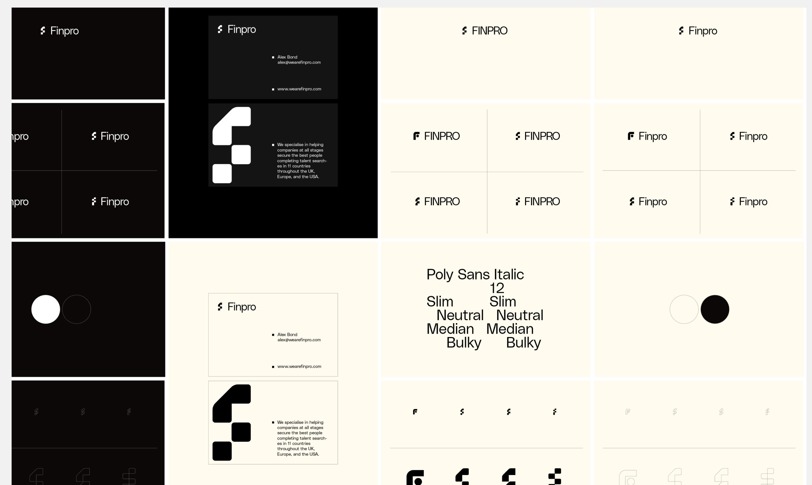
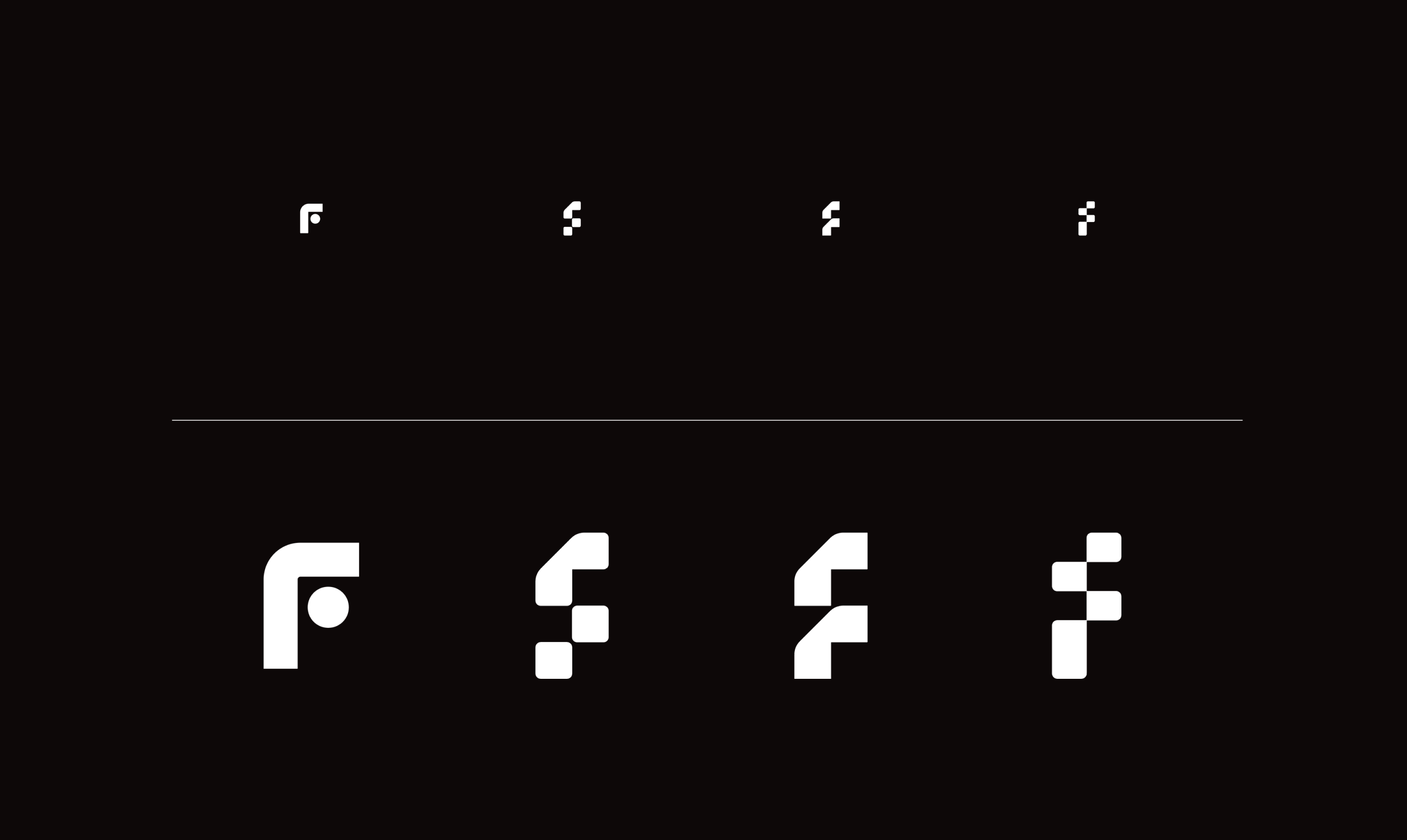
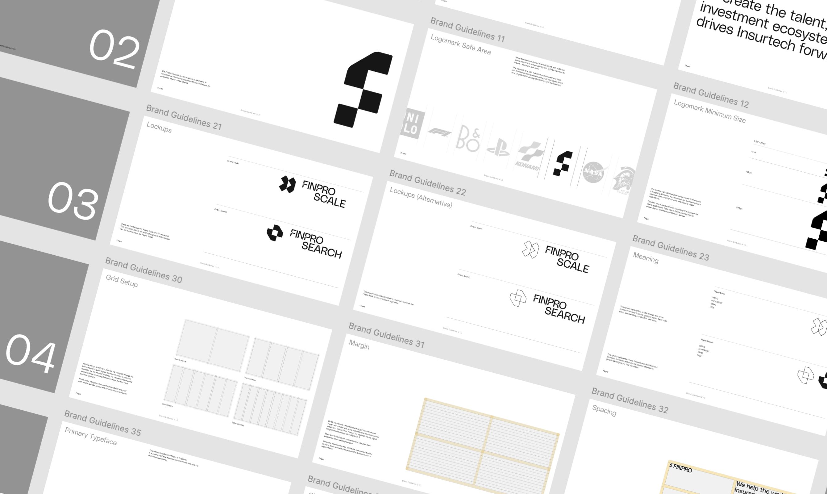
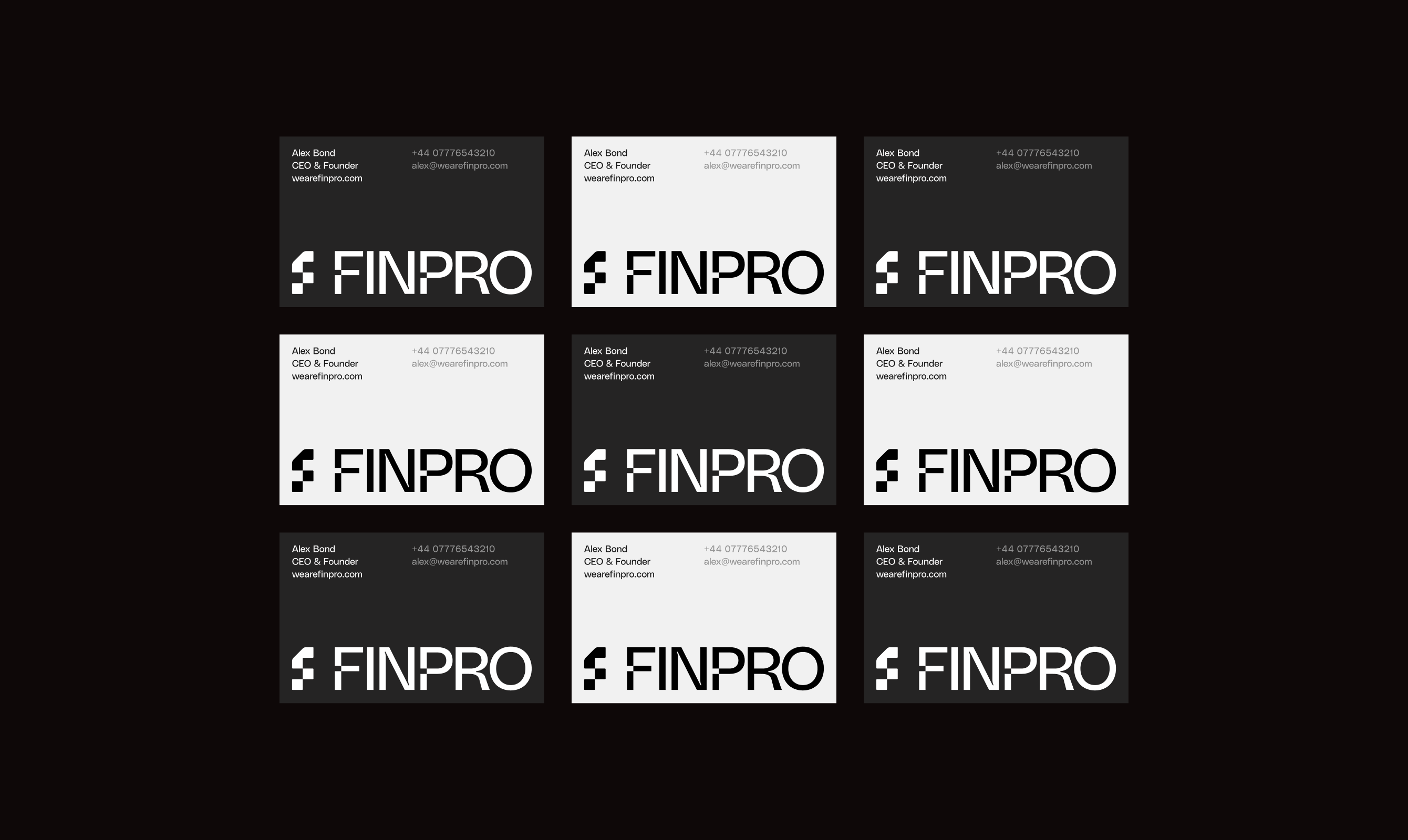
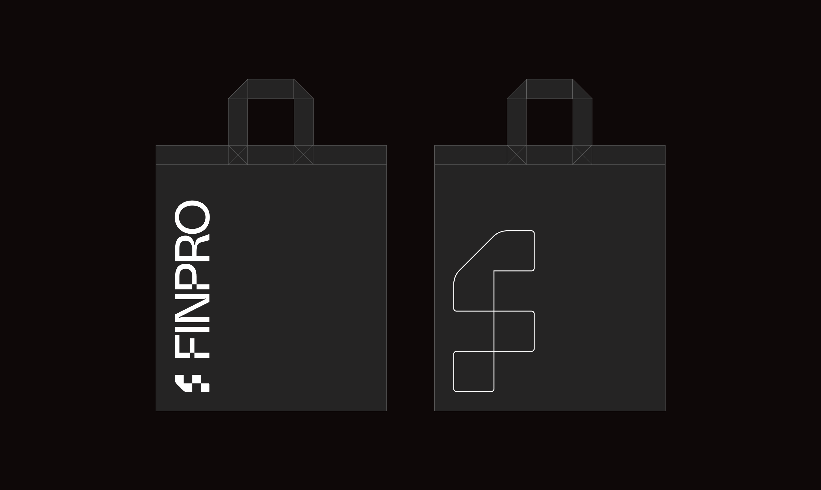
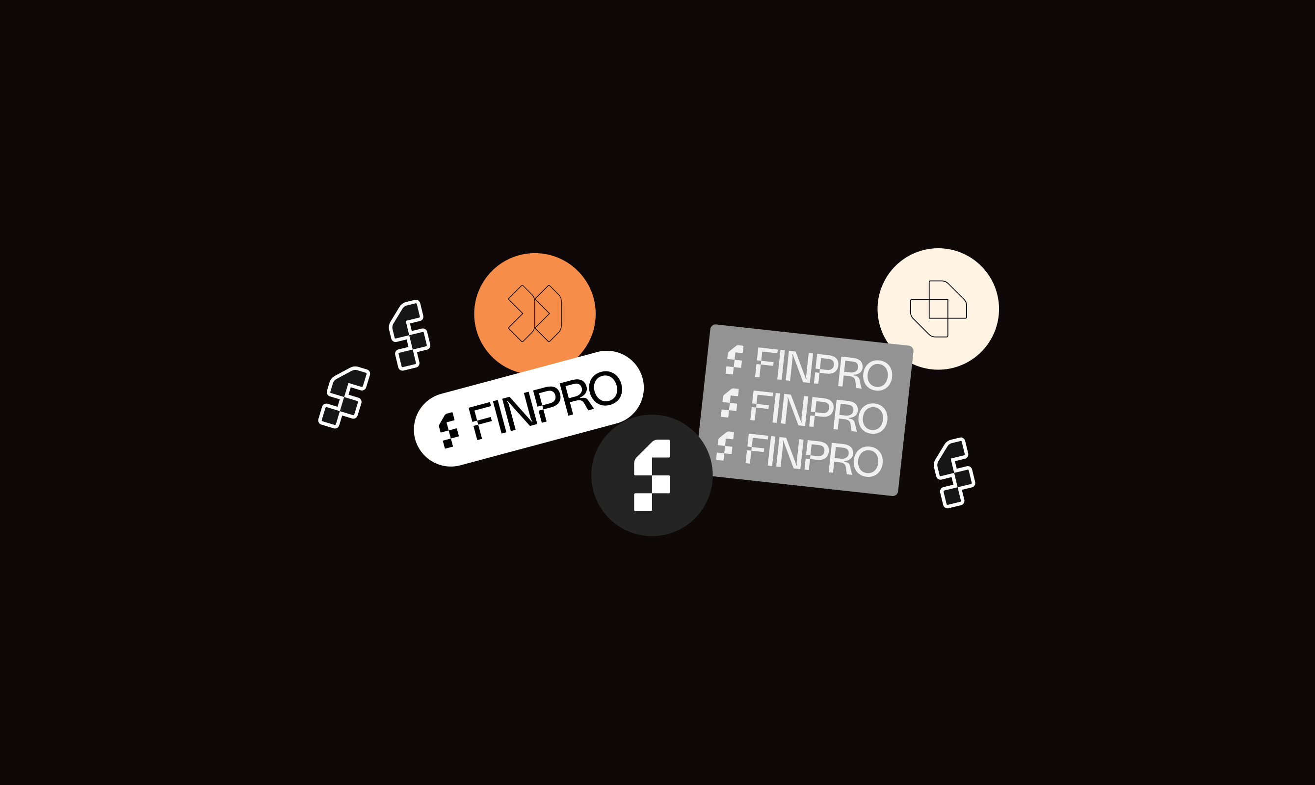
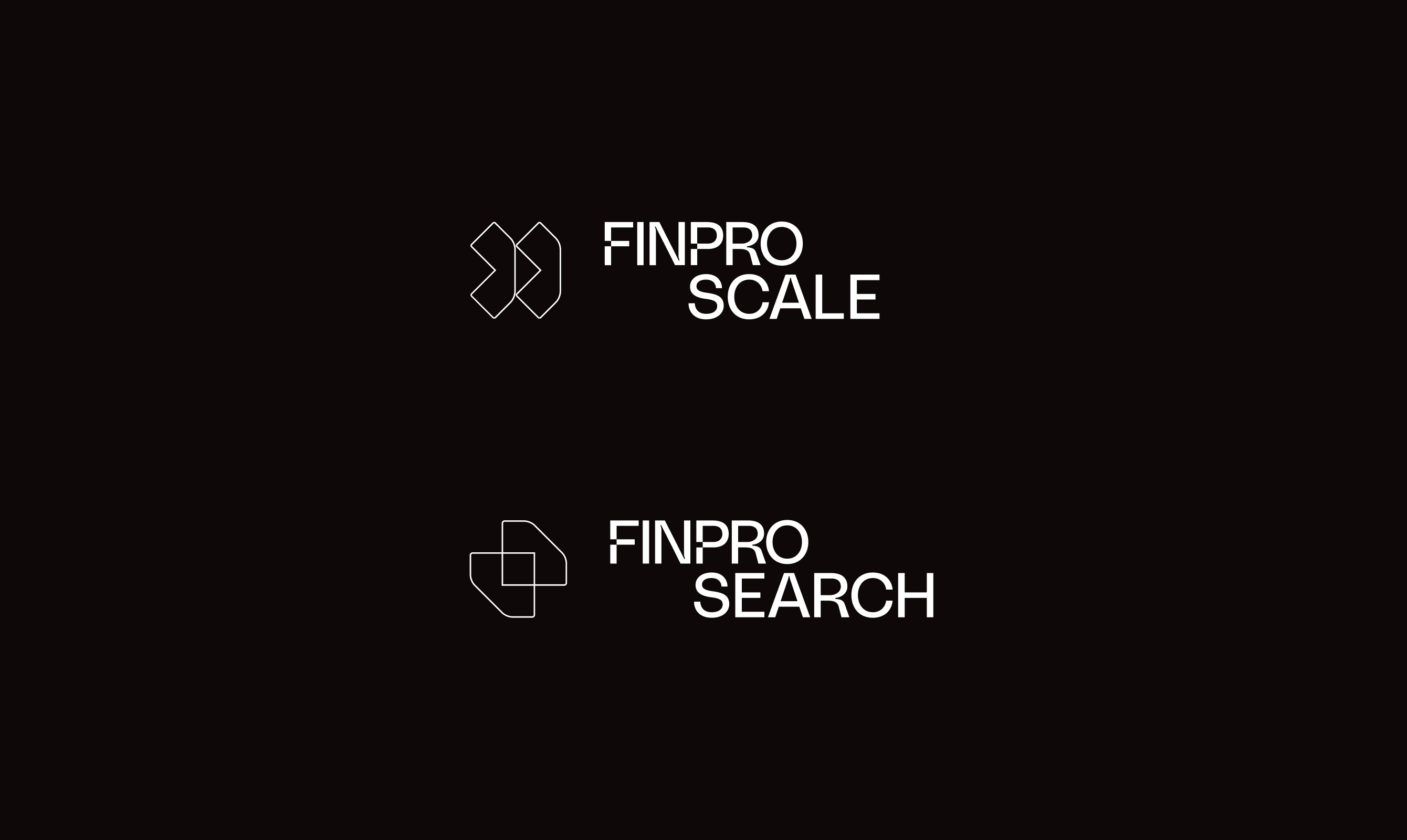
We started the way we start any brand, in a room together. A workshop at our studio to get at what FinPro actually is, who they serve, and the plain-speaking, no-nonsense personality that runs through the whole business. From there we built the identity: a confident, minimal system, the opposite of a stock-photo recruiter, with the sub-brand structure to carry a second service line alongside the core search offer.
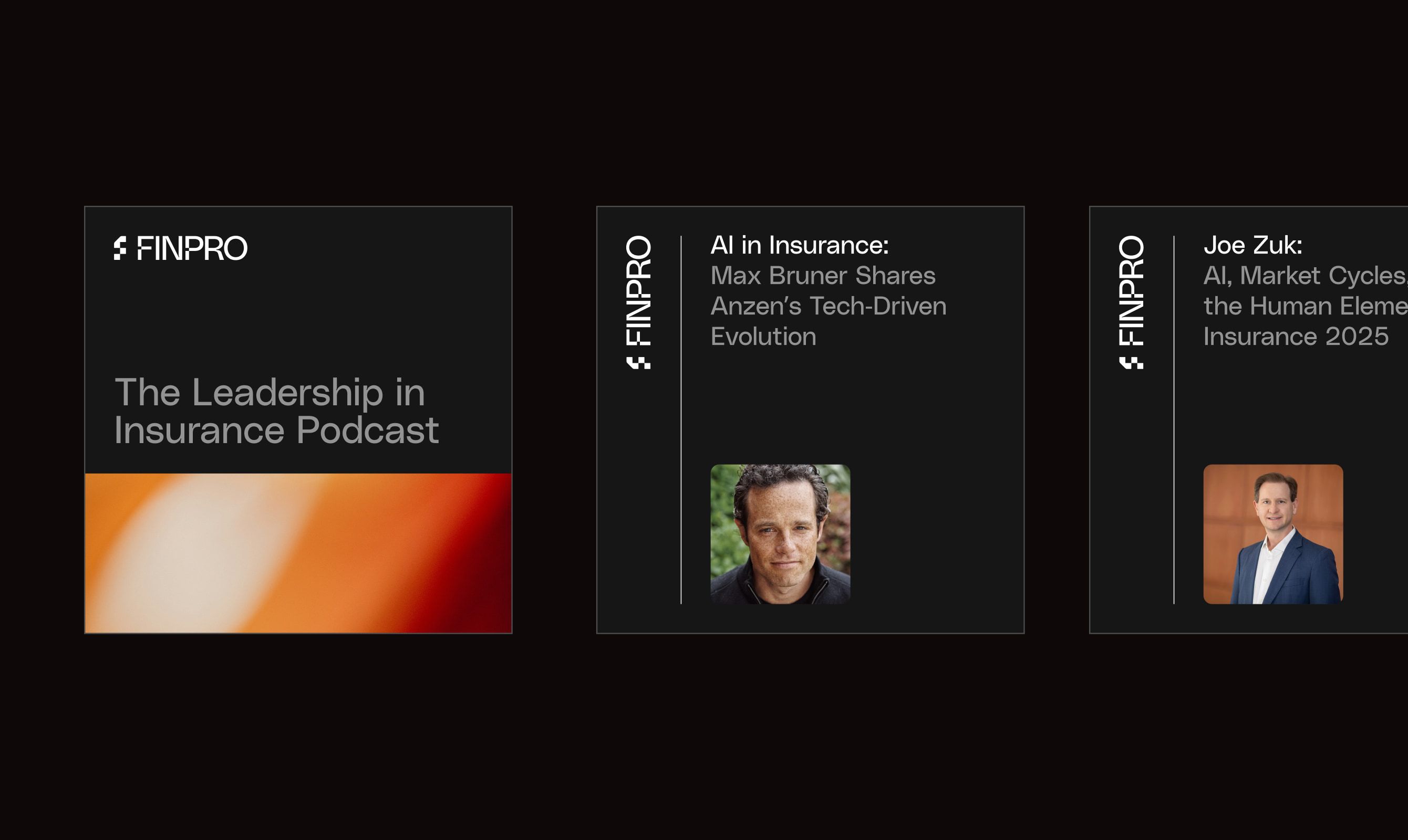
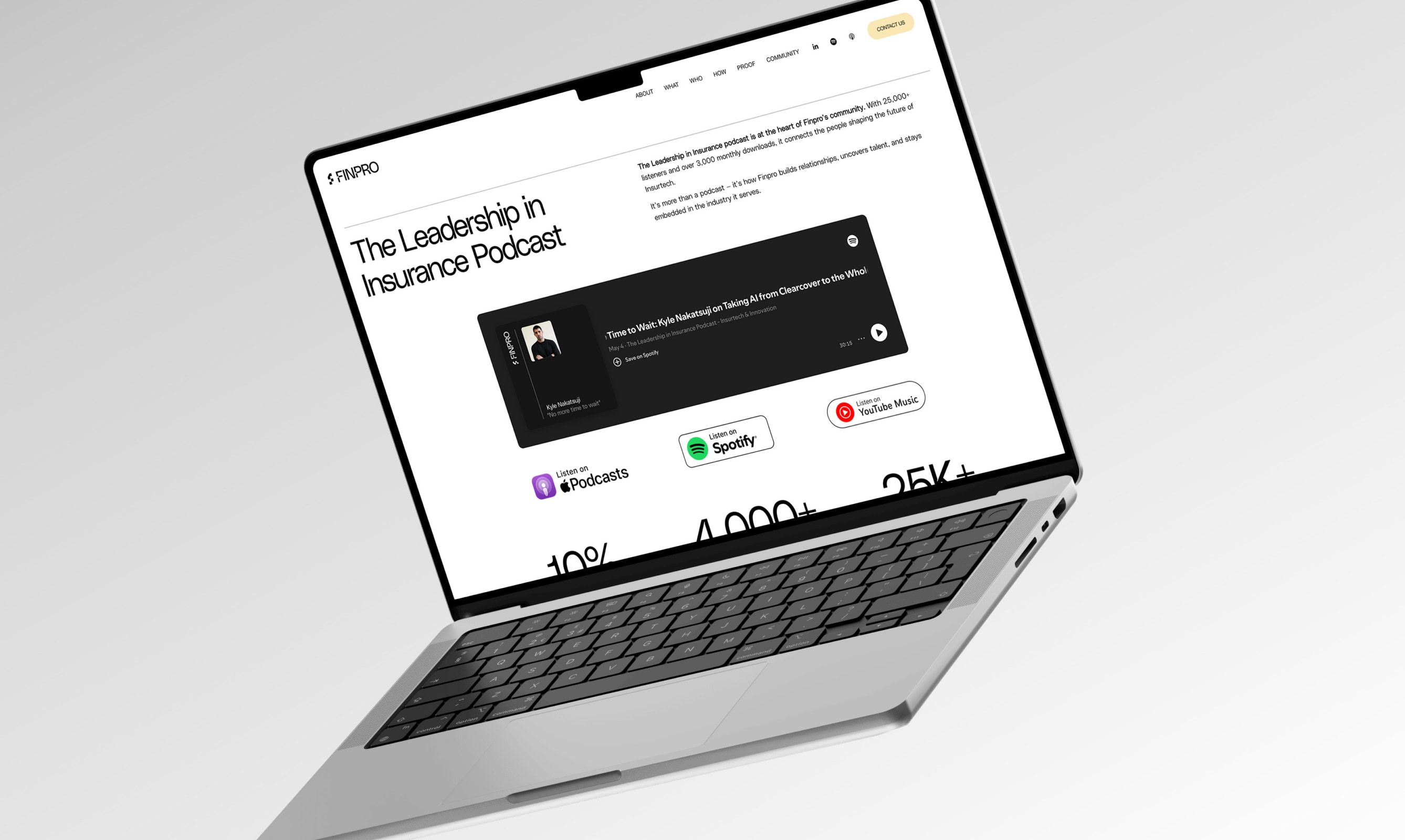
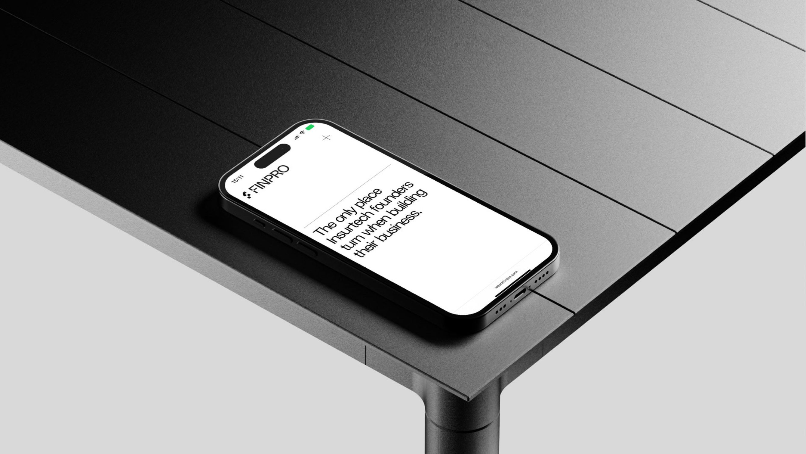
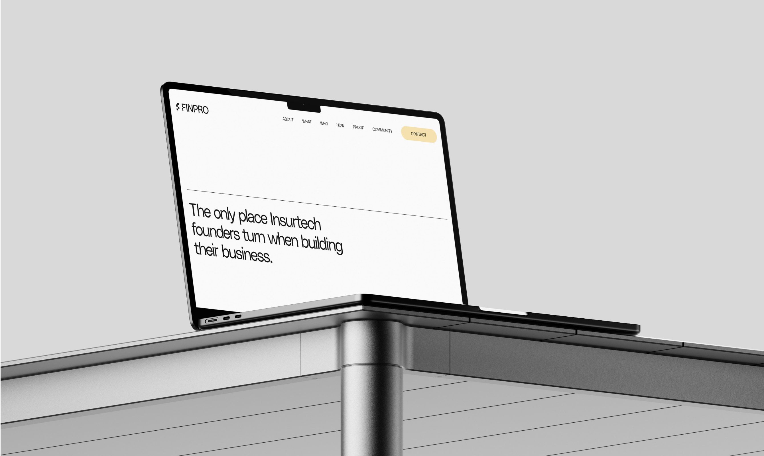
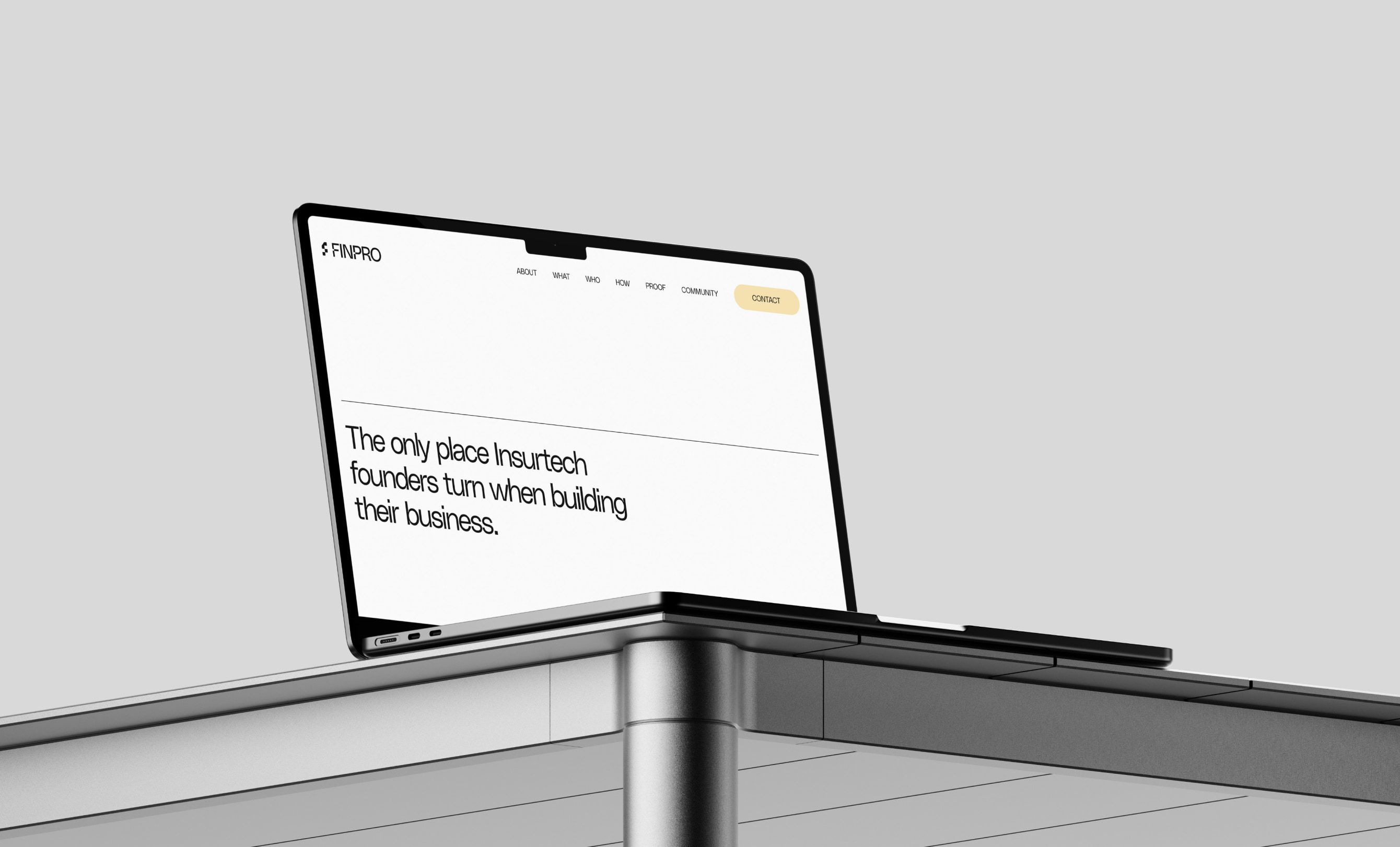
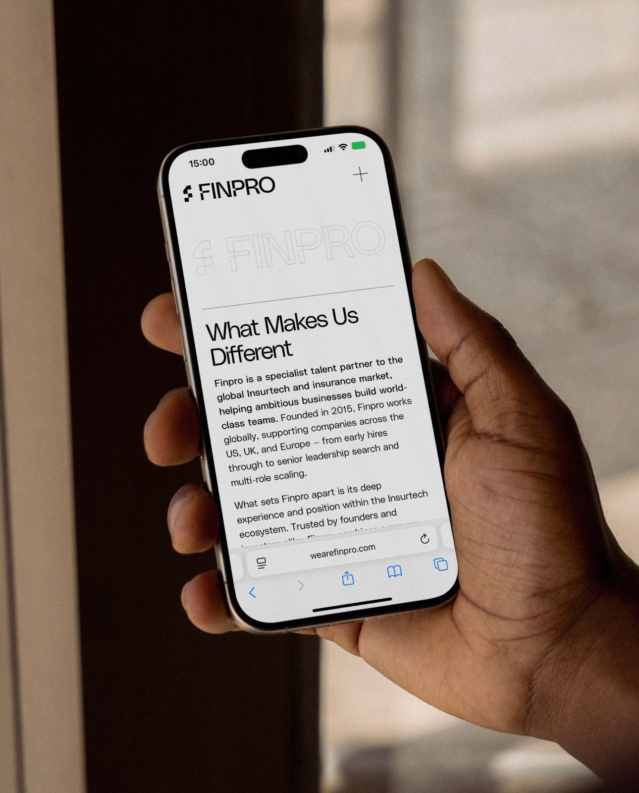
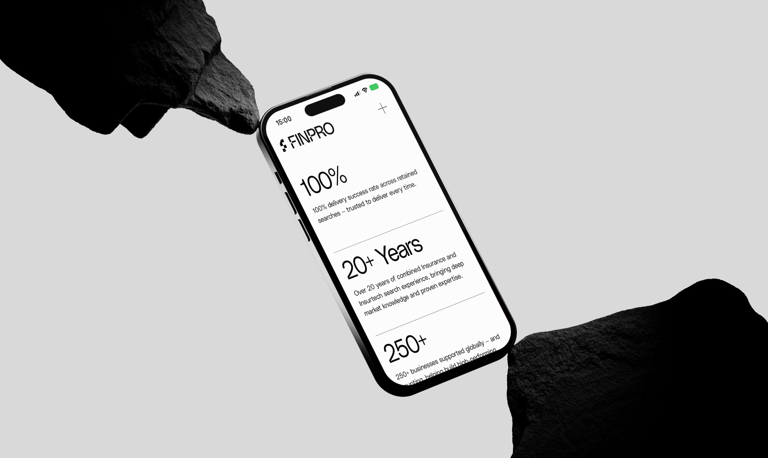
Then the website. Rather than a sprawling site, we made one page that does the job: who they are, the track record, the services and the podcast, in a single, fast, scannable scroll they can put in front of a client or open at an event. And we handed it over on a platform they can run themselves, so being locked out of their own site never happens again.
We needed a new, fresh look that said who we are as a business, and they delivered exactly that. I have been through two previous design changes and have never had a finished product so accurately reflect my vision, and speak so directly to who we are as a business.
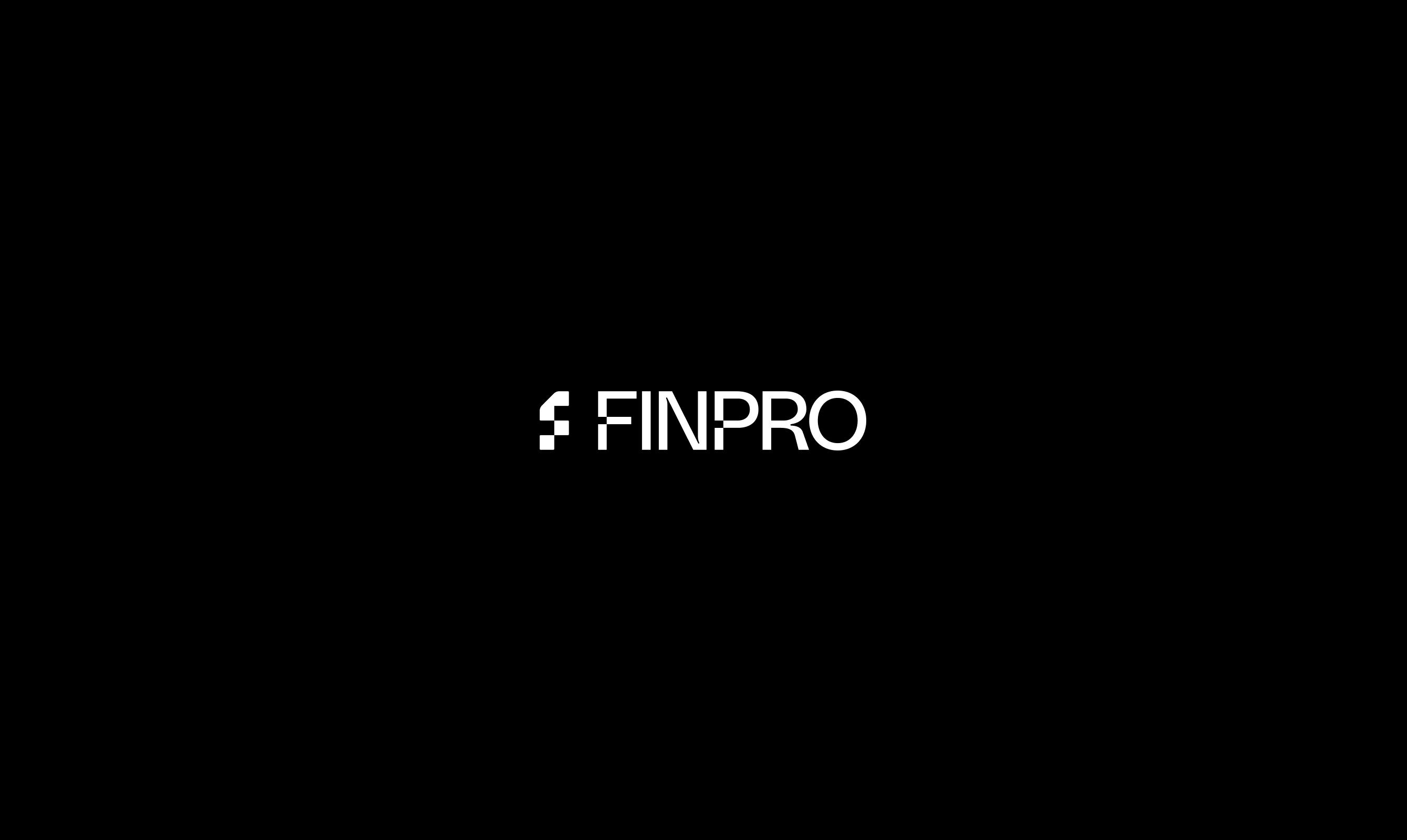







A brand that looks like the business
The brief was really about credibility. FinPro operate at the top of their market, and everything they put in front of a client now says so. The identity is confident and minimal, the site is quick and clear, and the whole thing carries the direct, no-nonsense personality that made them worth backing in the first place.
It also gave them room to grow. The brand and the site were built to carry a new service line alongside the core search business, so FinPro can expand what they offer without losing what makes the premium work premium.
No cliches
A distinctive identity built to avoid every recruitment stereotype, closer to a modern venture firm than an agency.
One sharp page
A single, fast, scannable site that carries the story, the track record and the podcast in one scroll.
Theirs to run
Built on a platform the team can update themselves, after months locked out of the old one.
FinPro are exactly who they say they are: sharp, direct, very good at what they do, and the old brand hid all of it. The best compliment on a job like this is the client telling you it finally looks like their business. That is the whole point of the work.