Understandingthe challenge
Industry
- Higher education
Platform
- Web
Services
- UX research
- UX & UI design
- Prototyping & testing
- Design systems
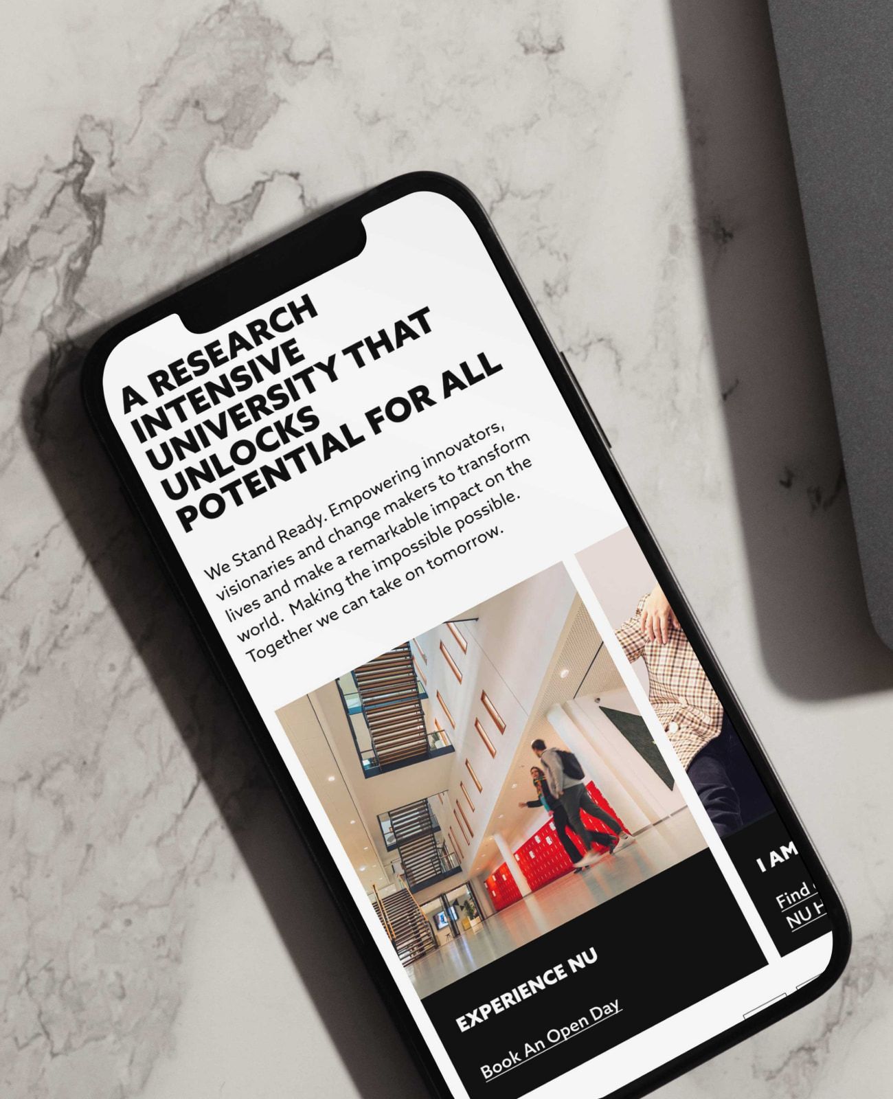
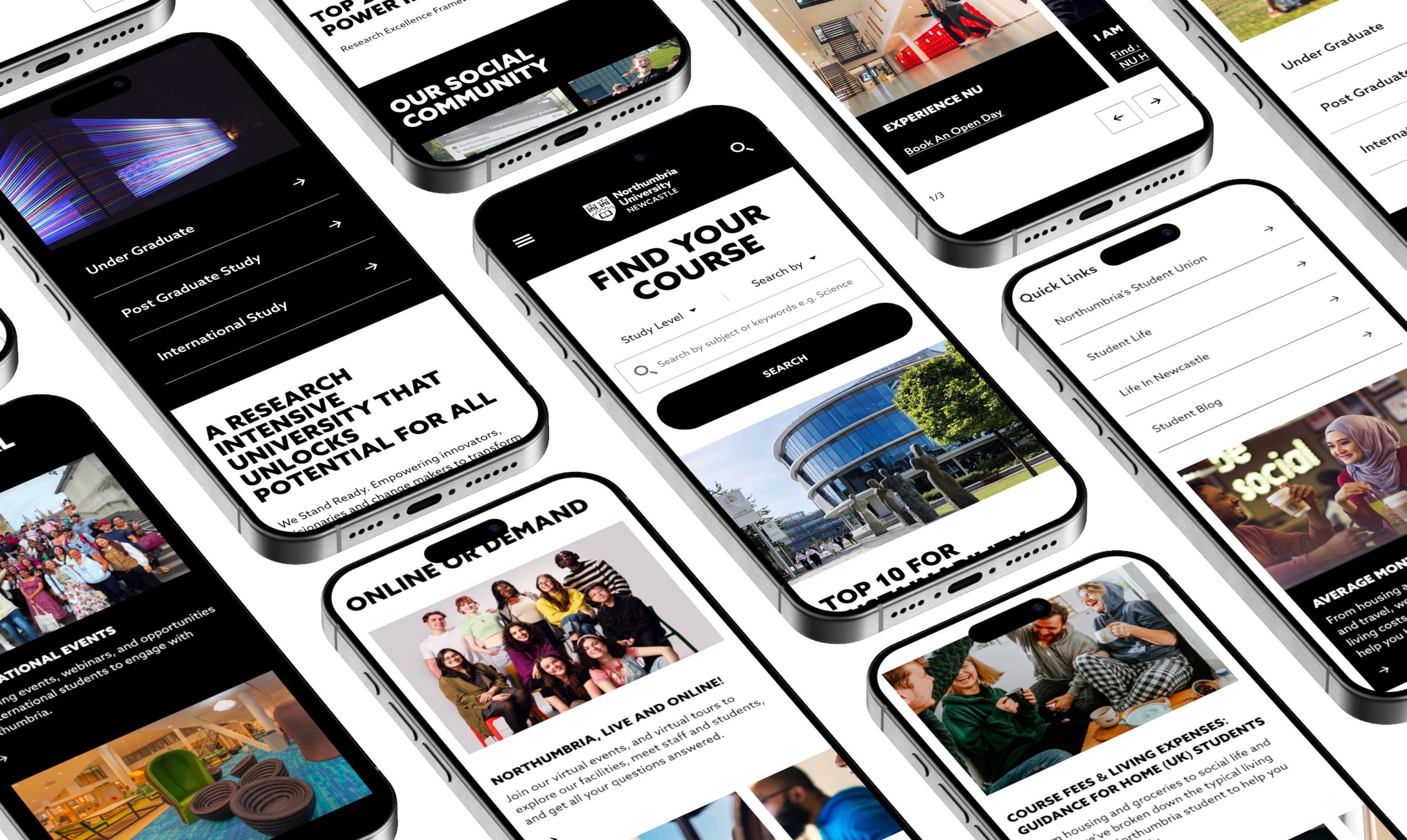
For most prospective students, a university’s website is the first real look they get. It is where they weigh up a course, picture themselves there, and decide whether to take the next step. So the pages that carry that story have to work hard, and be easy to use, especially on a phone.
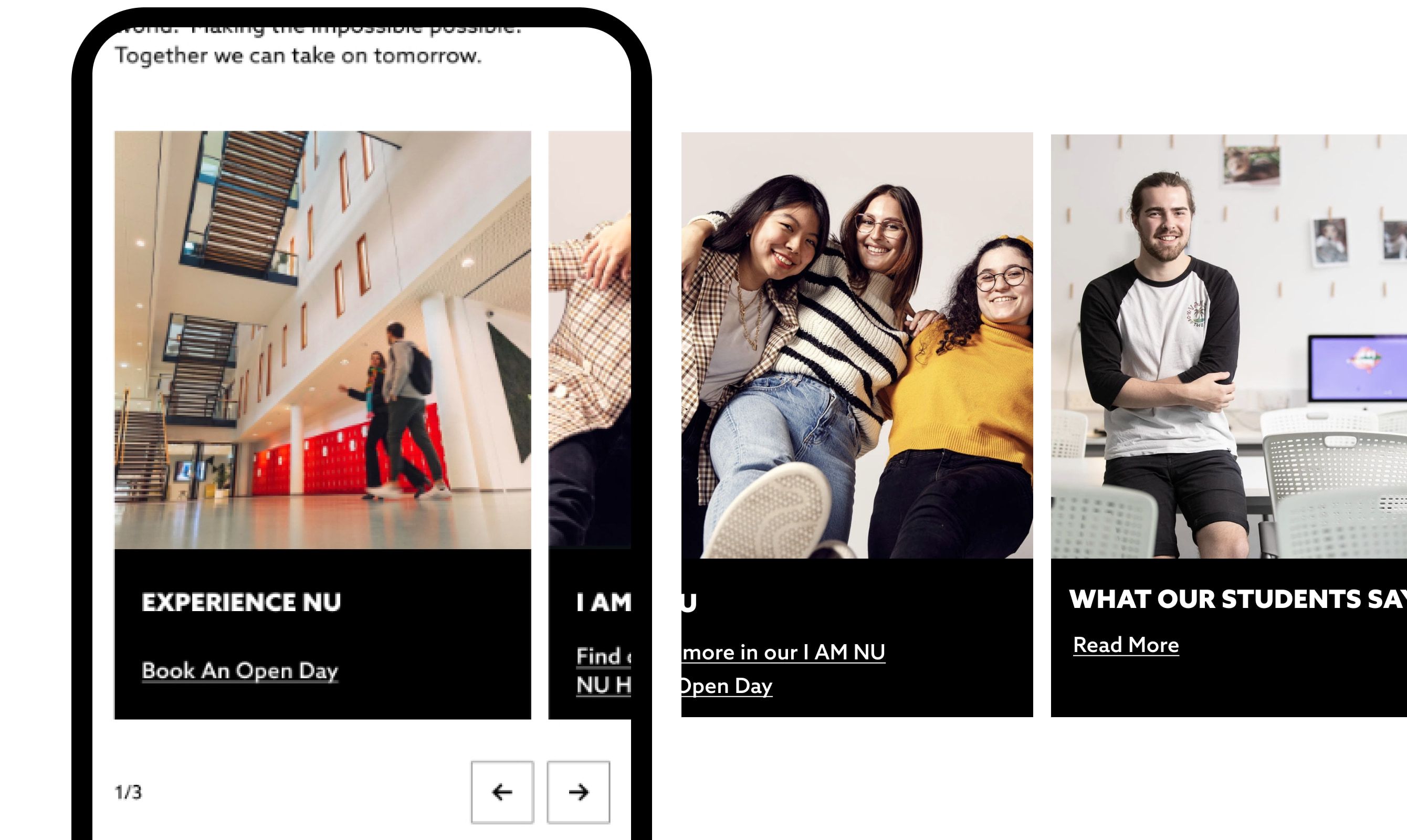
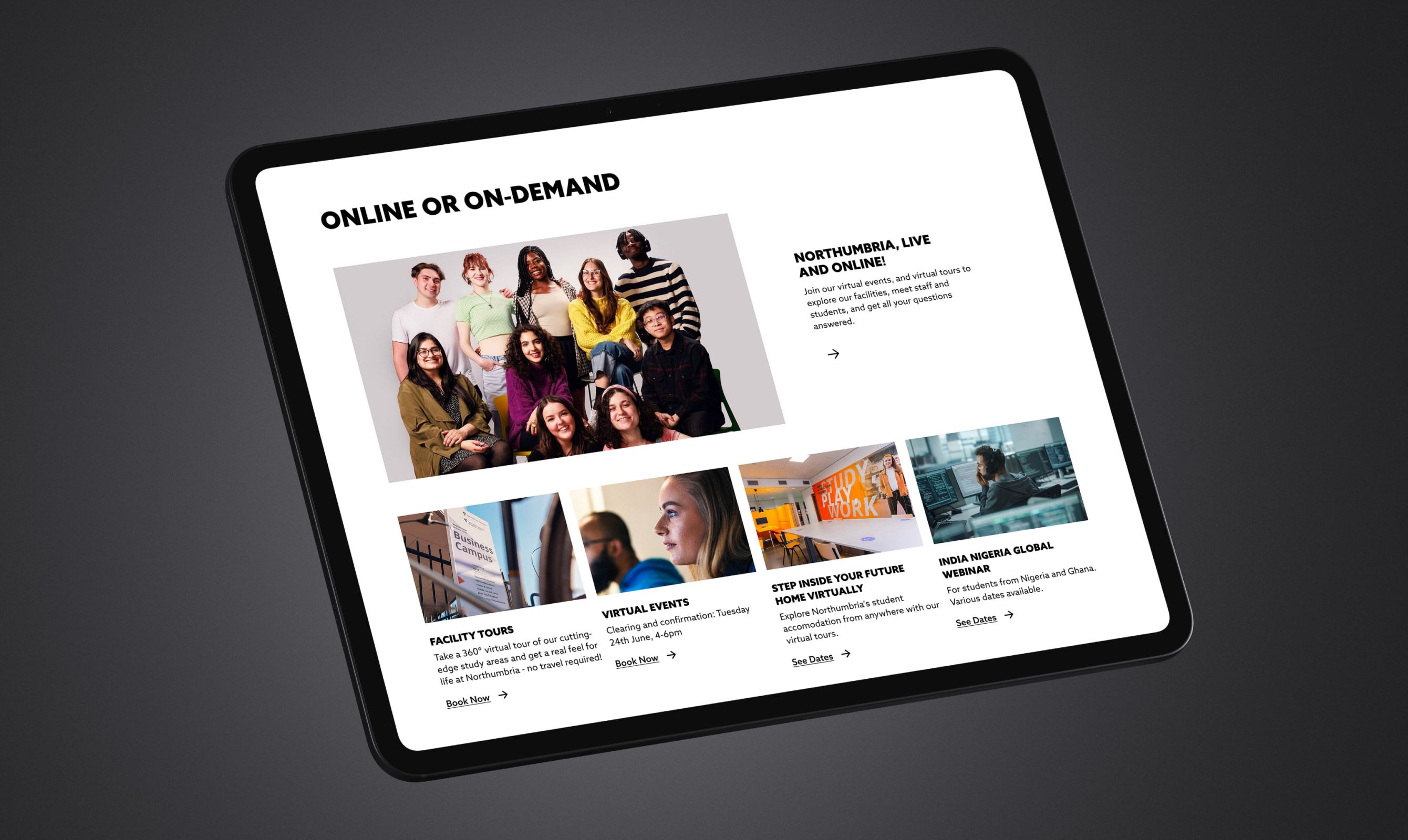
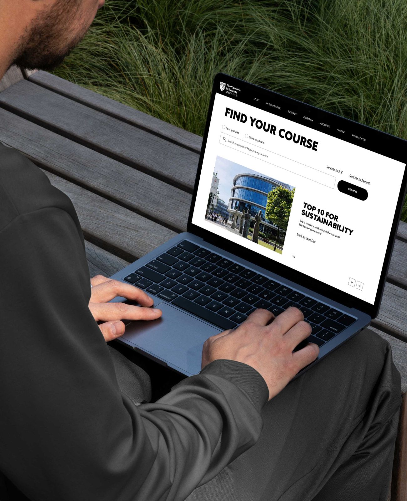
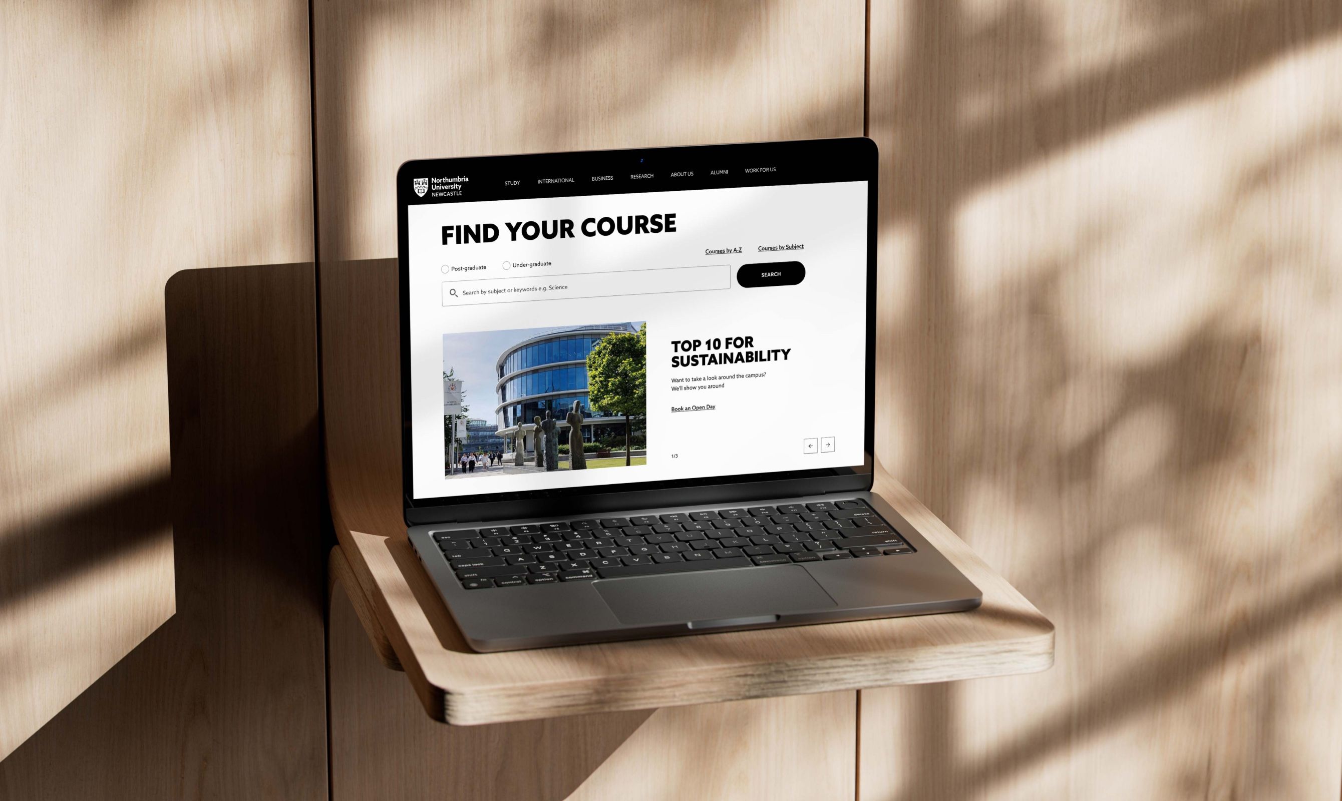
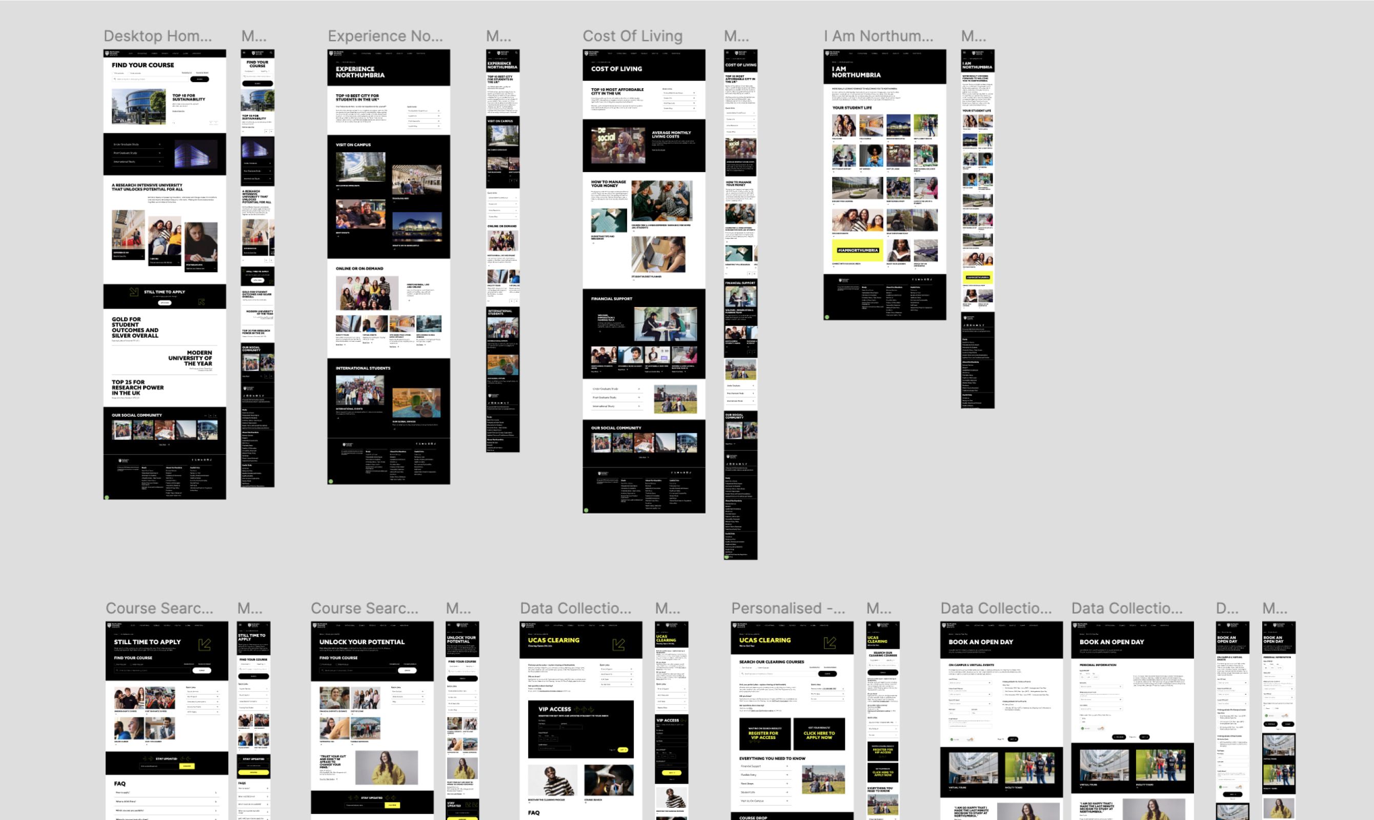
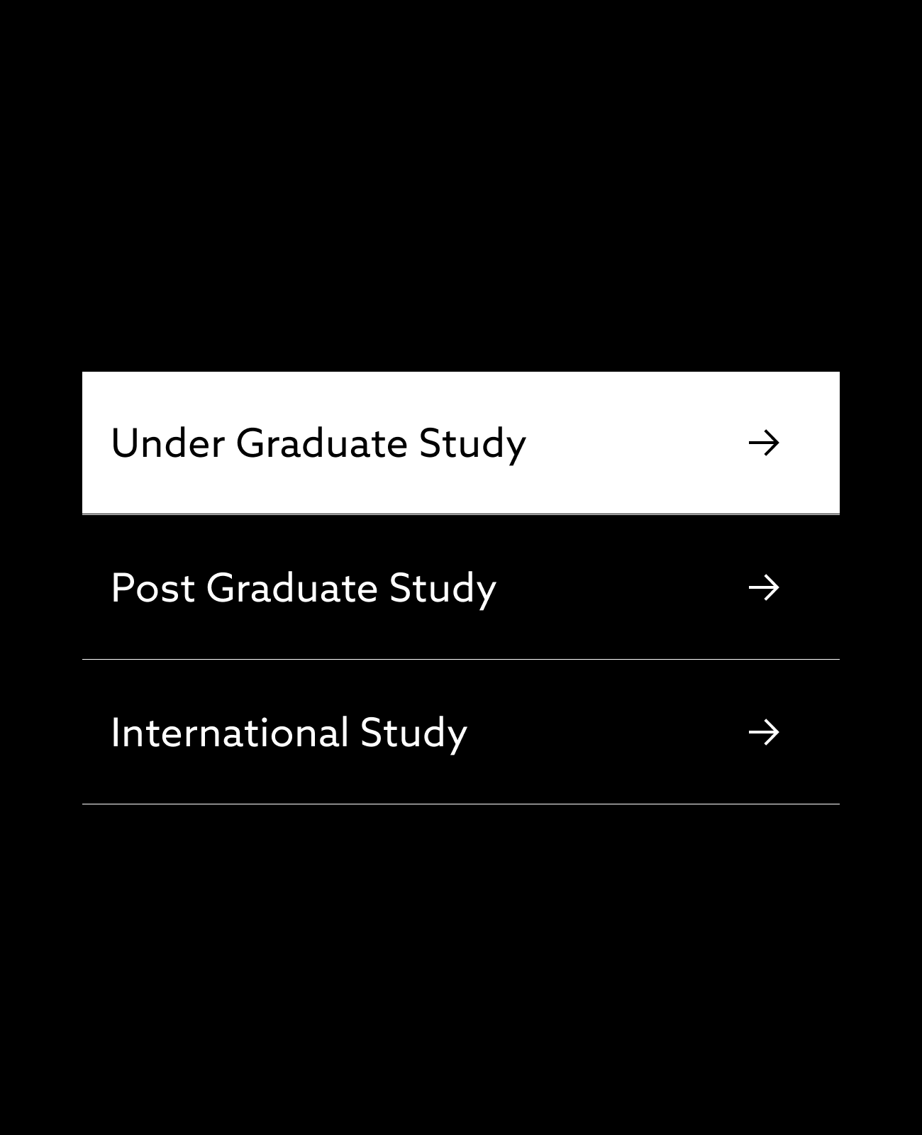
Northumbria University wanted to sharpen exactly those pages: the homepage, a key landing page, the “I Am Northumbria” content hub, and the forms where prospective students book an open day or come through clearing. The goal was clearer, more usable pages that help people find what they need and act on it.



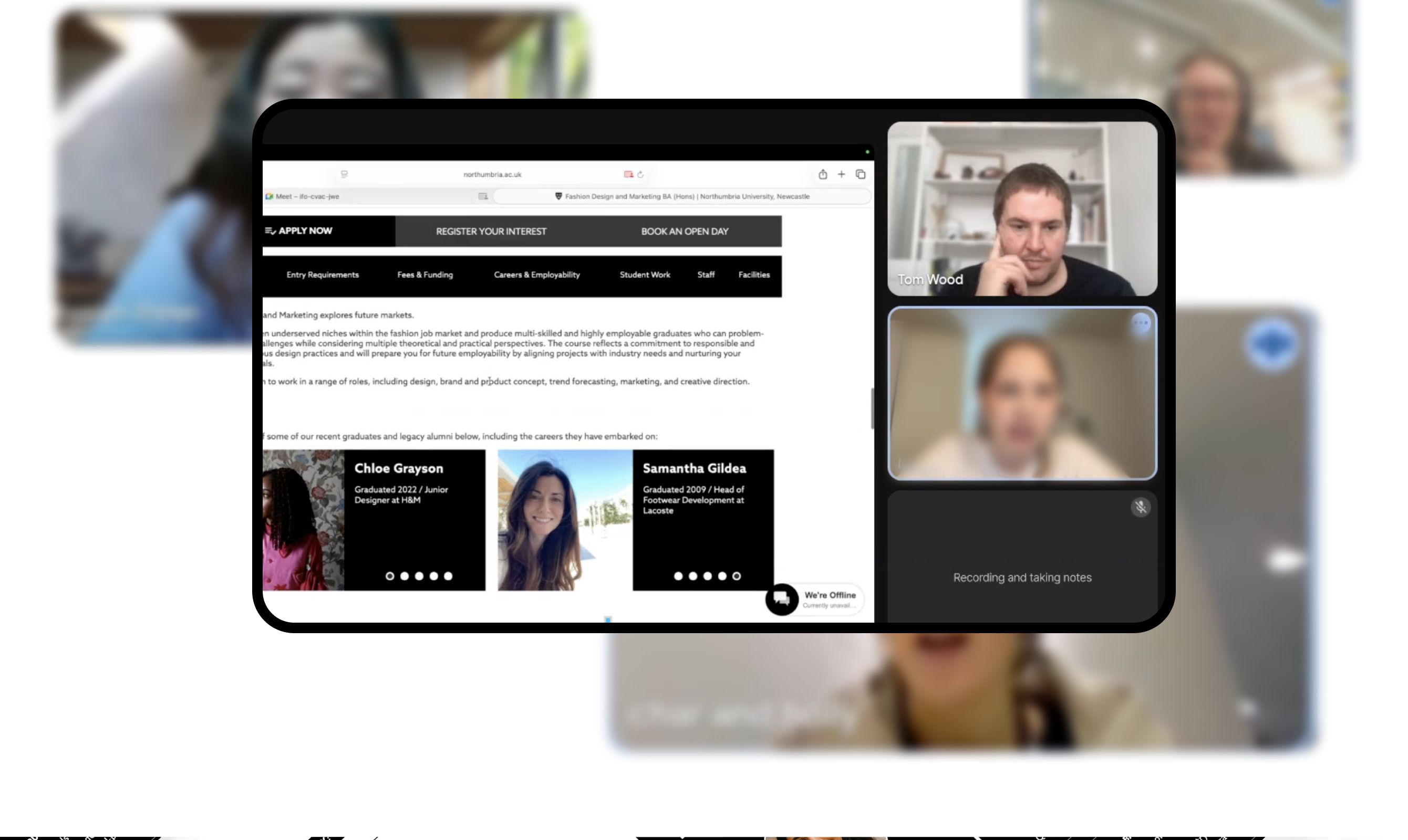
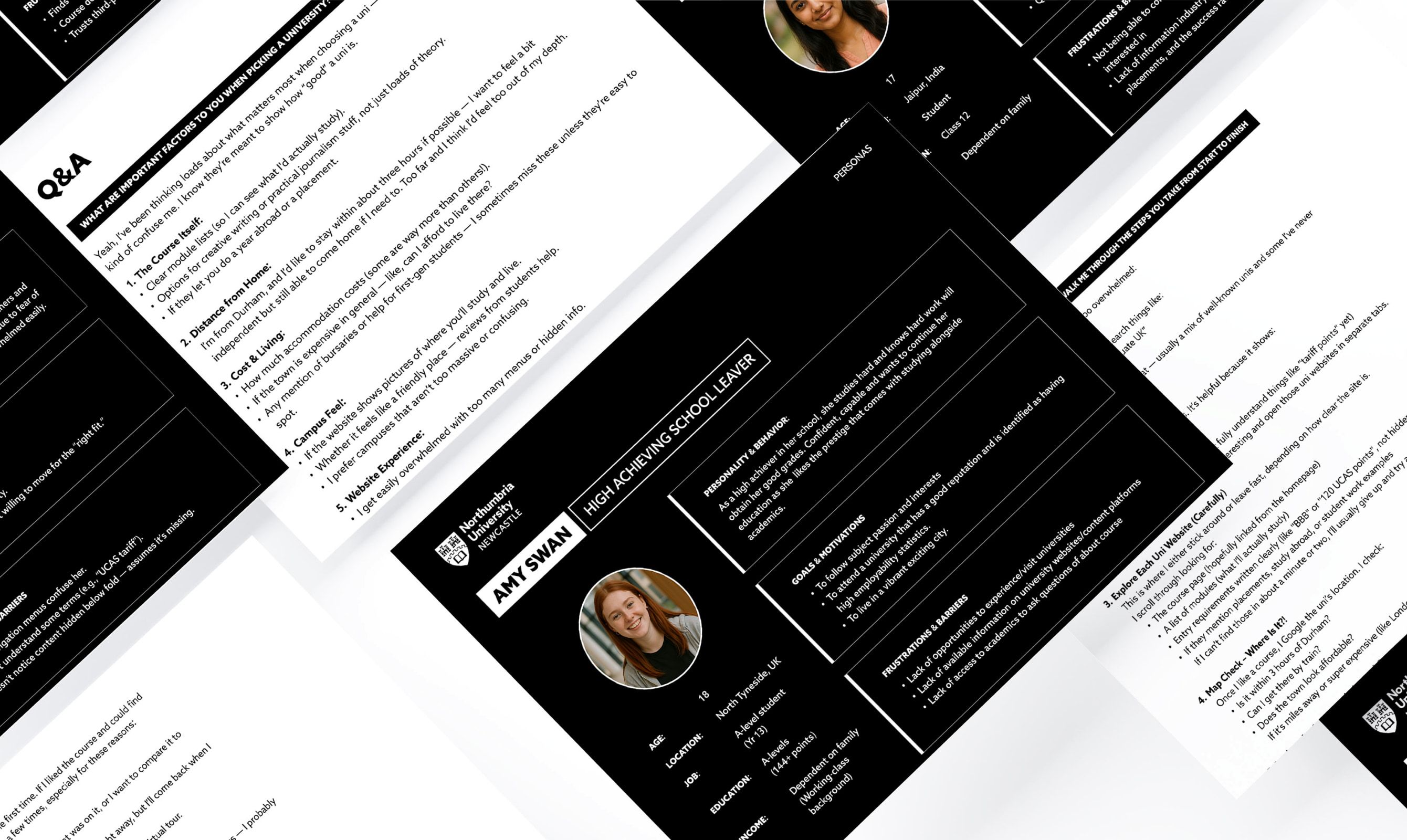
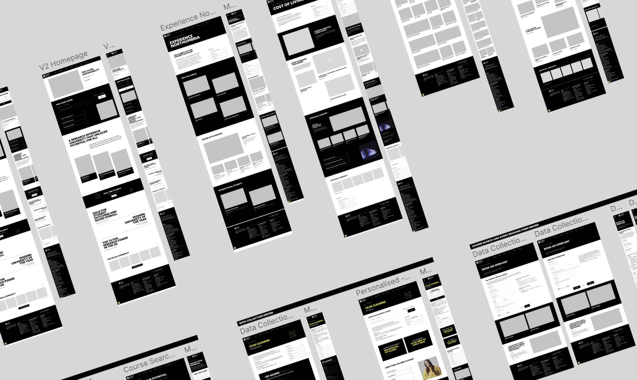
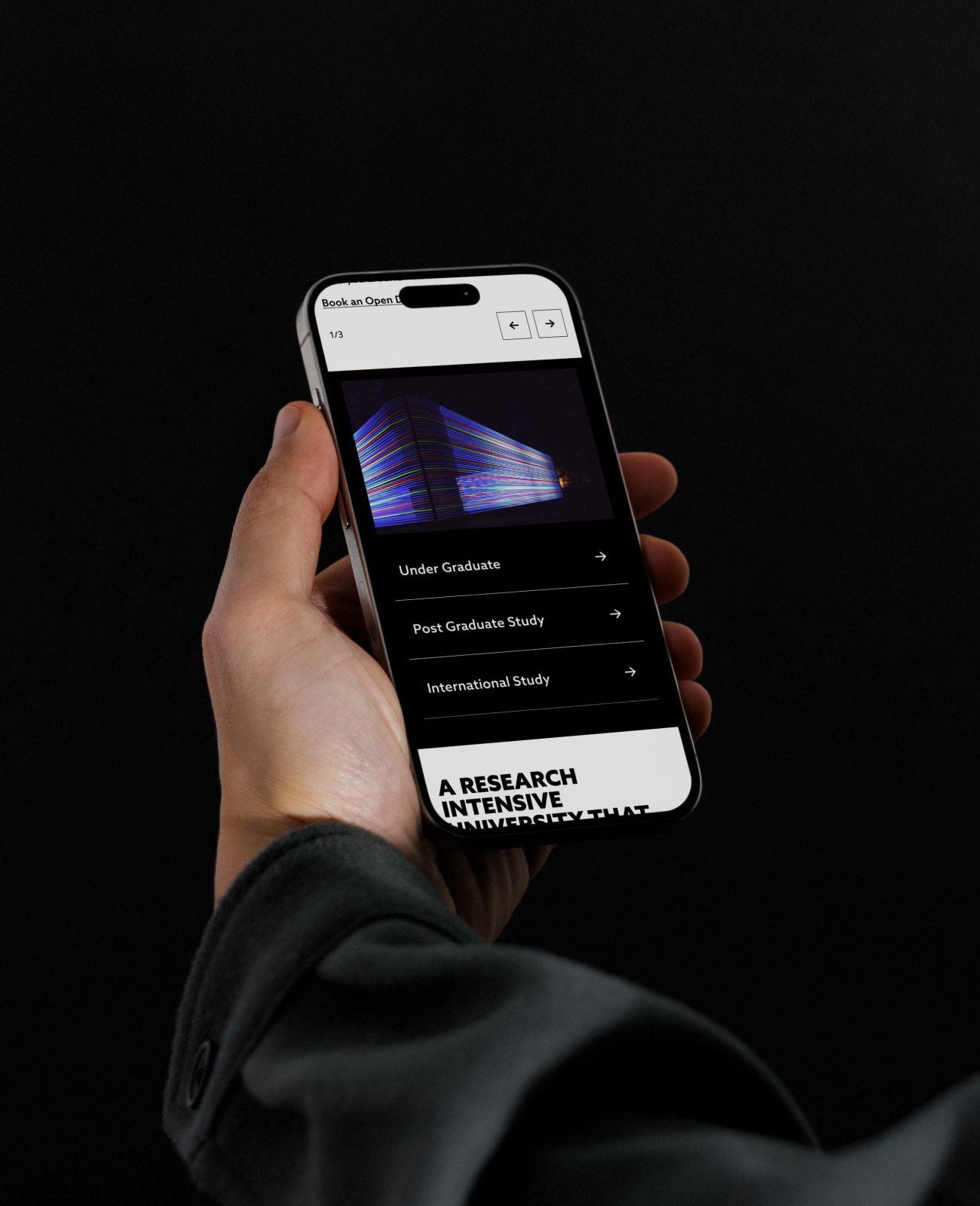
We started with an audit and competitor work to see clearly where the current pages helped a prospective student and where they got in the way. Then we mapped the journeys, built personas, and worked mobile-first through low-fidelity concepts into high-fidelity designs across desktop, tablet and phone.
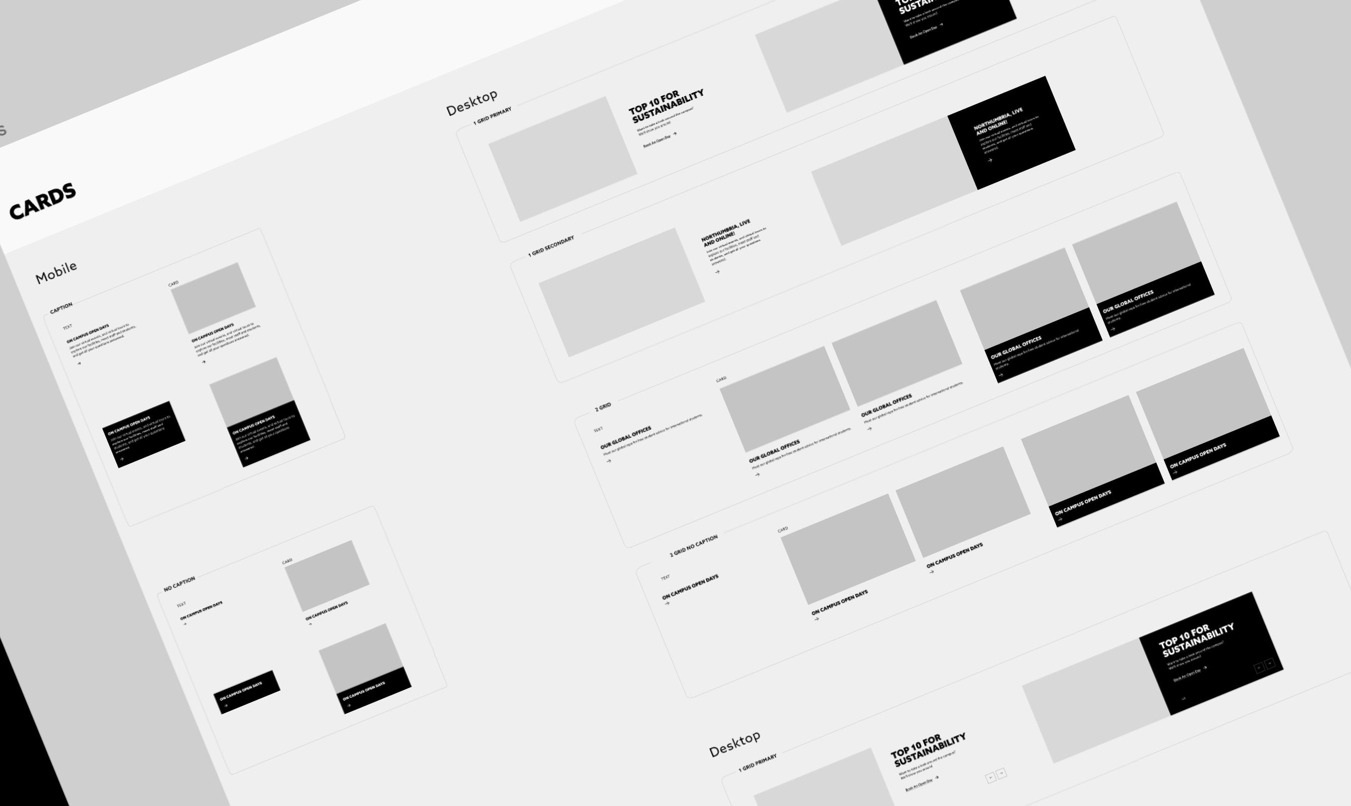
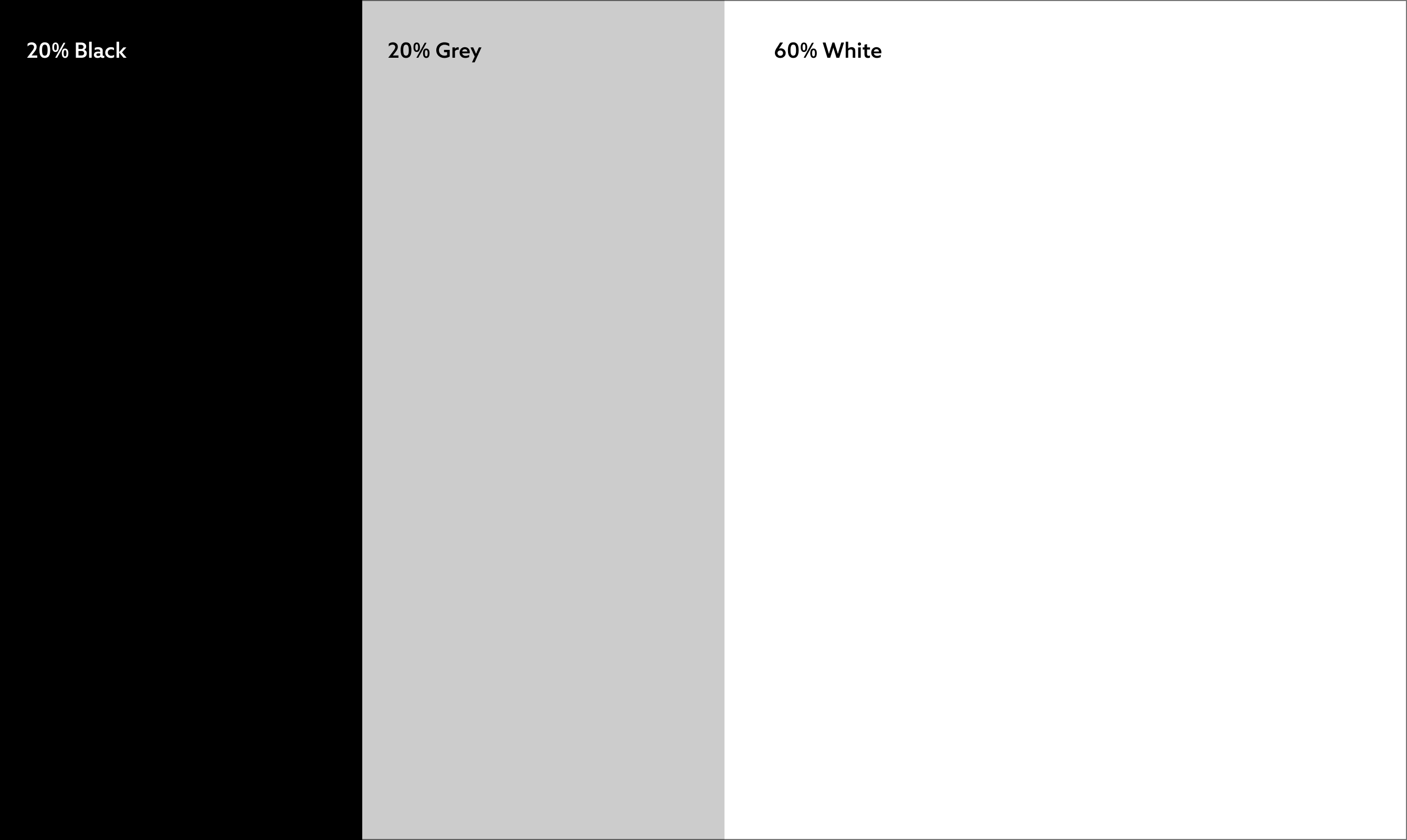
The important part was what we handed over. Not just designs for a handful of pages, but a component library and a clear design system, so the university’s own team can carry the same structure, accessibility and clarity across the rest of the site themselves.
A university site has one job that matters most: helping someone work out whether this is the place for them, and making the next step easy. We focused on the pages that carry most of that decision, then handed over a system the team could build on.
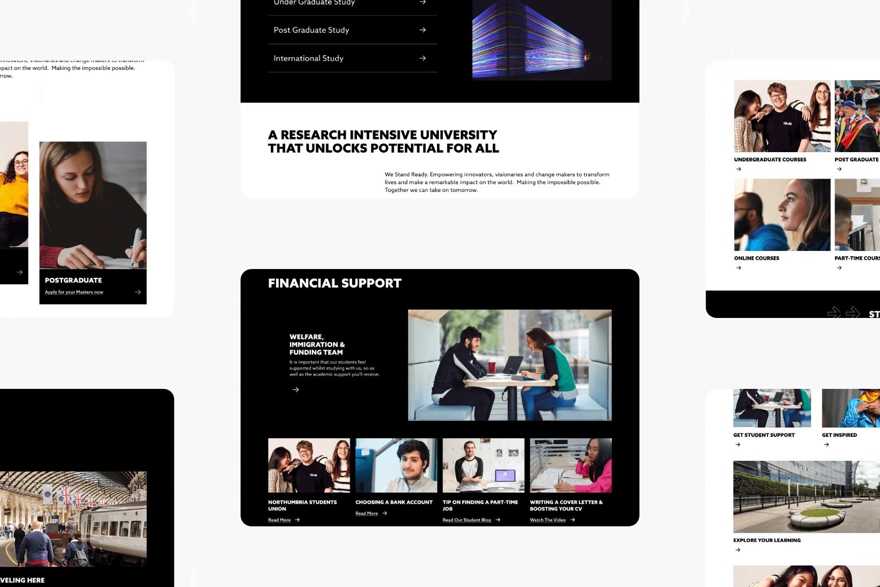
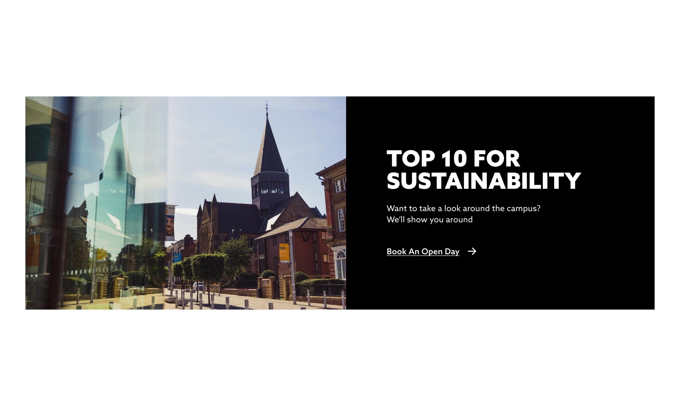
What we did
The result is a research-led redesign of the pages that matter most, and a reusable system behind it. The university is rolling it out across more of the site, and by their own account the accessibility and mobile improvements are already showing, even before that rollout is complete.
Audited what existed
A usability audit and competitor work to find exactly where the current pages helped and where they got in the way.
Designed the key journeys
Homepage, landing page, content hub and the open-day and clearing forms, worked mobile-first and tested with users.
Built a system, not just pages
A component library and design system so the team can carry the same clarity across the rest of the site themselves.
Governance for editors
A clear foundation for guiding CMS users across the university, so consistency holds as more pages roll out.
The website components and wireframes designed by Komodo have already improved our website’s accessibility and mobile performance, and given us a clear foundation for guiding and governing CMS users across the university with their web work, even before full rollout is complete.