Understandingthe challenge
Industry
- Professional body
- Healthcare
Platform
- Web
Services
- UX research
- Information architecture
- Search UX
- Design systems
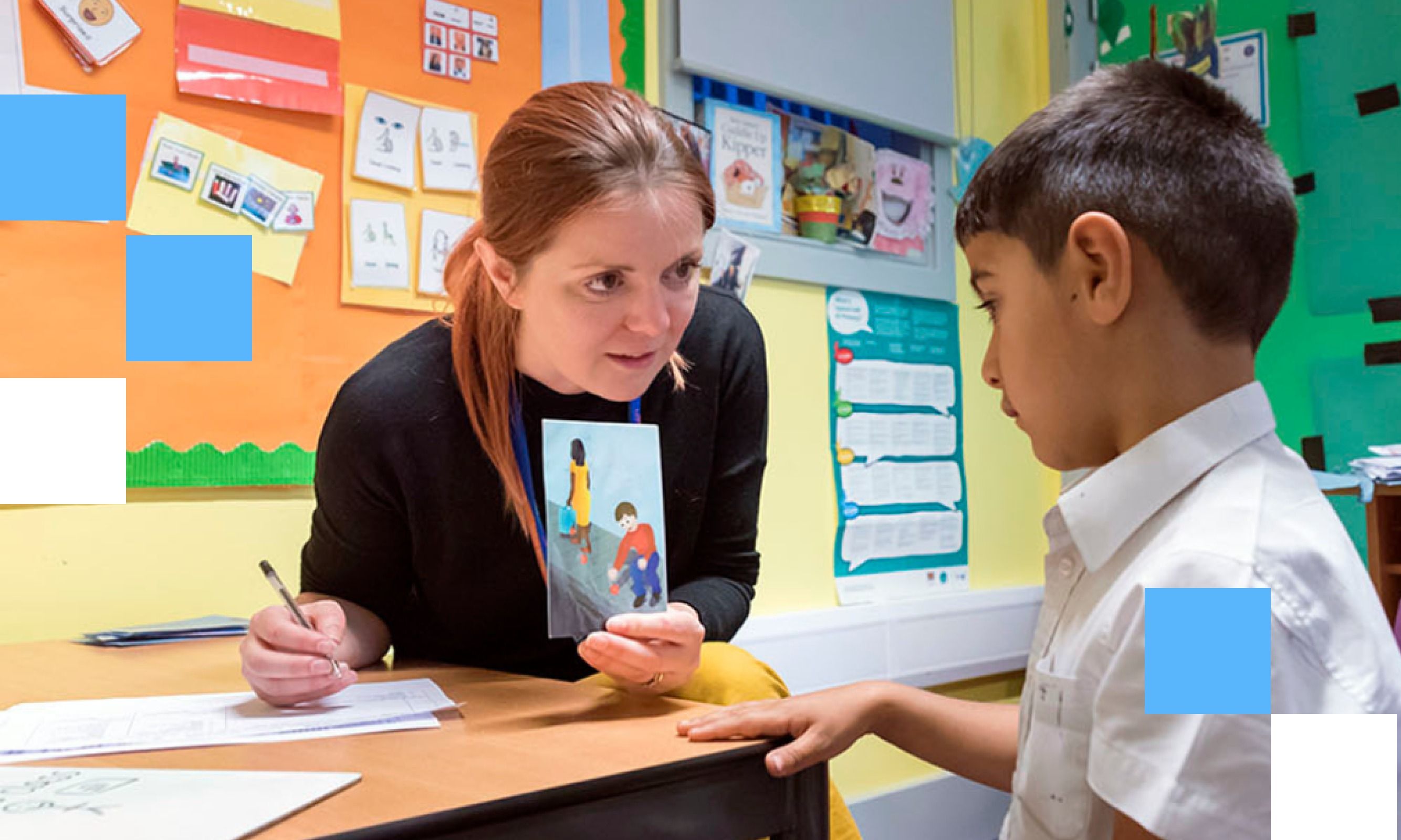
The Royal College of Speech and Language Therapists has an unusually hard website to design. It has to serve two audiences at the same time: members of the public, often a worried parent looking for help, and speech and language professionals who need clinical guidance. The same site, pulling in two directions.
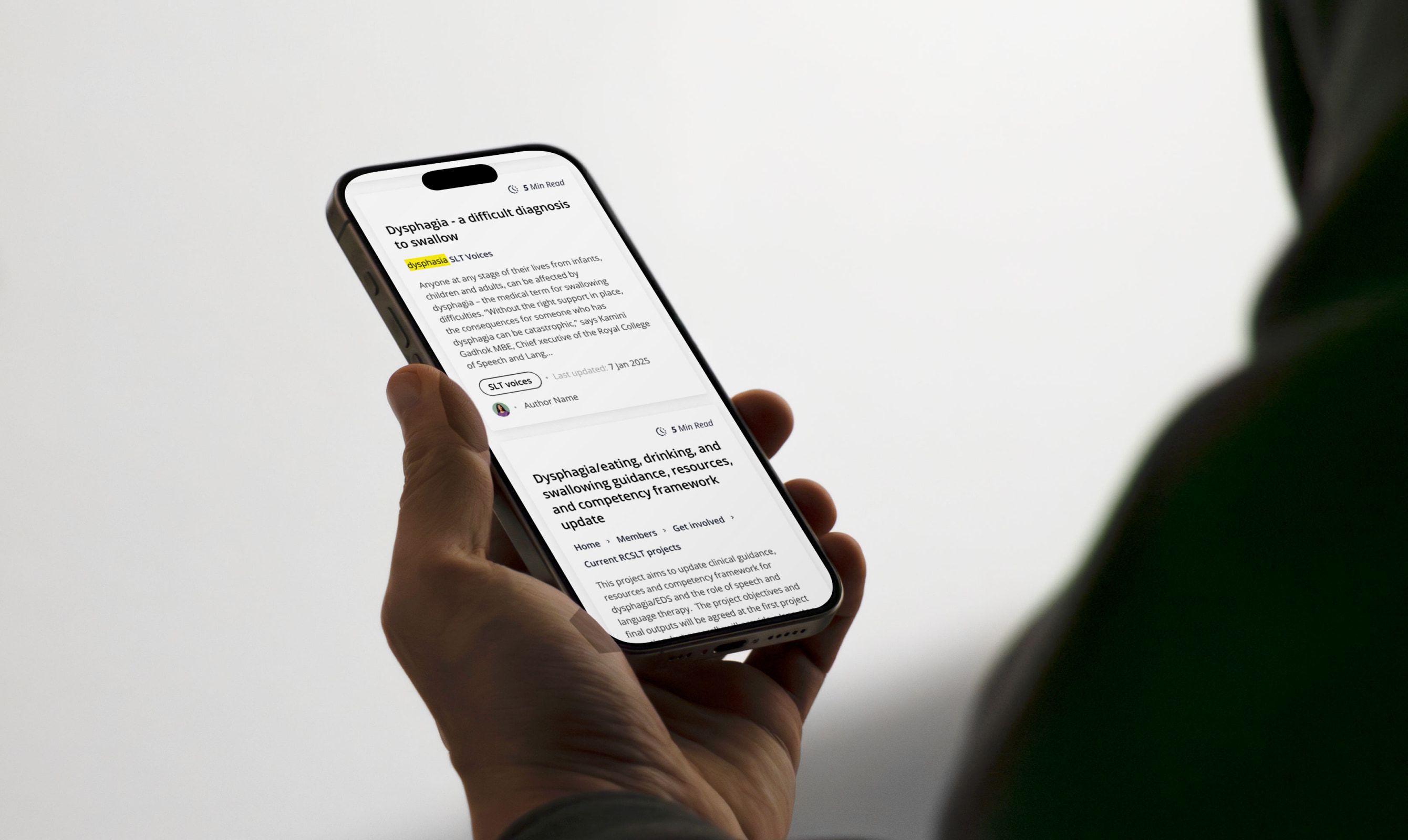
The result was content that was hard to find. Search surfaced old material over new, key journeys like becoming a member were buried, and the same words meant different things to each audience. The question RCSLT’s own team kept coming back to was a good one: how do you make navigation work for very different audiences without walling the content off from either?
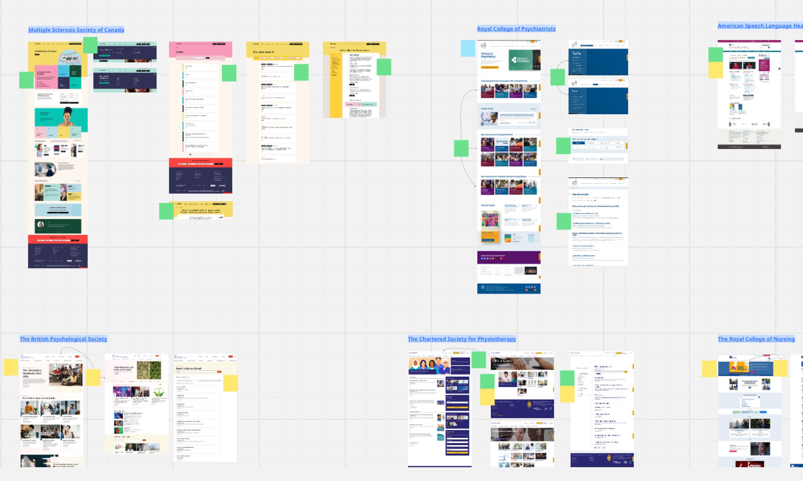
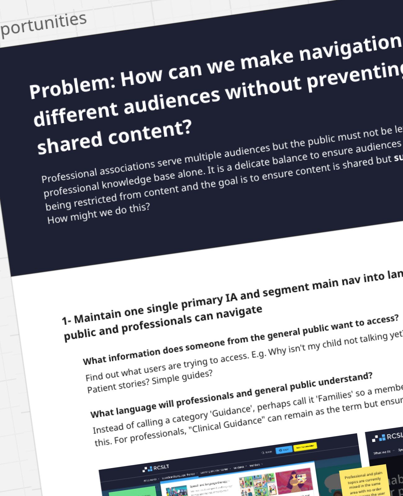
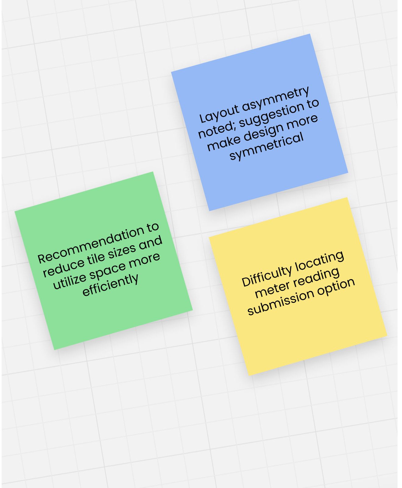
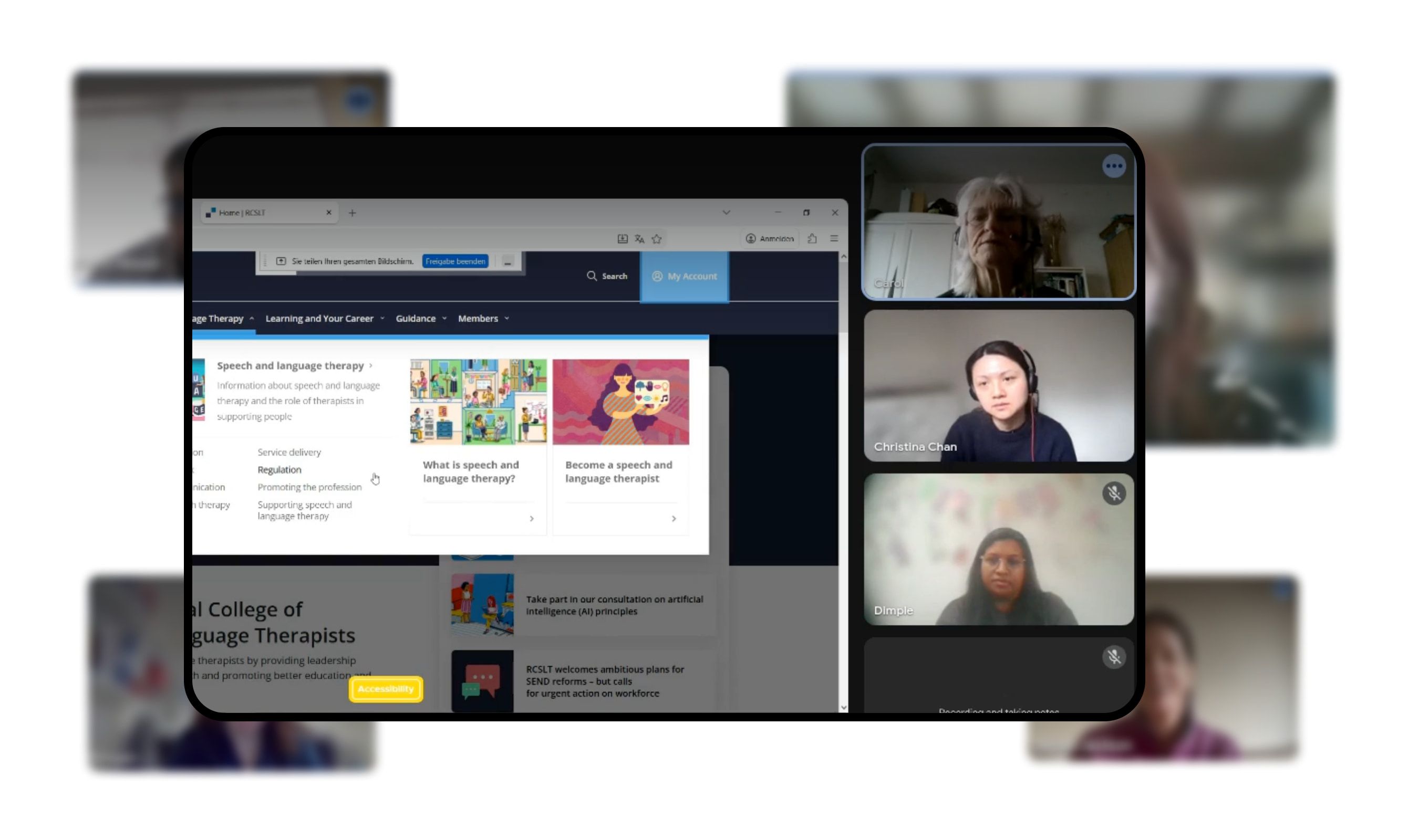
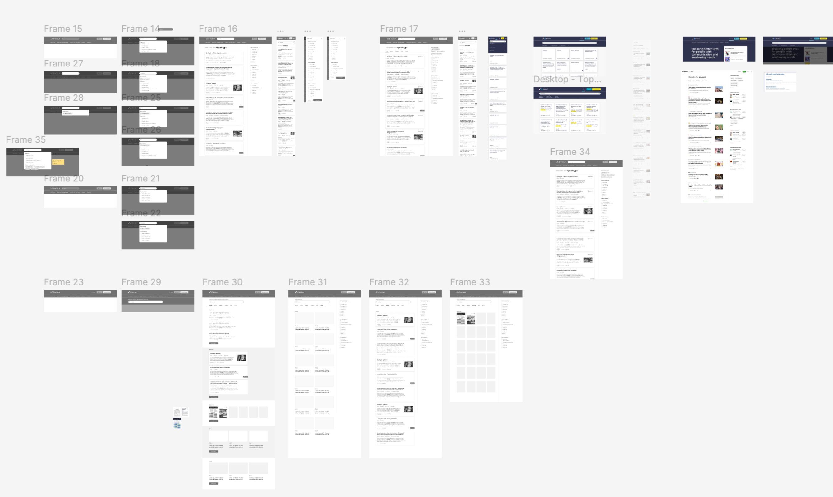
We ran this as research, not guesswork. Workshops with RCSLT teams across the organisation, user research, and a look at how other professional bodies handle the same two-audience problem. That told us exactly where people got lost.
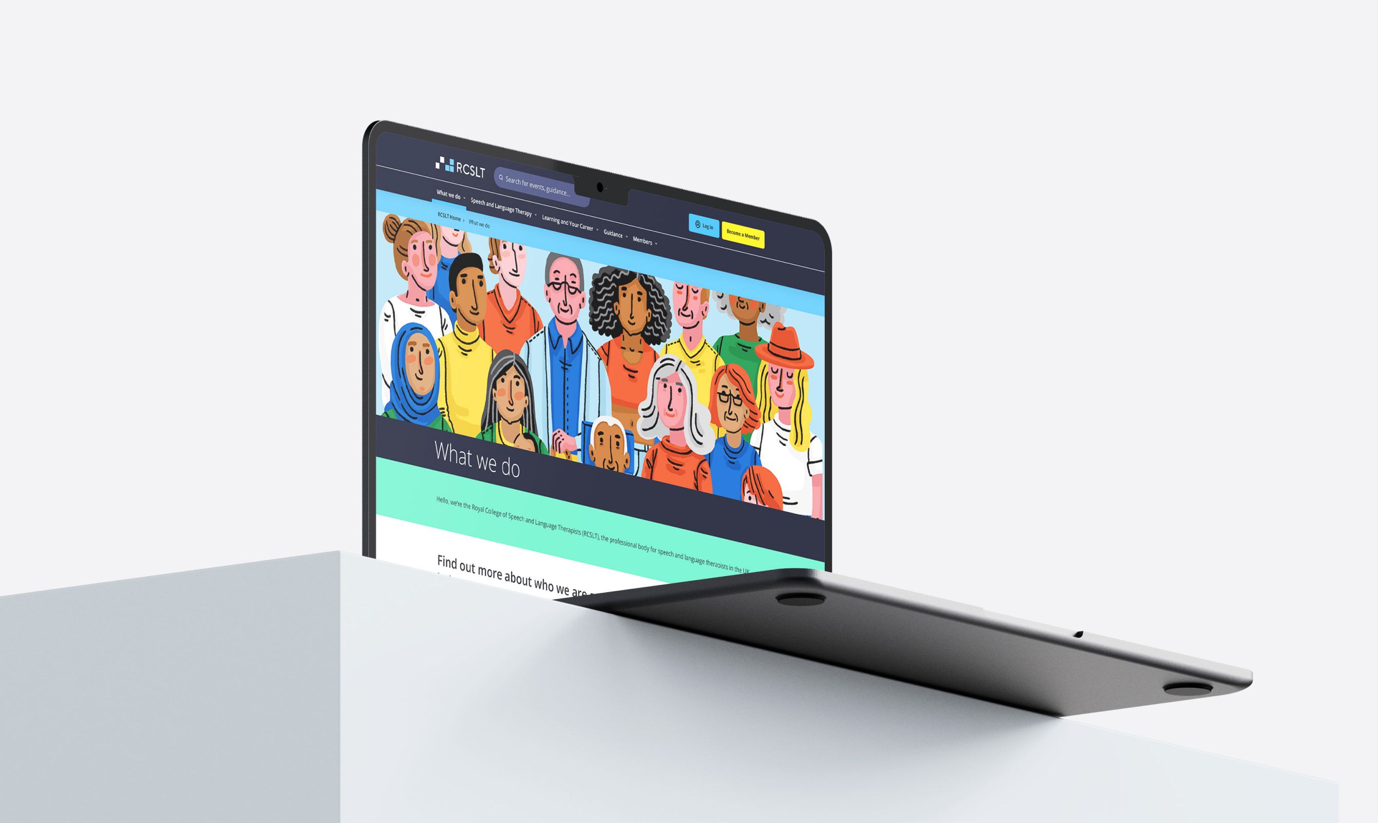
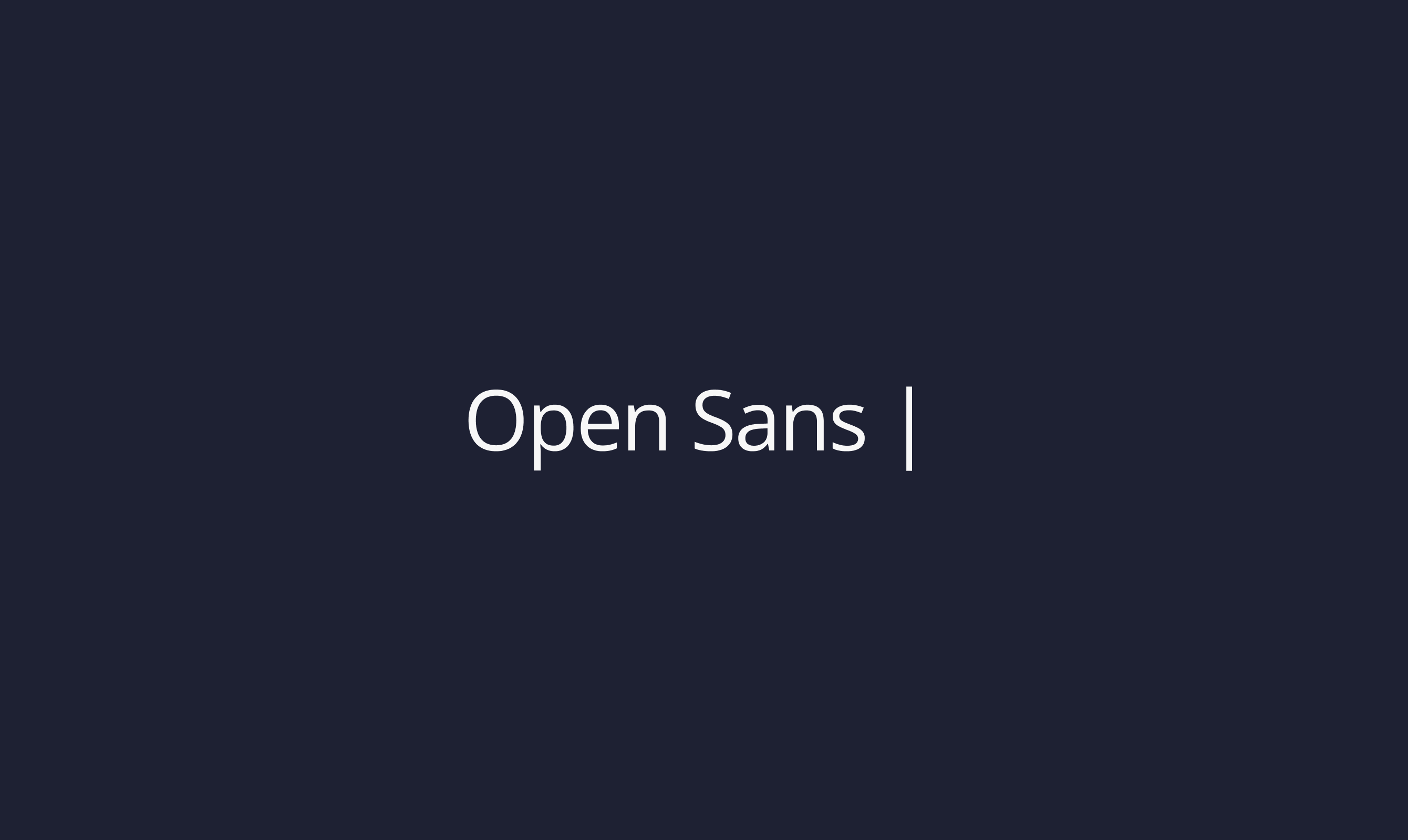
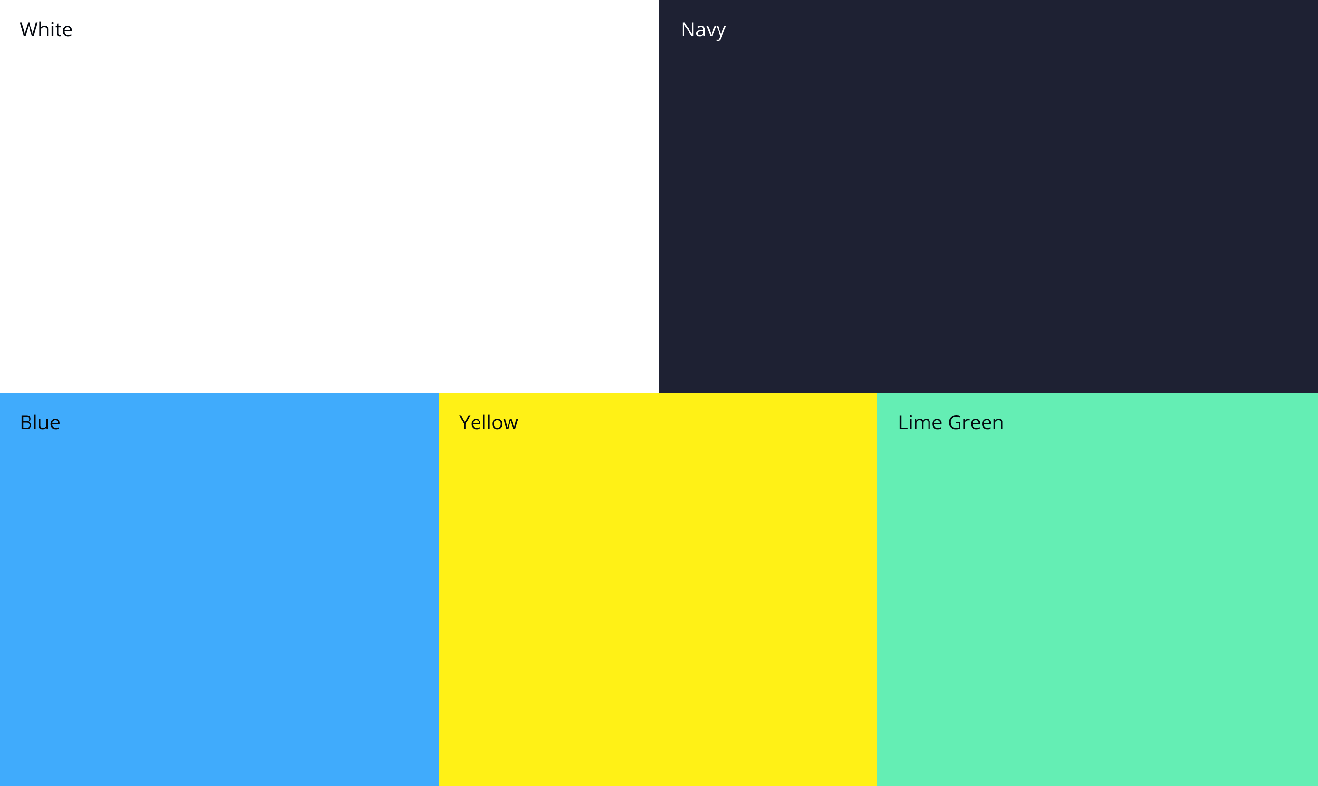
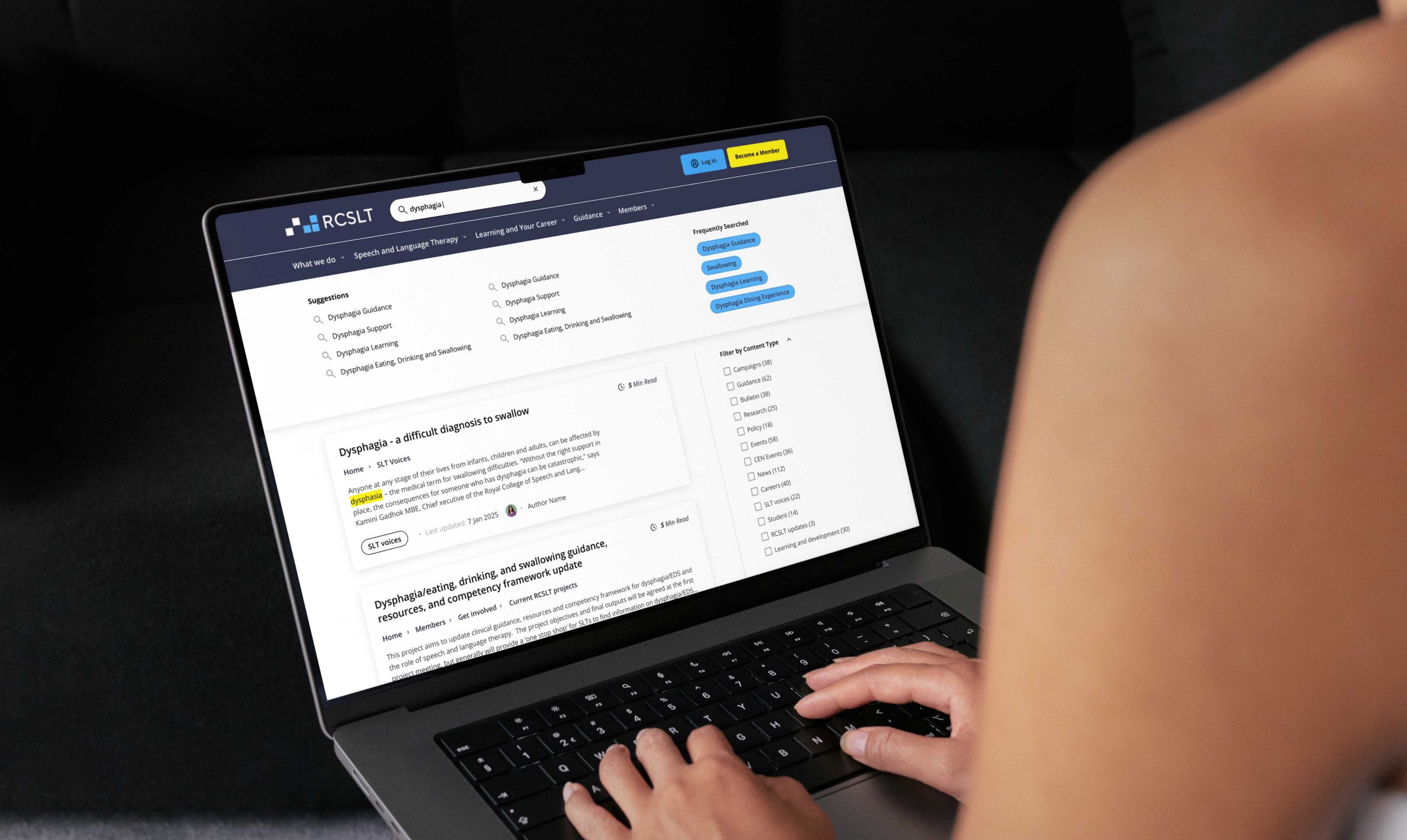
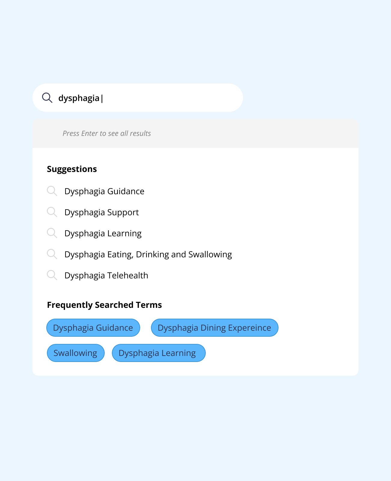
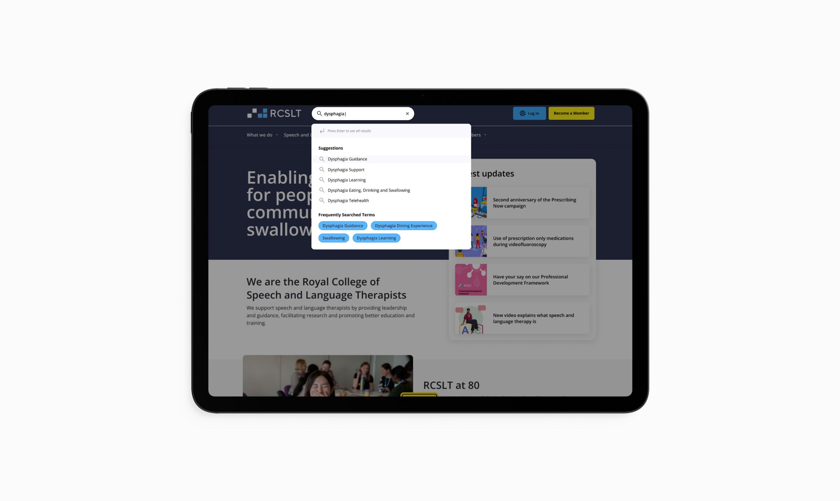
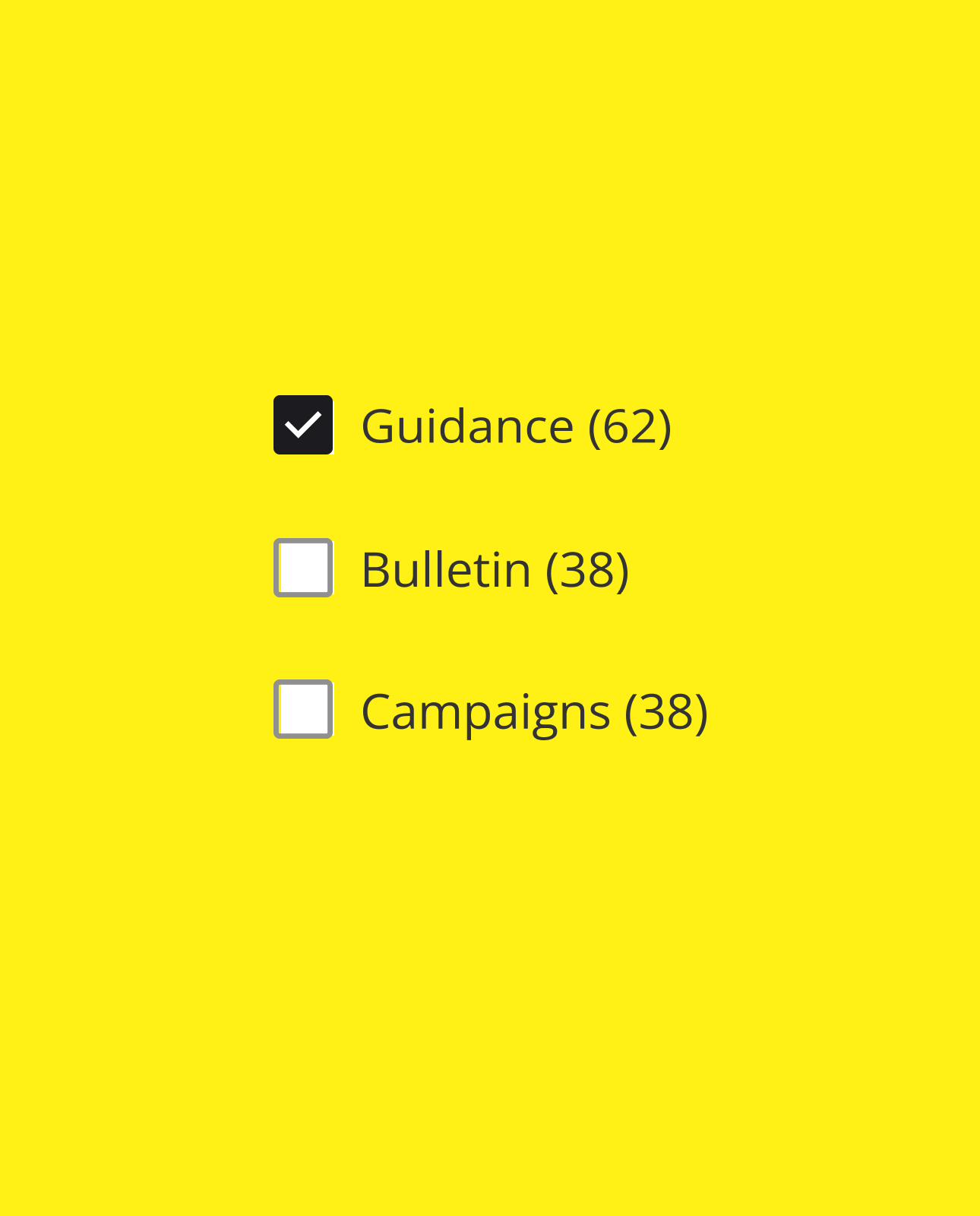
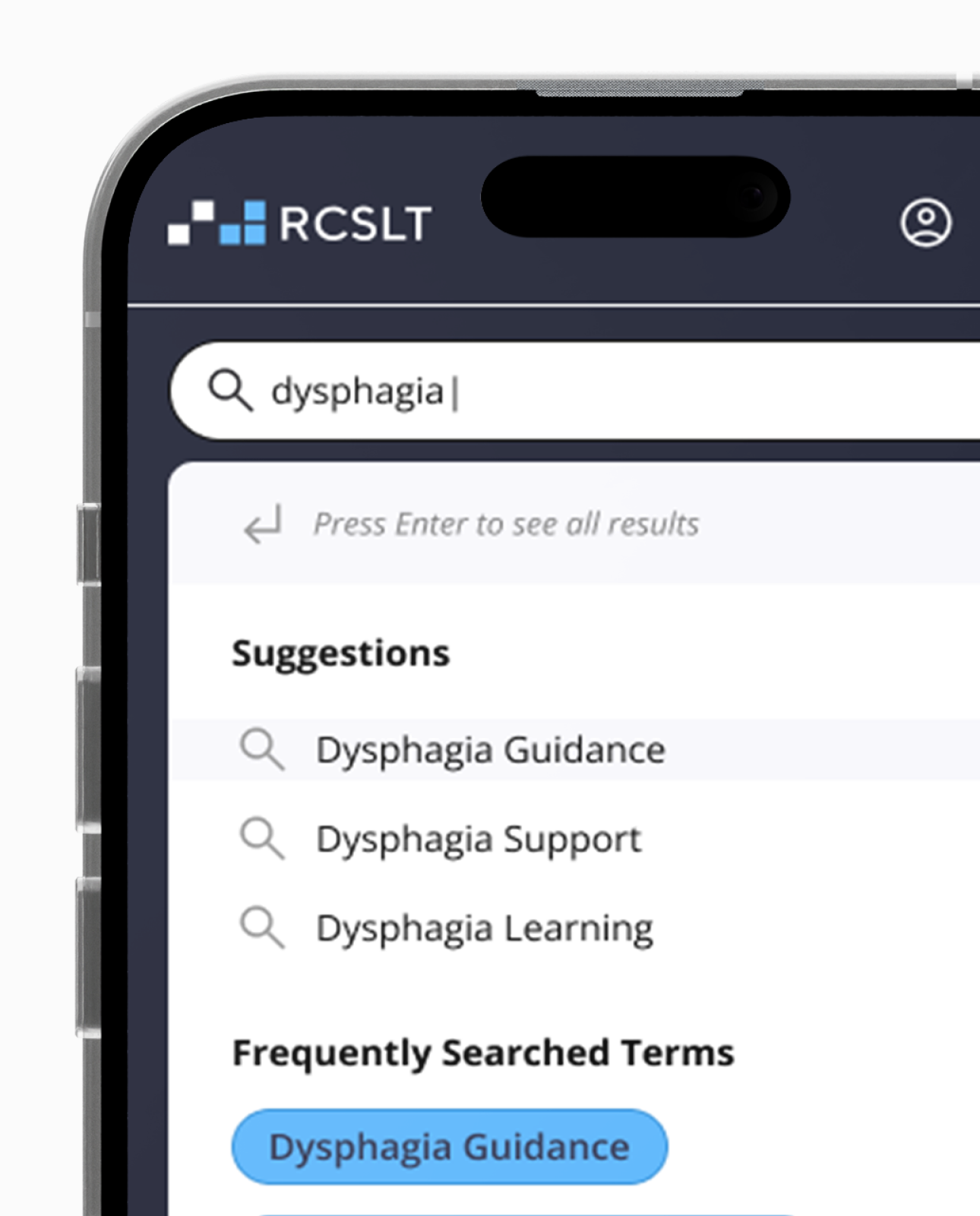
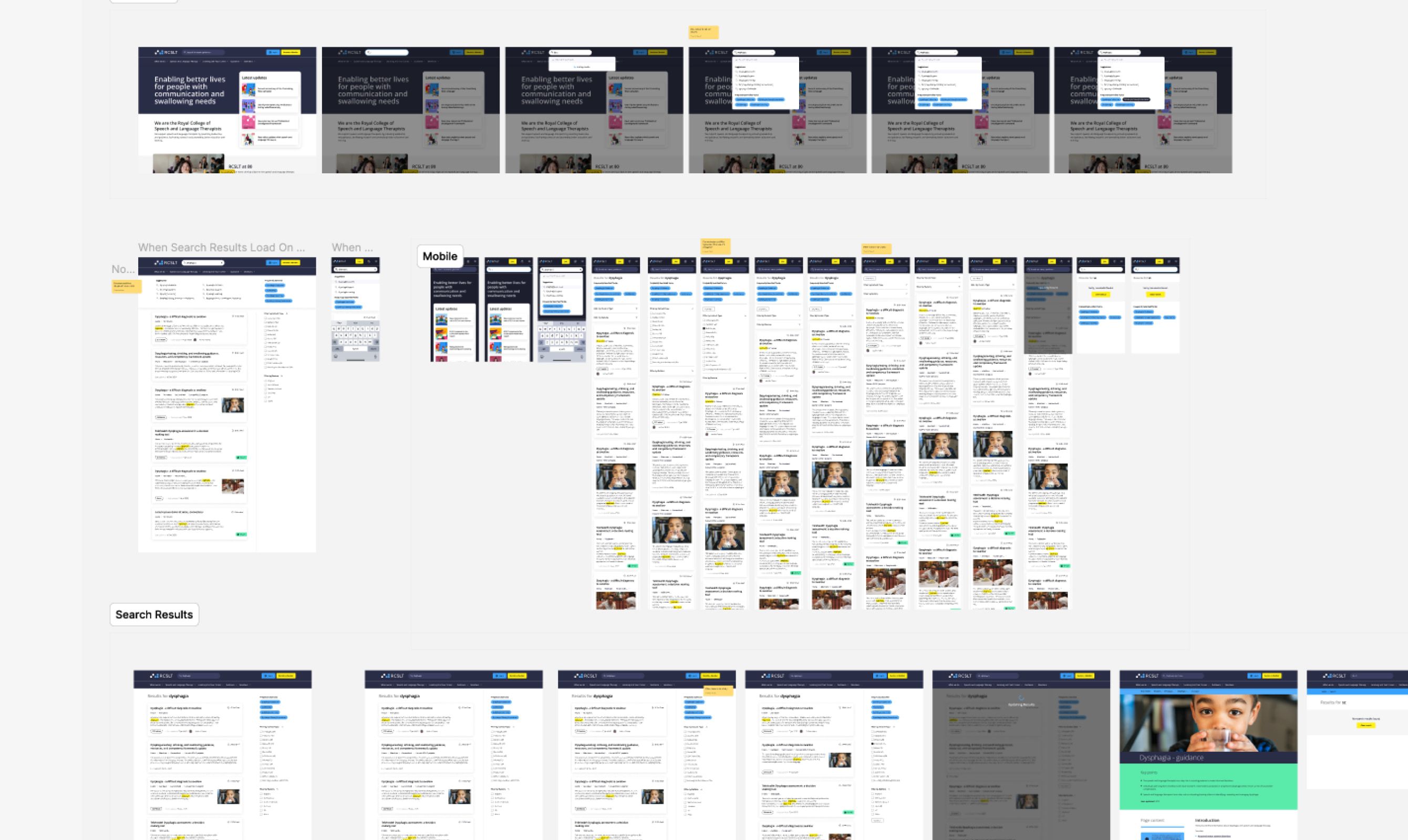
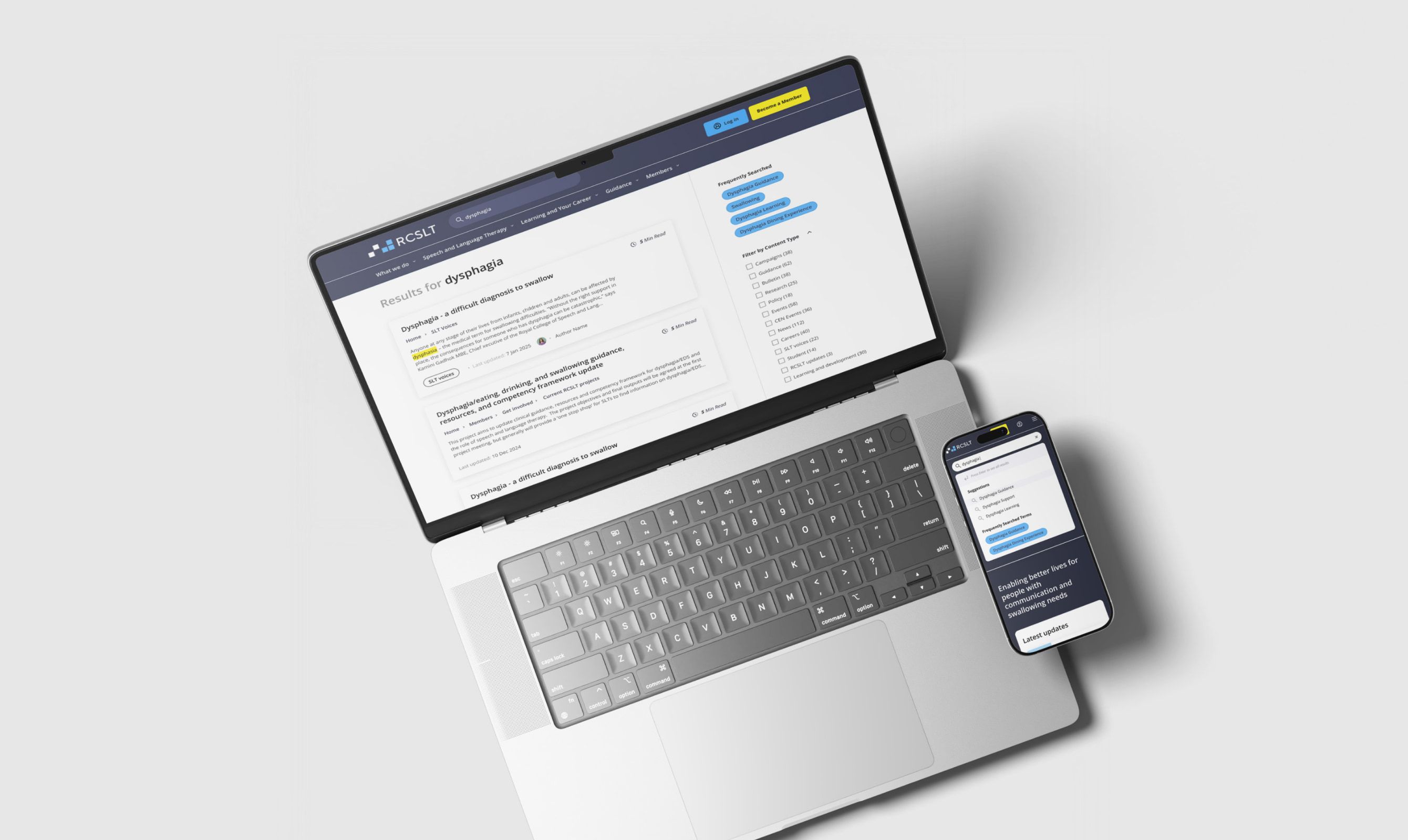
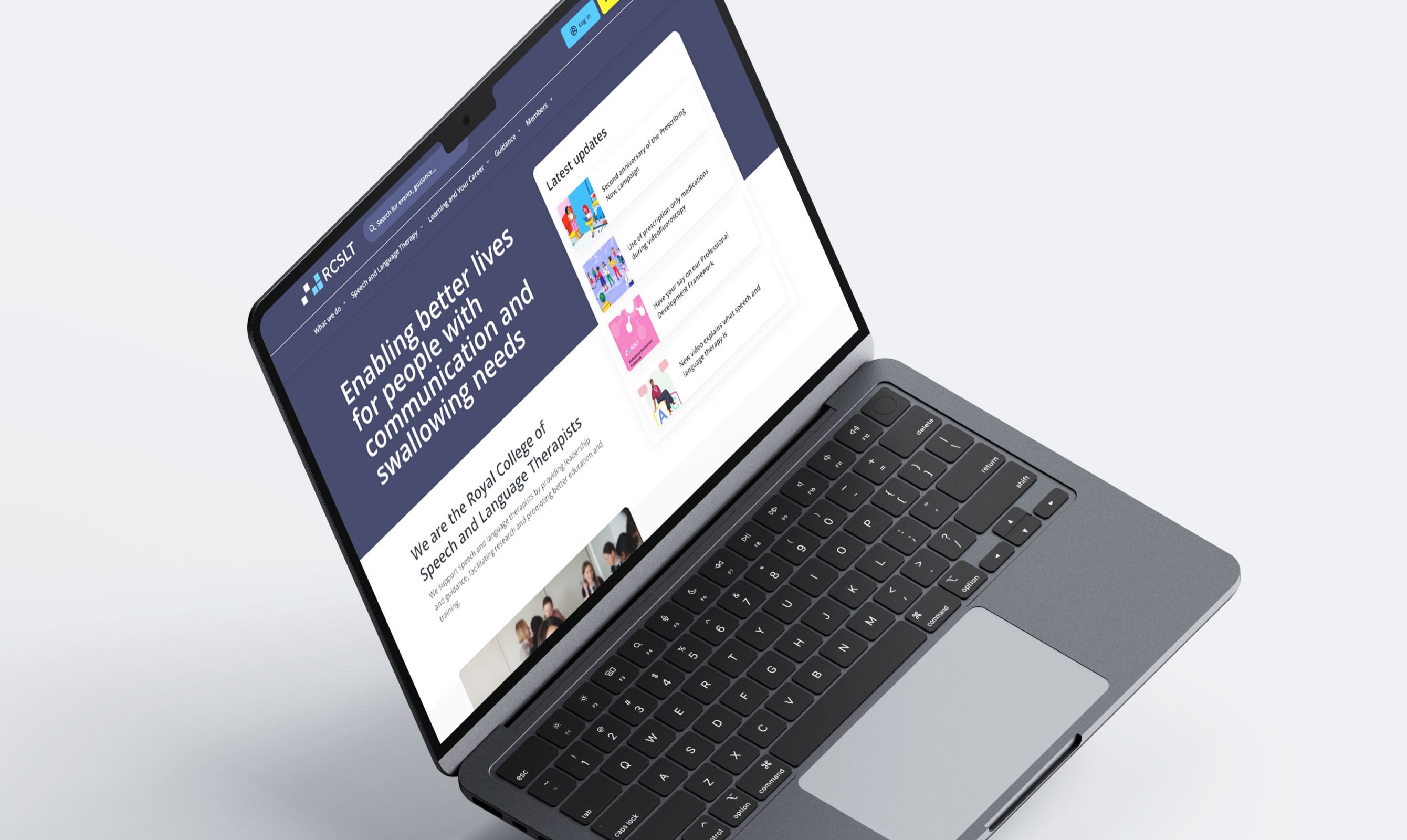
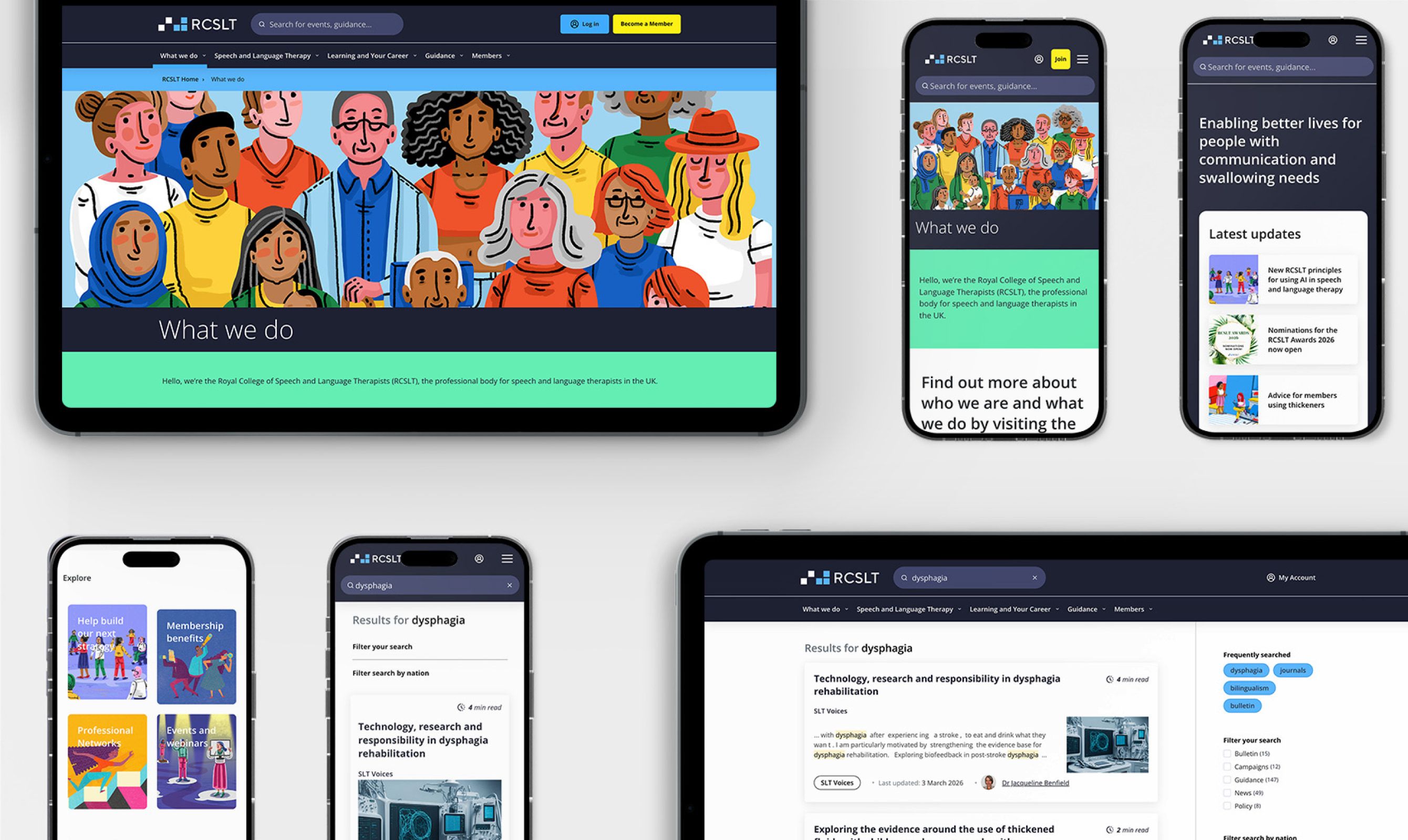
From there we redesigned the information architecture and the search: clearer routes for each audience, better search relevance and filtering, and a content approach that meets the public and the profession in their own language rather than forcing one set of words on both. We refreshed the design system around it, a clearer type and colour system, so the whole thing holds together as it grows.
Serving two audiences from one site is hard, and the temptation is to pick a side. The interesting work was refusing to: designing navigation, search and language that let a worried parent and a clinical professional each feel the site was built for them, without splitting the content in two.
What we did
The result is a research-led structure and search experience designed around a difficult brief: one site, two audiences, no walls between them. It gives RCSLT a clearer foundation to help both the public and their profession find what they came for.
Researched the real problem
Workshops, user research and competitor benchmarking to find where both audiences actually got stuck.
Redesigned search and navigation
Clearer routes for each audience, better search relevance and filtering, and buried journeys brought to the surface.
Wrote for two audiences
Content and labelling that meet the public and the profession in their own language, without splitting the site.
Refreshed the design system
A clearer type and colour system so the whole experience holds together as it grows.
Komodo have been invaluable partners in evolving our websites, delivering meaningful improvements quickly and iteratively. A responsive, skilled team who get things done.