The Impact of a Mobile First Design Methodology
App Development
Most UI/UX designers, and their clients, usually approach a web design project thinking about the desktop as the main direction. With the Impact of a mobile-first design methodology becoming more popular, the design of the desktop shouldn't always come first over the mobile experience. For many, the mobile experience would be left as an afterthought. As of April last year ComScore reported that, for the first time ever, the amount of users who use the internet exclusively on mobile devices has exceeded the number of users who exclusively use desktop devices.
Apart from the benefit of mobile growth in terms of popularity, there are many other benefits from a design perspective. When designing at a smaller resolution, compared to desktop, the screen real estate you have to work with is greatly reduced forcing you to focus and prioritise your design of the product by embracing the constraints mobile design brings with it. Starting with the mobile experience first allows you to deliver innovative experiences by building on capabilities that are only native to mobile devices and their modes of use.
The amount of space that you have to work with on desktop is greatly reduced when designing for mobile, so when you consider how much useless navigation, content or irrelevant information litter a typical web experience, it is often a good thing to focus on the constraints of mobile. This allows you to strip back to the minimum viable product and focus on what really matters to the user. Doing so allows the user’s experience to be greatly enhanced, mirroring this to desktop then accounts for a seamless experience across both devices.
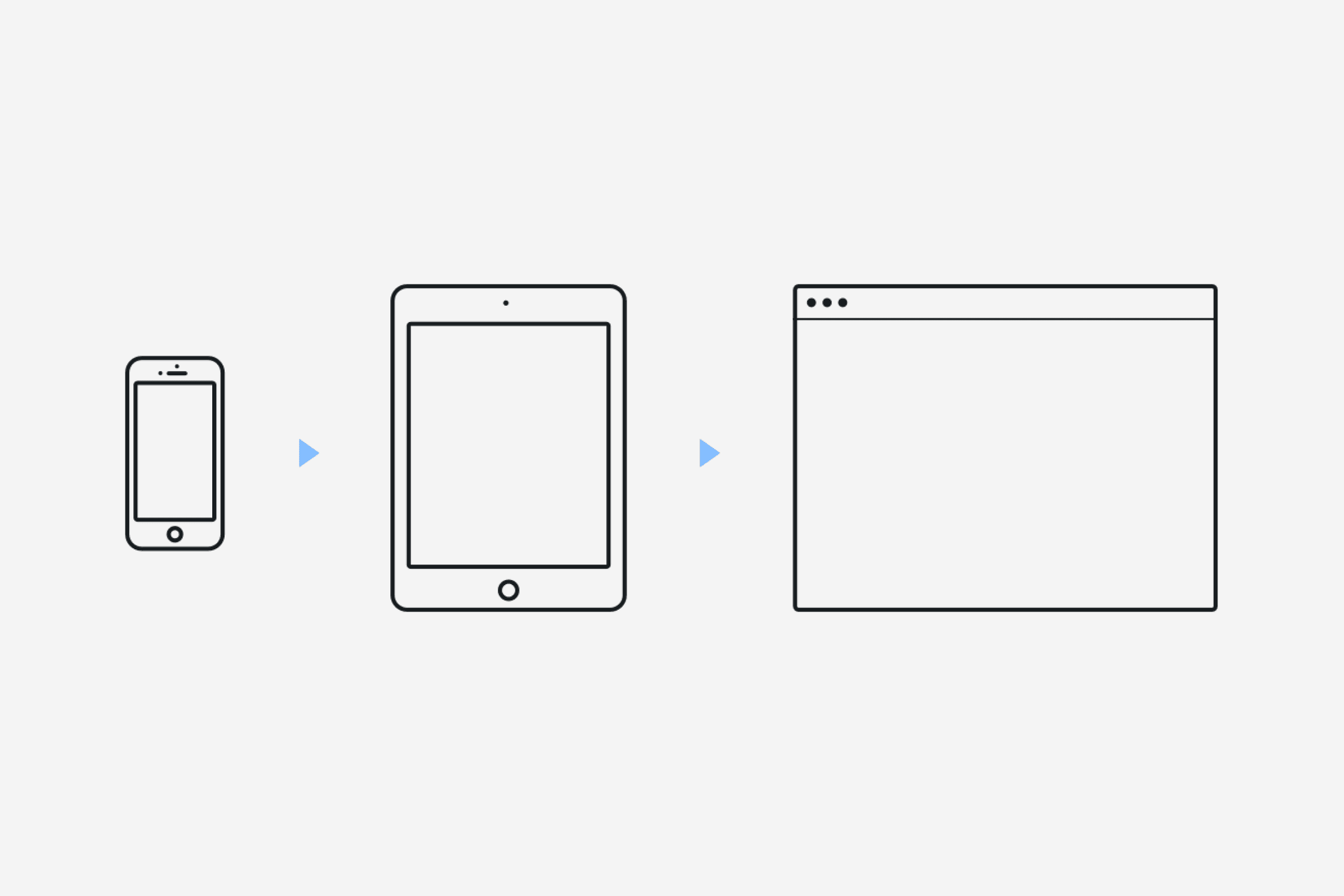
A problem often encountered when designing for desktop first is the reduction in size when converting the overall design from desktop to mobile. Often overlooked, a design could work exceptionally well on a desktop but may not transfer well to mobile. Starting with mobile-first allows you to realise the restraints from the start and then gives you more room to play with when designing for desktop.
Starting with mobile-first is key, as the number of mobile web users began to increase, people began to expect a seamless experience between desktop and mobile. If your site works well on a mobile device, it will then translate better to all devices as opposed to starting with a desktop-first approach and trying to shoehorn a larger desktop design into a screen with less real estate.
Another advantage to a mobile-first design approach is that the small-screen breakpoints can better fit around the content. When taking the mobile-first approach, the breakpoints are naturally created around the content, something that may be overlooked when starting with desktop first, resulting in changes needing to be made to the overall design further into development, on both platforms.
As mobile internet usage begins to grow it is important to put mobile first, rather than giving it a second thought. As of January 2016, Facebook reported that the number of mobile-only Facebook monthly active users hit 823 million users with 47% of Facebook users only logging in from a mobile device, with these statistics only growing it’s hard to ignore the importance of mobile-first. Embracing mobile constraints, taking what we know about designing for the web and prioritising the content that really matters will then, in turn, offer the best user experience across all devices.


Sign up to our newsletter
Be the first to hear about our events, industry insights and what’s going on at Komodo. We promise we’ll respect your inbox and only send you stuff we’d actually read ourselves.


