UI & Branding: User Interfaces To Win More Customers
UI/UX Design

Let’s make something clear: great UI design isn’t about your brand. Forget colour palettes, logos and typefaces when designing a product if you want it to drive a return on investment.

There may be some elements of the product that your brand influences. But, you can’t force your brand into a product if it’s detrimental to the user experience. Even if you have the world’s most beautiful branding you can’t prescribe your brand guidelines to your product and expect it to succeed. You must not consider branding as a rigid set of prescriptions. Instead, it needs to be a flexible gateway through which users interact with your business. To understand how and why this works, we must first recap the fundamentals of UI and UX design.
Great UI has its own brand guidelines
User Interface (UI) and User Experience (UX) design are often discussed in tandem, but the fields differ in their approach. They can, and often do, overlap - but they have different ‘goals’. UX design adopts a full solutions-based approach that assesses user types, behaviours, and needs to meet requirements. UI designers are focused on the tangible ‘how’ of that user journey. They create the graphical elements through which a user interfaces with your digital product. User research is what enables both of these disciplines to function. Gaining real insight into user needs and behaviours gives UX and UI designers more tangible insight into how to design the product. Branding, on the other hand, is more speculative and generally not based on the same level of user research. Forcing your brand’s visual components into UI can cause issues, as seen in this tweet:
Hey @teamweek your new mint colour is cool looking, but it makes your button unreadable with a white label. A UI fix is required! #usability pic.twitter.com/ih1n8no7s7
— Matthieu Souteyrand (@Nazermatt) January 10, 2018
Even if an expert team does your branding with real user research (more on that in a moment), UI and UX teams must consider the digital product independently of overall brand ideas. They must make independent decisions based on what users need from the product, not what they expect from your brand. This focus on functionality has led to some defined ideas about UI, which are summed up by Adobe as:
Place users in control of the interface
Make it comfortable to interact with a product
Reduce cognitive load
Make user interfaces consistent
However, strict adherence to these rules and fulfilling ‘functional’ requirements can result in poor artistic design. A UI designer can’t forget that ultimately, a design must marry both functionality and aesthetics - so they must make something visually appealing as well as useable. Often, that means incorporating branding into the UI so that it doesn’t jar with customer expectations - but how heavily a designer might borrow brand elements depends on how well researched the brand is.
Branding isn’t a logo
Branding elements can simply be part of the UX journey as a whole. The ideal way to create branding concepts is through the same level of detailed user research you’d perform for a product, but this is rarely done. Most commonly, branding assets are delivered early in a business’ journey and then either occasionally tweaked or left alone.
Rethink branding as one element of the whole process and suddenly, it’s easier to see how you can successfully incorporate it into the UI of a product. A brand is ultimately a visual language which embodies key aspects of your business.
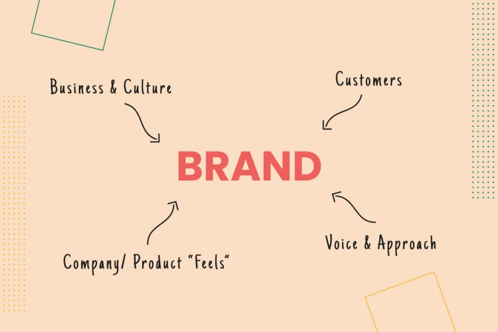
What ‘brand’ represents
Your customers
Your voice and approach
How your company/product ‘feels’ to experience
The physical elements of the brand, such as the logo, aren’t the ‘brand’ itself. Rather than focusing on trying to shoehorn these assets into a UI, a designer can instead reconsider their interface design around what the brand means rather than what the existing assets look like. A seamless brand/UI integration is beautiful to behold. Take Netflix, for example, which manages to blend its brand colours, logos and iconography across a complex interface that remains intuitive. They’ve added dark screens, profile-picture login tiles and other non-brand asset interface elements because they work to enhance the brand ‘feel’. They are complementary and not in conflict, and created as a result of long-term user research.
UI branding is about concepts over assets

Your digital product is not your brand. It doesn’t need to borrow every aspect of your branding book. In fact, it might make sense to actively disregard some brand restrictions after you’ve done your user research. For example, you may need to ditch your brand colours or typography choices if they don’t function on certain devices or restrict accessibility.
Grid systems can highlight brand flair
As digital products evolve, the UI a business chooses is becoming just as important to the brand as a classic set of components. Grid systems are now commonplace in mobile app design because they help govern how a product looks across multiple screen sizes and display formats. Grid systems are technical guidelines, but they are also responsible for forming a universal language for UI designers. In turn, it means end-users have certain expectations and a level of experience when they engage with a new product. If a designer uses established grid-system values for an interface, users should grasp it more intuitively. All of this gives designers some freedom back that allows them to be more creative with certain visual choices. To even bring brand colours, logos and typefaces back into consideration. By following a user research process and designing within a grid system, then being selective about how your branding’s visual elements will enhance or impair this approach, a UI designer creates an interface that accomplishes all 4 of Adobe’s UI success criteria:
Users feel they have the level of control they need over the product as a result of user research.
They’re familiar with the layout chosen due to the traditional grid system approach. They may feel more comfortable with the interaction if your branding is incorporated as they may already trust you.
The interface is clean and decluttered which reduces cognitive load and distractions. The UI designer removes any unsuitable branding elements to ensure the cognitive load stays low.
The interface is consistent not only with pre-existing expectations from modern grid systems but also as a result of well-chosen complementary branding elements such as colours or typography.
Build UIs For Users
To finish this article off, we wanted to remind you why we created it. Too often we find that businesses approach digital product design with pre-conceived notions of what it will do and how it will look. On the design side of things, that’s often a result of existing branding guidelines. We aim to have shown you that while visual brand assets can be incorporated into UI with the right considerations, it’s the user-driven process behind the UI and UX of a product that communicates what your ‘brand’ really stands for. The UI itself becomes part of a brand’s identity. So, focusing on usability is more important than trying to tie in brand elements or over-designing visual elements. As long as the UI makes it easy to accomplish needs, the aesthetics can be relatively simple. Take the famous social platform Reddit.com. It has a fairly basic UI offering, with buttons and styles influenced by branding but kept minimal. It’s not a beautiful site by any stretch of the imagination. But, the UI cleanly facilitates the user journey. To access their account, interact with posts and join communities.


Sign up to our newsletter
Be the first to hear about our events, industry insights and what’s going on at Komodo. We promise we’ll respect your inbox and only send you stuff we’d actually read ourselves.


