User Experience Design For Action And Intent
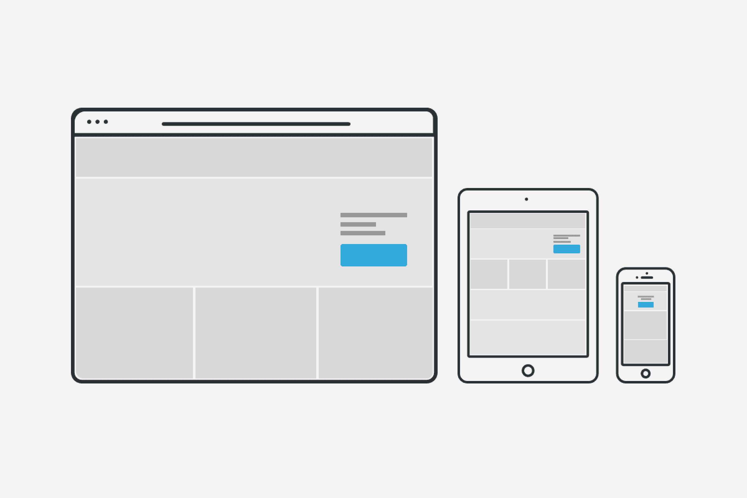
UI/UX Design
Users take in visual cues subconsciously whilst browsing any form of media, the context of the designs and visual indicators within it can make a difference when it comes to conversion rates. We, as designers, must build a bridge between the user’s intent and the outcome of that intent. The design must be intuitive enough to use to ensure the user is guided to their destination quickly and without confusion.
After reading this, it is clear how much context matters within the design – the contextual information surrounding the passage alters what you think, the same can be said for UI design. We need to consider who the user is, what they are aiming to do, why, and where they are in relation to the task they are trying to complete. Of course, you can do this with thorough user research.
Colour theory can play a large part in user perceptions and the likelihood of them clicking on a call to action button with connotations playing a large part in how a user perceives an action or process. Green and blue tend to be the most popular button colours throughout the web, with both colours having positive connotations such as trust and security, however, there have been experiments conducted that suggest that red is the strongest colour to use! However, with such designs, the colour contrasts and how well the button colour works with the rest of the page must be taken into account to avoid the button having a negative impact on the overall design. Colour tests continue to be the biggest A/B tests run by businesses across the web, as even just a minuscule increase in conversion rates can yield huge rewards for the prospective seller.
Not only the colour of a button but the style and placement can also alter the user’s actions. Professor Jürg Nänni, author of Visual Perception states: “A rectangle with sharp edges takes indeed a little bit more cognitive visible effort than for example an ellipse of the same size. Our “fovea-eye” is even faster in recording a circle. Edges involve additional neuronal image tools. The process is therefore slowed down.” This suggests that a rounded button, along with the right size depending on the importance of the action should entice the user.
Furthermore, the placement of a button can make a large difference. It has been found through eye-tracking software that users mostly scan web pages in 3 different ways depending on the content they are looking at. Either using the Gutenberg Diagram or using a ‘F’ or ‘Z’ shape. These patterns can aid us in pinpointing the best locations to place a call to action button for the highest success rates.
Finally, the language used in the design. This is an integral part of any design as the correct words can prompt the user to take action. Using a verb within a CTA will provide direction, but ultimately, the success of a button will depend on the context and content it is being used in. The words used must reassure and direct the user whilst removing any ambiguity surrounding the button and its actions. For example, in a shopping cart context a ‘buy now’ button implies a fast and simple action, whereas a ‘shop now’ or ‘continue’ button is not as direct, this will undoubtedly affect the click-through rates and subsequently, conversion rates within that site.
Buttons that create a sense of urgency such as “Start Your Trial Now” also have more success, and even better still 1st person tense, such as “Start My Free Trial Now” will further lift the click-through rate of a button. In a test conducted by Michael Aagaard it was found that a change in tense can in some cases, result in an increase of 90% in click-through rates.
In conclusion, there are a number of variables that will affect the success rate of call to action buttons and designs that have intent for the user, the challenge is to research and design an experience that suits the end user by using language, colour and layouts that are relative to the context of the design itself. Keeping the user at the centre of the design, as always, is key.


Sign up to our newsletter
Be the first to hear about our events, industry insights and what’s going on at Komodo. We promise we’ll respect your inbox and only send you stuff we’d actually read ourselves.


