Best EV Charging Apps In The UK - A Tech Review
UI/UX Design
User Research


Once a niche product relegated to the distant future, electric vehicles are now more and more mainstream. In the UK, one in six cars registered in 2021 were plug-in. The UK Committee on Climate Change stated that approximately 1,170 charging points would be needed per 100km of road by 2030. Signs of making this a reality are encouraging: according to zap-map.com, EV charging points are growing at a substantial rate - with a rise of 335% from 2016 to 2022. That takes the total to 29,740 charging devices available. EV vehicles represent a more sustainable future and a significant leap forward in terms of technology. To support EV drivers, many platforms have launched apps that help you find charging points and track performance. As a digital product studio, we’ve taken a keen interest in EV usage and how EV charging apps have evolved to meet the changing needs of everyday users. So, we got our UX & UI design team on the case to dig a little deeper! We’ve compiled a list of the top apps in the UK to offer detailed insight and feedback on how the apps work to fulfil user needs. This includes the all-important user score, but also notes from a technical level to help you understand what makes a good EV app tick…
Navigate This Guide - Best EV Charging Apps In The UK
Bonnet

User rating: Appstore: 4, Playstore: 3.3 KOMODO’s UX score: 3.5/5 Bonnet is a subscription-based charging app that supports multiple charging networks. It allows you to find charge points on a map, use them and monitor your usage over time. When searching for a charge point you can configure the search filters manually or choose to apply filters based on your car, which reduces the chance of error. It’s very clear when the charger is in use and you can stop the charge remotely from the app. You can see your usage in terms of kWh used and money spent, it also shows you the CO2 savings you’ve made to an equivalent amount of trees, plane journeys, cow farts and landfilled bin bags. The way these stats are presented is quite engaging, it doesn’t bombard you with information. The UI is clean and attractive, with an intuitive format that makes everything clear. Despite this, it does lack many user-friendly tweaks that would enhance it. Bonnet has a reliance on icons in the UI that require the user to think (or guess) more than they should have to. Icons should be labelled where appropriate. There are icons that most people are used to seeing; like a cog for settings, or magnifying glass for search, but you can’t take that for granted. On the ChargePoint list, some of the charge points have a little motor car icon, but since that’s not a commonly used icon and it’s not labelled, its meaning may be lost. Another thing the app does which is a little confusing is when you tap into an individual charge point, the main navigation bar disappears and gets replaced by a different nav, with different options related to the charge point. This is a jarring thing that only happens in this interaction. In a world where users can quickly ‘bounce’ off your app if they are surprised in a negative way, this is unacceptable. Conclusion: Overall, Bonnet looks good and is easy to use. EV charging apps have a pretty bad reputation for being unfriendly to their users, but Bonnet is one of the better ones.
Instavolt
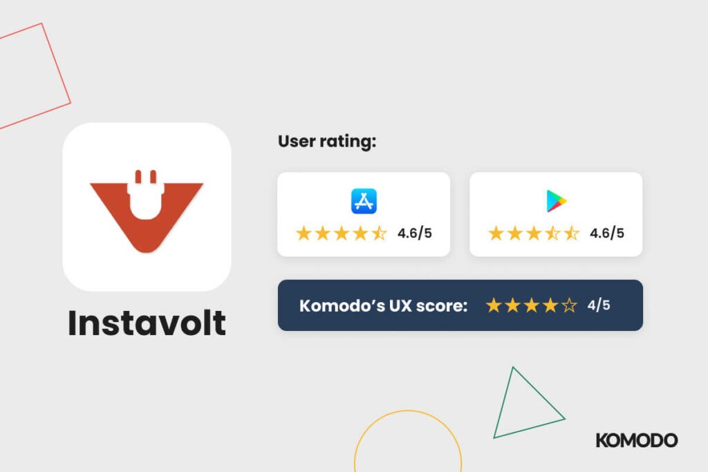
User rating: Appstore: 4.6, Playstore: 4.6 KOMODO’s UX score: 4/5 The Instavolt app covers all chargers on their network. It allows a user to find, use and pay for a charge, as well as view your charging history month by month, both in terms of electricity usage and cost. When you open the app it allows you to bypass registration in order to go straight to finding a charge point - a great example of skipping to the point for users who value that. The process from there is very straightforward. However, once the vehicle is actually charging, it doesn’t show the current battery percentage or the rate of charge in the app, so you couldn’t leave the charger if needed to know this. While the process of connecting to a charger is quite simple, there are other parts of the app’s UX that are a little awkward… If you choose to set up an account the process of doing so is clunky, and once you've started the process there’s no option to go back a step. It doesn’t tell you which form fields are mandatory until you’ve submitted it and it fails. The only way to get out of the registration process is to tap the menu icon on the top left which minimises the screen you’ve come from to open a side menu on the left. It feels strange and looks a bit dated, but it doesn’t stop you from using it once you figure out that that’s just what it does. However, given that users are forced to download multiple apps for different networks, using a standard navigation would make it less jarring. Conclusion: Instavolt’s high user scores show that it does the job it needs to - but we’d like to see more data on charging available within the app itself. Bonus points for allowing you to skip the registration screen, as that can be a real pain.
Electric Highway

User rating: Appstore: 1.5, Playstore: - KOMODO’s UX rating: 2/5 (Despite its straightforward UX, we can’t rank it highly as technical issues limit actual usability). The Electric Highway app covers the Ecotricity charging network. It allows you to charge your car and find charging stations close to you, or another specified location. The flow for starting a charge is really simple and straightforward, assuming it works. You tap the charge button, scan the pump’s code or enter its serial number, pay and charge. Short of finding a station, that’s all the app really does, which I imagine really suits people who just want to charge their car with minimal effort. You can use the app to charge as a guest, which is helpful, as the full registration process is quite cumbersome, asks for a lot of information and doesn’t provide you with much in return. The UI on Electric Highway is a little untidy. Despite an abundance of space on some of the screens, there are pieces of information that are awkwardly squished into spaces that are too small for them. It’s not attractive, but it’s not unusable. Conclusion: The problems users really seem to have with the app are technical ones. It could be the smoothest journey in the world to get to the point of charging, but if it fails at that point it’s useless. It’s also hard to rank any app highly if it isn’t available on all main devices - as you’re alienating a large user base.
Pod Point
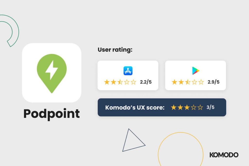
User rating: Appstore: 2.2, Playstore: 2.9 KOMODO’s UX rating: 3/5 Pod Point covers multiple charging networks as well as home chargers, so in theory, it replaces the need for having multiple charging apps downloaded for individual networks. This means it should ideally act as a ‘one-stop shop’ for EV charging - but does it? There are a lot of positives to Pod Point; its ability to export charging data including business mileage over a specified period of time, the ability to set up automatic smart charging for home users and quick registration free access for casual users. There is a clear onboarding process and navigating around the app is straightforward. The UI is neat and legible - with buttons and features placed where you expect them to be, though a lot of the buttons are a bit too small. The process of starting a charge is a little complicated, and once you’ve started a charge you only see confirmation via text rather than any form of notification or ‘active charging’ icon. It doesn’t tell you how the charge is progressing, or how long it’s likely to take. Conclusion: It’s great that Pod Point stops the need for multiple apps and keeps everything in one place. However, if an app aims to be the one-stop place for EV charging it must include information vital to the user such as charging time etc.
Osprey Charging

User rating: Appstore: 4.1, Playstore: 3.3 KOMODO’s UX rating: 3.5/5 This app covers the Osprey charging network only. It allows you to find a charge point via a map or list view, start and stop charge sessions, view live charging status, see your charge history and download VAT receipts. As soon as you open the app it takes you straight to a map of nearby charging stations. A lot of charging apps take you through a pretty time-consuming registration process before you even see what the app does so this is a useful option. The app has a clear charge status screen that shows while the vehicle is charging. There’s a large progress graphic that tells you the current charge percentage. It also shows you the cost of the charge and gives you the ability to stop the charge remotely from the app. The process is pretty streamlined and user-friendly, with a clean UI. It’s not that pretty, but it’s quite intuitive. One of the things that might be frustrating about the Osprey app is that it doesn’t tell you whether or not the charge point found on the map is currently available or not, so there’s every chance a user could make their way to a charging point and then have to wait or find another one, with no guarantee that would be free either. With a little bit of additional user research, the need and value for an 'in-use' status would have been uncovered, leading to a boost in the app's experience overall. Conclusion: the overall UX of this app is clean and intuitive, but the potential risk of driving to a charging point to find it occupied could lead to huge user frustrations and seems a significant oversight.
GeniePoint

User rating: Appstore: 1.5, Playstore: - KOMODO’s UX rating: 1/5 The GeniePoint app is one of the lowest-rated charging apps in terms of user ratings. This seems to be largely due to problems users have had connecting to the charger and starting the charge. But the experience around that probably doesn’t help. The app itself looks more like a website that has been repurposed for app use. So, it just doesn’t work the way you’d expect a native app to behave. You can expand the map of chargers using gestures and the navigation takes up a full page, which you have to keep going back to. The process of finding a charger is awkward too, as the listed chargers only show their location so you have to tap into everyone to see whether the charger is suitable for your car. There’s no way to filter down what chargers are shown, you can however choose which connector types are included on the map version. After you’ve found a charger, attempting to start a charge will prompt you to sign in. You do have the option to use it as a guest, but this is at the bottom of the screen in small text. If the option to sign in or use as a guest was given on opening the app, users wouldn’t have to be taken away from starting a charge just as they’re ready to do it. Conclusion: we can’t recommend this one as it’s frustrating from a UX standpoint AND a user review one. Again, the lack of cross-platform functionality is another hindrance that isolates many users.
Charge Your Car

User rating: Appstore: 3.7, Playstore: - KOMODO’s UX rating: 1.5/5 Charge Your Car is a UK-based charging network. You need to apply for an access card that accompanies the app and costs £20, as well as needing a direct debit to pay for use of the network. This immediately primes a potential user to expect higher quality service - but the app doesn’t quite manage to meet these expectations. Like Geniepoint, it looks like something that’s been designed as a website and made into an app, though it does have the familiar tab navigation at the bottom of the screen. It allows you to search for charge points on a map or list and shows you the speed and availability of those charge points, but this is colour coded which isn’t ideal for accessibility. It also allows you to favourite chargers - which is a useful feature we’d like to see more of across other apps. The app looks dated but that’s not the biggest problem. The UI is a bit untidy and the text is very small. There are also instances of poor colour contrast, which may cause trouble for those with visual impairments. When a user taps into an individual charge point to see its information, the screen is so cluttered and lacking in a hierarchy that it’s hard to process the information. For every action a user takes, there’s a little hurdle to jump over - a huge red flag considering the paid-for nature of the app. Conclusion: in a world where free alternatives and competitors abound, you can’t afford to have a paid experience offer so little. Charge your car needs to work on its app and create a native, intuitive experience or risk losing users fast.
Fastened
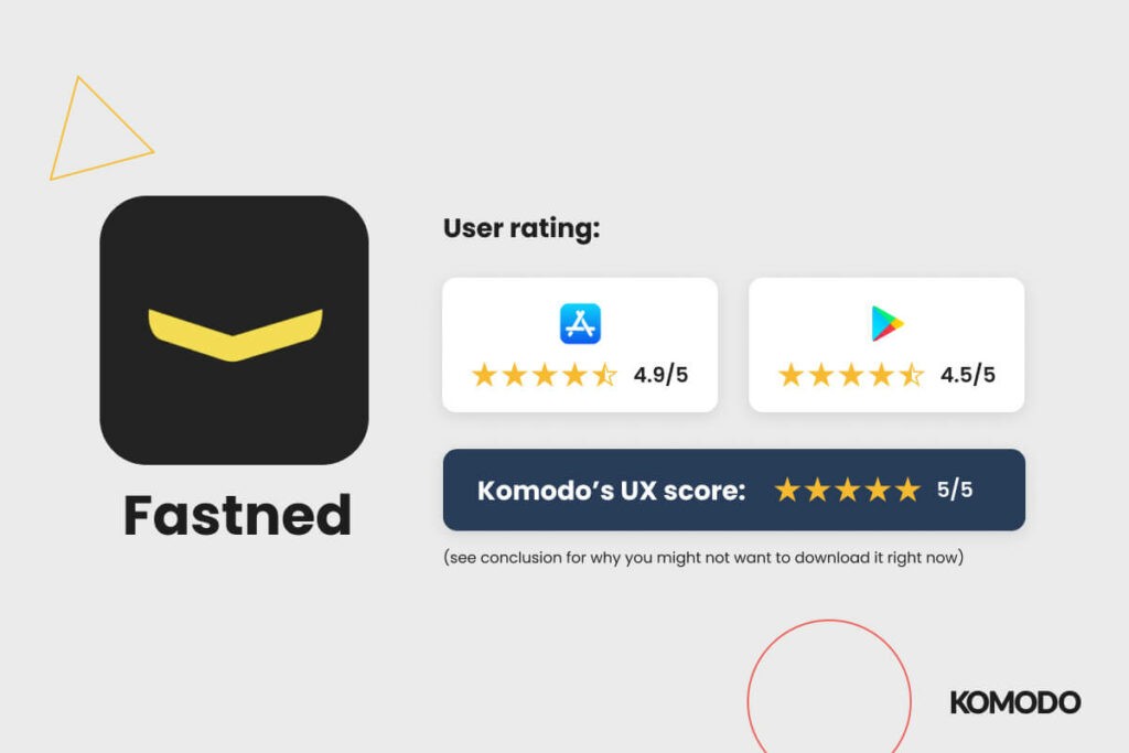
User rating: Appstore: 4.9, Playstore: 4.5 KOMODO’s UX rating: 5/5 (see conclusion for why you might not want to download it right now). Fastened is an appealing network-only app focused on fast charging with renewable energy. You are able to skip registration, but if you do choose to go through the process, it’s very straightforward and you’re rewarded with a nice animation once it’s complete. Once you’re into the app, it’s all quite intuitive. Though like Bonnet, the navigation icons aren’t labelled so there’s a bit of figuring out to do. There’s a large yellow charge button in the middle of the nav which is the most straightforward to-the-point process I’ve seen in any of the apps and a great example of ‘signposting’. Tapping this button allows you to enter the code of the charger you want to use and go from there. It’s clear when the app is charging, there’s a nice graphic interface that gives you the current percentage and speed of charge and allows you to stop it remotely. Fastened does all of the things that are standard on charging apps well but also has some added extras. The map section of the app, it allows you to plan a journey with multiple stops with the ability to specify a battery level that you’d like to have at each point. It then tells you where to charge along the route. Conclusion: While this is the most effective app on the list from a UX standpoint, at the time of writing (04/05/22) it’s hard to recommend to UK audiences. There’s only a handful of Fastened charging stations in the country - so you’re not likely to use it until the company comes to the UK in force. But, they do have plans for expansion and are actively searching for new locations here. However, other EV app designers can take a lot of inspiration from it.
Ionity

User rating: Appstore: 4.2, Playstore: 2.7 KOMODO’s UX rating: 3.5/5 Ionity is a high-power charging network. The app allows you to find a charger, pay to use it and start charging. In the reverse of ‘jack of all trades, master of none’, this app is singular in its focus and performs its set task well. You have to sign up before using the app, but the flow is straightforward and cuts down on distractions. When verifying your email address, the app opens your email app for you and takes you straight back to the app to complete the process to minimise the need for manual action. Considerations like this make for a smooth user experience (which is probably welcome when you’re downloading your 20th charging app). The UI is modern and attractive with animated transitions between actions. It works smoothly and you take for granted that the text is legible and all the information is easy to process. There’s a profile page which shows an easily digestible overview of charging stats and it’s clear how to seek help should you need it. Conclusion: The Ionity app doesn’t have the wealth of extra features that some charging apps have but what it does do, it does well. However, poor Android user ratings do hamper our ability to recommend it.
Monta

User rating: Appstore: 4.6, Playstore: - KOMODO’s UX rating: 4/5 Like Pod Point, Monta covers multiple charging networks and home chargers, but with much better UI/UX. Monta has a wealth of useful features that they are proactive about adding through triaged user suggestions, but this doesn’t make the app feel overloaded. Tasks performed in the app are completed in a guided, step-by-step process. From onboarding to connecting a home charger, it doesn’t leave you in the lurch. Users are provided with detailed insights on their usage that are laid out in an easily digestible way, with a hierarchy that makes sense. The process of finding a charger and starting a charge is streamlined. The app gives you all the information you need along the way. There’s also a journey planning feature that allows you to find chargers along a specified route, though, unlike Fastened, you can only plot between two points. The only thing we can think of that could be improved on Monta is the charging page. There are three sections of equal importance stacked on top of each other. In our opinion, it may be easier for a user to process this if they were placed in separate tabs. Conclusion: Monta is an effective app that offers consistent UX across its user journey. The planning feature is a welcome addition that adds value to user experiences. The app has poor Android reviews, so more work needs to be done to reach parity with Apple’s version.
Build Better Products, Faster.
Here at KOMODO Digital, we create apps and digital products designed with user experience at their core. We believe in product, over production - creating digital experiences users love and delivering a return on your investment. In the EV world, customers are already seeing new choices crop up for everything from in-car entertainment to charging and peripherals. Get ahead by working with our team on your next app project in the automotive and telematics sector. Want to learn more about our approach to the product design process? Download our free guide to the product design process here.


Sign up to our newsletter
Be the first to hear about our events, industry insights and what’s going on at Komodo. We promise we’ll respect your inbox and only send you stuff we’d actually read ourselves.


